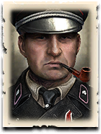
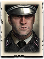
Some extra feedback on the details of the new portraits:
I've been thinking that the two shirt & tie variants for certain classes of OST and OKW commanders could be adjusted. While having two variants is interesting, I feel that certain commanders should have the tidier look and others the messier look.
For example:


This is the one I consider the "messier" look and I think it fits well considering the grittiness of their faces.
But in these cases:


I'd have preferred to see the first two get the "tidier" and the Assault Gren commander get the "messier" look, a tidier uniform fits the old officers better than the young one. It's a lot more formal for the older officers this way. The AssGren commander's original portrait is gritty and that aspect could carry over with the slanted hat + "messier" shirt/tie option. Right now he looks perfect, while the other two senior officers have become ragged. I would swap this aesthetic.
Also, I would swap the Spearhead's slanted hat as it looks too fashionable for older officers with the straight version seen on the third portrait's AssGren commander. The slanted officer hat is mostly on young-looking portraits such as the Luftwaffe Supply and the Elite Armor doctrines, and it looks like a fashion statement. To me it looks a little silly over a battle-hardened, older officer face like the one of Spearhead. He used to look like a warrior, now he looks very close to a civilian.
EDIT: The Assault Support commander, the second groups middle one, could have his iron cross be more visible as he's one of the Field Officer commander. I suppose it is supposed to be carried by that red ribbon, but it might as well not exist as it is invisible compared to the other officer doctrines of OST.


 Greece


 cblanco ★
  보드카 중대
  VonManteuffel
  Heartless Jäger