CoH2 - my review of the alpha level UI

 1
1 Posts: 2439 | Subs: 6
Link to video - In this I go over various stills and give my impression and analysis of the UI as it stands in Alpha. Hopefully it opens up a bit of discussion.
Posts: 881
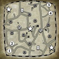
Regarding the green color; yes, it should be blue or at least more saturated, I find it difficult to see the territory borders on the minimap. And it's a green map, I somehow subconsciously expect the minimap to be green already before I've capped it..
Posts: 332 | Subs: 1
Posts: 838


Posts: 82
One thing I have a question on is how will control groups work? Obviously click on units then hit ctrl+1 and it makes control group 1, but how will that be shown on the right side? From the pictures shown, there is no space left for a control group to go without it pushing more into the center of the screen because of the new boxes there for the abilities.
The whole dynamic interface thing about the picture to the unit is really dumb also. Kill count and things like that is more important to me than what seems to be a little animated portrait of the unit I'm selected. I'd rather see information at a glance than have to scroll over it. (This is where I ran out of time to stop watching the video, but very good job reviewing it.)
Posts: 862

Posts: 11
Posts: 28
The green is horrible, especially since I'm a bit colourblind, I can barely see my units and my territory..
Indeed, should be Blue and Red.
Green isn't even something that you'd associate with the Ostheer or the Wehrmacht.
Posts: 217
Also, where is the the tactical map?
Posts: 217
I can imagine you would have to double take to get all the resource information you need during a game.

Posts: 1210 | Subs: 1
Posts: 14
- CoH's UI is not very intuitive and sometimes awkward to use. For example you have to go to the game starting screen to watch a replay. For basic matches, both "Main menu" and "Leave game" buttons lead to the same screen. No information design whatsoever.
- Relic generally favors a short-lived wow-moment - or what they dream up to be one - over long time usability. That's their reasoning behind ToV units. And the convoluted level names still make me cringe.
BTW: am I the only one whom the new UI reminds of the Total War series UI?
Posts: 1
Biggest areas for improvement are:
• Change map color from green to red.
• Change resource display from horizontal to vertical.
Both changes seem pretty easy and would make a big difference.
Posts: 27
The green colour needs to be changed
Posts: 65
Posts: 255
Posts: 508 | Subs: 1
Anybody else who thinks it looks like this? (it's a MOW video from our very own TychoCelChuu)
I just feel it's terrible overall, with the horizontal resources being the worst part.
Posts: 117
 4
4 Posts: 505
Posts: 879
Also, I do not think the resource panel should be horizontal either. It's much easier to take in vertical information when there are separate categories. There's a reason you almost never see tickboxes in software arranged horizontally. Bulleted lists are also never horizontally arranged. It would be ugly and hard to read. Note that they also used a serif rather than san-serif font for the income numbers. Sans-serif is much easier to read on computer screens.
Overall I also think it's much too busy in the color scheme. It's not totally garish, but I think they need to reduce their palette a bit.
Ladders Top 10
-
#Steam AliasWL%Streak
- 1.59482.879+8
- 2.43163.872+9
- 3.13644.756+10
- 4.14839.791+7
- 5.286162.638+4
- 6.18151.780+4
- 7.313114.733+9
- 8.14265.686+10
- 9.388260.599+2
- 10.14059.704+7
Replay highlight
-
 cblanco ★
 -
 보드카 중대
-
 VonManteuffel
 -
 Heartless Jäger

Board Info
3 posts in the last week
49 posts in the last month
Welcome our newest member, Depner
Most online: 2043 users on 29 Oct 2023, 01:04 AM


