Login

russian armor

The new Brit maps are gorgeous

1 Sep 2015, 09:16 AM
#1
avatar of AmiPolizeiFunk
Admin Black Badge
Patrion 15

Posts: 16697 | Subs: 12

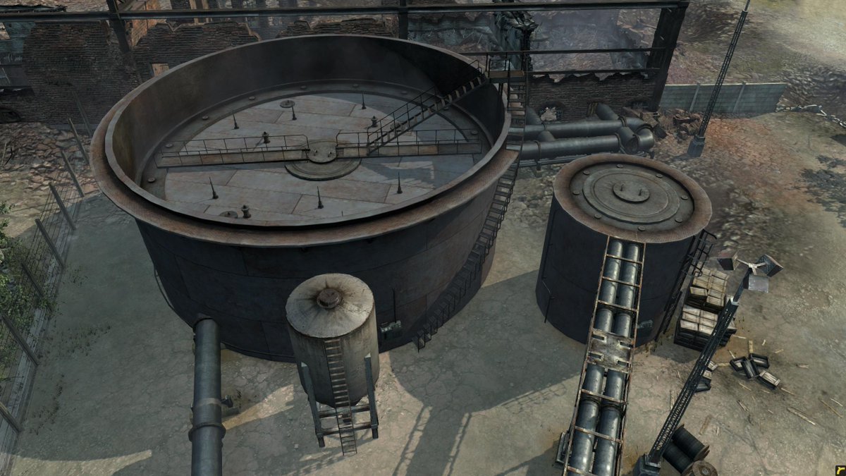
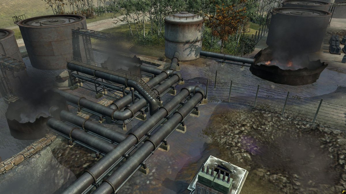
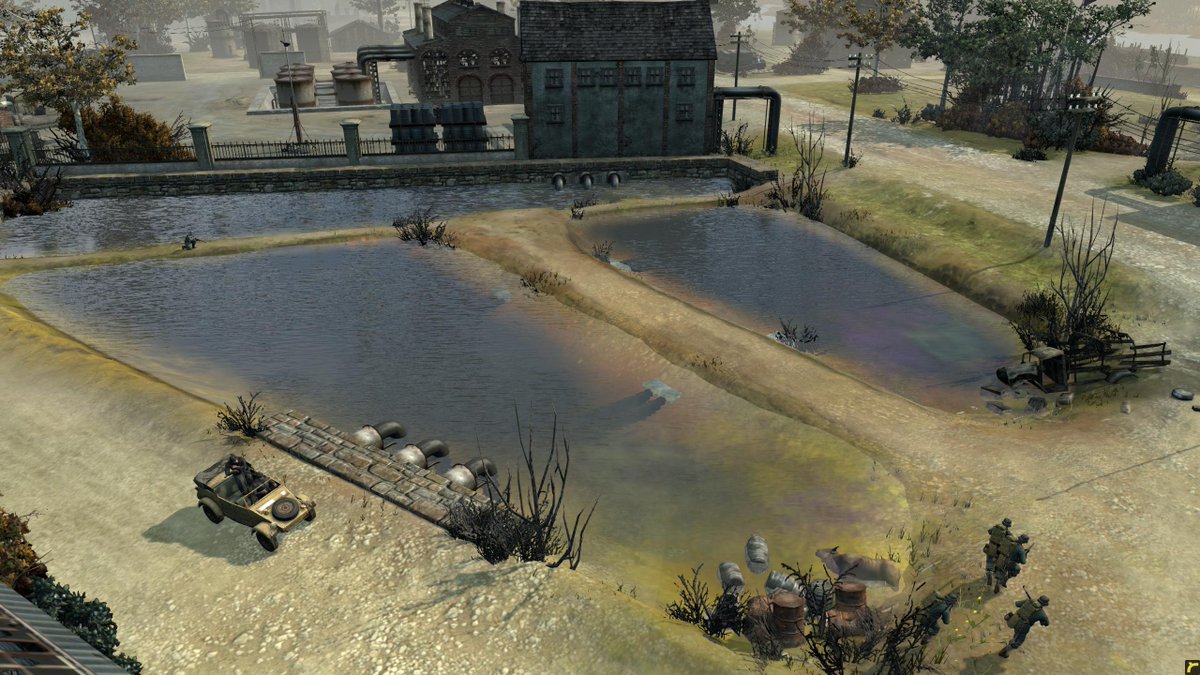
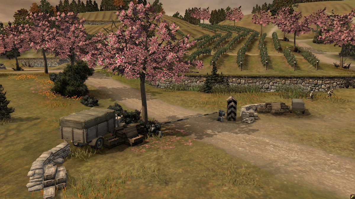
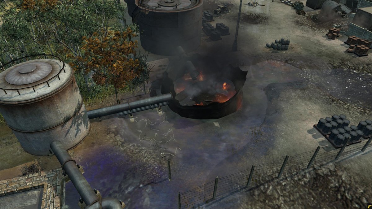
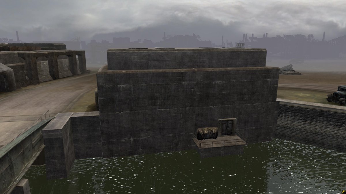
I'm blown away by the beauty of this new batch of maps. Cherry trees and sloping vinyards at Arnhem, massive industrial pipe structures and rusty run-offs at Gelsenkirchen, the huge shipbuilding yard at Hamburg... I see that so much work was put into making new buildings and interesting architectural elements for these maps. They also feel like WW2 and Germany under the grip of the National Socialists.

I was just in Munster and I was reading about the history of that area as a place where chemical weapons were developed and it's some gnarly stuff. Somehow the map at Gelsenkirchen evokes this kind of frightening factory where some nasty shit is being developed. Just a fantastic map. KUDOS to the designers.

Relic, who do we have to thank for these? I wish there were credits somewhere that said who worked on which maps.

Arnhem:


Gelsenkirchen:


Hamburg:
1 Sep 2015, 09:33 AM
#2
avatar of Kreatiir

Posts: 2819

+1. Props to the devs :)
1 Sep 2015, 09:42 AM
#3
avatar of RMMLz

Posts: 1802 | Subs: 1

Relic's Art team has always been excellent. The concept, the design, props, textures everything. In each and every one of their games, they give you the feeling and they truly make a great visual atmosphere.
1 Sep 2015, 09:45 AM
#4
avatar of Mr. Someguy

Posts: 4928

Yeah, they really outdid themselves with these maps. They are beautiful.
1 Sep 2015, 09:46 AM
#5
avatar of Hater

Posts: 493

I wonder which of the 4v4 maps will be available for automatch. Because you see... Lorch has 5 vp and some ruins like Esch-sur-sure, Hamburg made me remember winter city 17, with many points isolated on one piece of the map.
1 Sep 2015, 09:53 AM
#6
avatar of Kreatiir

Posts: 2819

5 VP? That would actually make sense in 4v4 :).
Cool!
1 Sep 2015, 09:55 AM
#7
avatar of Spielführer

Posts: 320

I dislike the maps. Some are nice from the optics, but clusterfuck and not much space. Atleast we can see that they invested a lot of time and did a good quality job. Still not my first choice
1 Sep 2015, 09:57 AM
#8
avatar of __deleted__

Posts: 830

Agreed :D

How do they play?
1 Sep 2015, 10:08 AM
#9
avatar of MajorBloodnok
Admin Red  Badge
Patrion 314

Posts: 10665 | Subs: 9

The map designs were one of the first things that struck me in the alpha - a real commitment by Relic to keeping the game interesting.

I agree with Ami that it would be great to see the artists accredited, It's a pity really, when you think M/s Pytlewski's buildings carry her stamp in CoH1.
1 Sep 2015, 10:48 AM
#10
avatar of SgtBulldog

Posts: 688

I found myself trying to avoid knocking those cherry trees over with my tank! Makes no sense, but they look really nice and remind me of spring.
1 Sep 2015, 11:13 AM
#11
avatar of Katitof

Posts: 17914 | Subs: 8

New maps indeed look great, but have you played them all?

Have you played 2v2 stalingrad yet? :foreveralone:
1 Sep 2015, 11:26 AM
#12
avatar of MoerserKarL
Donator 22

Posts: 1108

+1
thanks to those wonderful created maps :)
1 Sep 2015, 11:33 AM
#13
avatar of wuff

Posts: 1534 | Subs: 1

I wish they did a visual makeover on the older maps.
1 Sep 2015, 11:59 AM
#14
avatar of awa59noob
Benefactor 3110

Posts: 152

I have to say i only played one 1v1 map yet (Arnhem), but i think it looked gorgeous too. I liked the map design too. Pro playeers might disagree but i had fun. If i had a wish the texture of the ground seems a little weak but this is bitching on highest level. Thx relic.
1 Sep 2015, 12:26 PM
#15
avatar of pigsoup
Patrion 14

Posts: 4301 | Subs: 2

are some of those water ranbowish due to oil?

+1 to OP.
1 Sep 2015, 12:42 PM
#16
avatar of dasheepeh

Posts: 2115 | Subs: 1

they do look nice, but many of them are horrible to play on.
1 Sep 2015, 13:18 PM
#17
avatar of Schewi

Posts: 175

they do look nice, but many of them are horrible to play on.


+1
1 Sep 2015, 13:24 PM
#18
avatar of Katitof

Posts: 17914 | Subs: 8

they do look nice, but many of them are horrible to play on.


Dusseldorf :foreveralone:
Pretty stalingrad version of 2v2 with central point church garrison resistant to nuclear explosions :foreveralone:
You won't be picking anything out of that building with normal nades/molos.
1 Sep 2015, 13:36 PM
#19
avatar of mycalliope

Posts: 721

well almost all games have great artist the thing comes down to level design which is fucking shit...relic are the phantom of their previous glory.(playing lots of mgsv the level design in this game puts design in coh2 to shame)
1 Sep 2015, 13:41 PM
#20
avatar of ThoseDeafMutes

Posts: 1026

(playing lots of mgsv the level design in this game puts design in coh2 to like a poop)


1 user is browsing this thread: 1 guest

Livestreams

unknown 23
unknown 18
Germany 941
Poland 1
Russian Federation 1
Germany 0

Ladders Top 10

  • #
    Steam Alias
    W
    L
    %
    Streak
Data provided by Relic Relic Entertainment

Replay highlight

VS
  • U.S. Forces flag cblanco ★
  • The British Forces flag 보드카 중대
  • Oberkommando West flag VonManteuffel
  • Ostheer flag Heartless Jäger
uploaded by XXxxHeartlessxxXX

Board Info

820 users are online: 820 guests
0 post in the last 24h
8 posts in the last week
34 posts in the last month
Registered members: 49113
Welcome our newest member, Dedek545
Most online: 2043 users on 29 Oct 2023, 01:04 AM