Login

russian armor

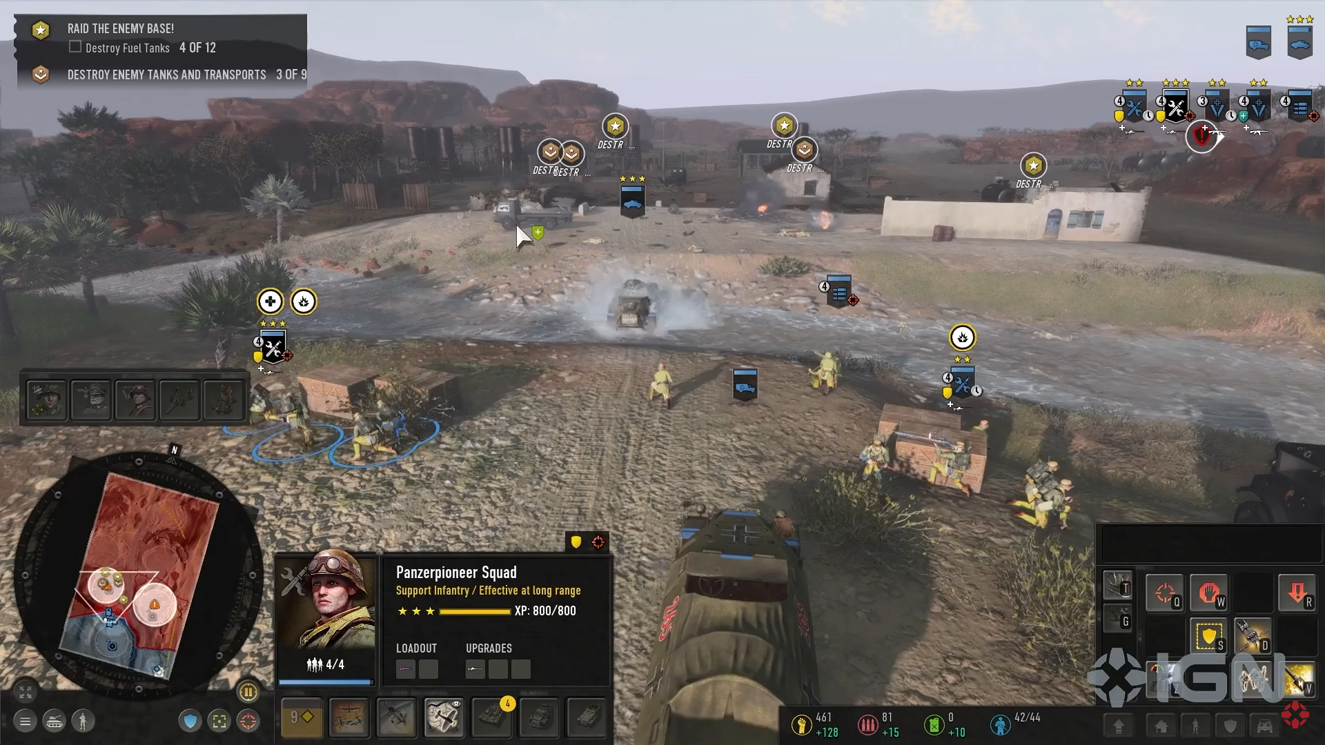
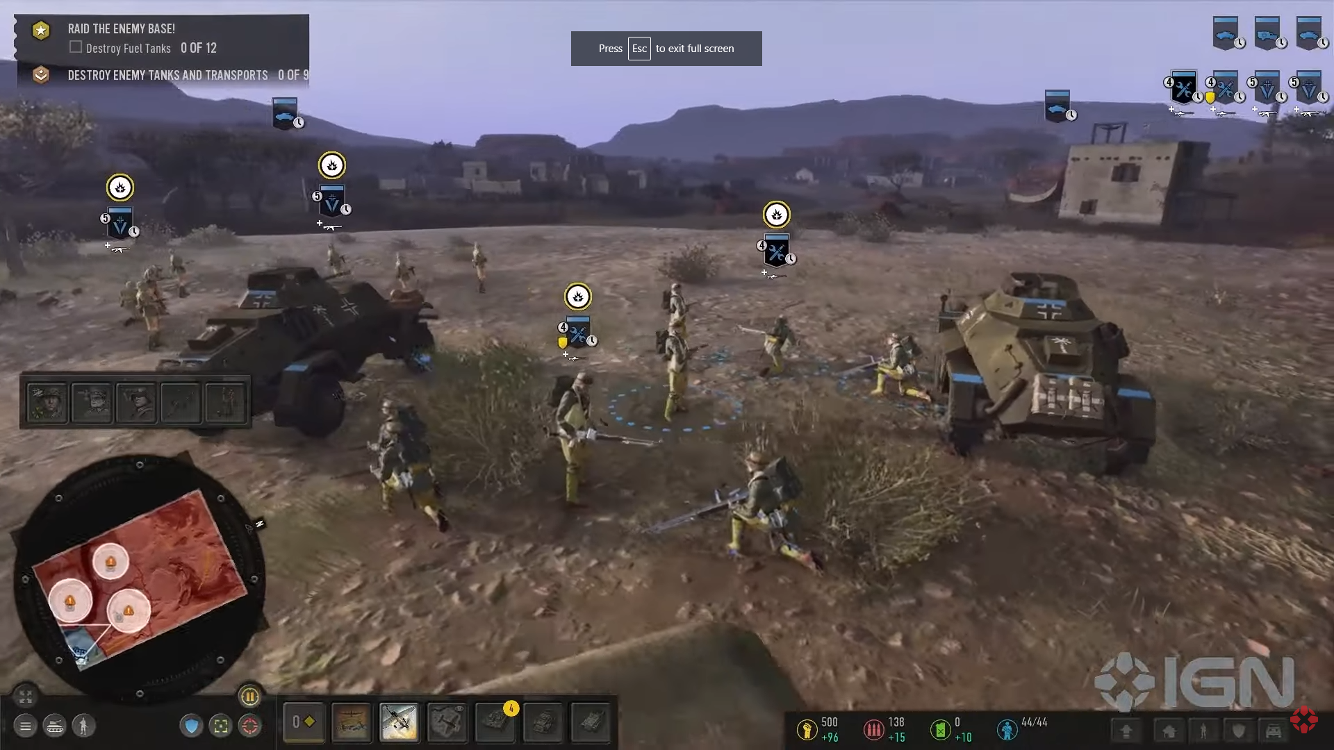
First look of the new UI

What do you think?
Option Distribution Votes
3%
39%
58%
Total votes: 31
Vote VOTE! Vote ABSTAIN
22 Sep 2022, 17:54 PM
#1
avatar of Spanky
Senior Strategist Badge

Posts: 1820 | Subs: 2

Way better than before, not sure about the "call ins" tab above the minimap tho. Also the unit panel should go on the right side I feel.


22 Sep 2022, 18:55 PM
#2
avatar of Kurobane

Posts: 658

Still complete ass
22 Sep 2022, 18:57 PM
#3
avatar of GachiGasm

Posts: 1116 | Subs: 1

I just dont get it, what with this desire to put this unit box everywhere but not in the place where it should be.

Why should be near the mini map and not on the right side where you literary have an empty space which is not used.

There was like dozens of concepts made by the community which looks x10 times better then this.
22 Sep 2022, 18:59 PM
#4
avatar of Hannibal
Senior Moderator Badge

Posts: 3114 | Subs: 2

Better, but still looks untidy to me.
So many floating and protruding elements, why? CoH2's UI occupies way too much of the screen, but at the very least it is thematic and clearly separates the screen into the battlefield and static elements.
CoH3's UI is not thematic at all and constantly mixes static elements with snippets of the moving background. E.g. near the minimap. I don't need these tiny spaces to the left and bottom, I won't pick up information through these anyway. This could at least be used to make the UI 'pretty' or but some better info there.
22 Sep 2022, 19:02 PM
#5
avatar of Kurobane

Posts: 658

I just dont get it, what with this desire to put this unit box everywhere but not in the place where it should be.

Why should be near the mini map and not on the right side where you literary have an empty space which is not used.

There was like dozens of concepts made by the community which looks x10 times better then this.


And the Community told Relic exactly how to fix it and they ignored it. Just like how they ignored early feedback for Dawn of War 3 and couldn't for the life of them figure out why Dawn of War 3 failed.

When your customers are telling you what you want and you say fuck them I will do what I want anyway, then they wonder why Relic games have never been able to become mainstream like say Starcraft 2.

They ignore the community, they don't fix any bugs, they have outdated tooltips that are either incorrect or have terrible vague descriptions (too lazy to fix) they struggle to add basic features like being able to change your hotkeys and the biggest new feature for COH 3 is a single player pause.

Sorry to say but Relic staff needs to be purged and have the COH license given to a more competent studio.
22 Sep 2022, 19:33 PM
#6
avatar of gunther09
Donator 22

Posts: 538

those call ins look like an error, like unfinished business.
The rest ist faaar better than before.
If they stick those call in boxes somewhere else - I would be habby
22 Sep 2022, 20:26 PM
#7
avatar of Rosbone

Posts: 2145 | Subs: 2

I have not played or even looked at any of Coh3, for obvious reasons.

- I would move Call-ins(1) and Commander(3) above stats (2). Another option would be make Call-Ins vertical and move them to the left of the minimap.

- Units in upper right(4) need flipped. You will always have way more infantry then vehicles, so Inf should be on top of the screen out of your view. I also liked these being at the bottom near the minimap so you can select, see, and move units all within a small area. But I think that was an option correct?

- The selection detail pane (3) should be resized. The Portrait can remain the same size but the details should be about 60% of that height. And the upper right buttons should be on the left side. This would create an easy to see thru portal to the center of the screen.

Since I did not play it, I could be completely wrong of course :romeoMug:
22 Sep 2022, 20:55 PM
#8
avatar of d0ggY
Senior Caster Badge

Posts: 823 | Subs: 3

Still complete ass
This
22 Sep 2022, 22:55 PM
#9
avatar of aerafield

Posts: 3032 | Subs: 3

I think if the unit card gets moved to the right, above the resource counter, then it's okay
22 Sep 2022, 23:17 PM
#10
avatar of Kurobane

Posts: 658

I think if the unit card gets moved to the right, above the resource counter, then it's okay


If Relic wanted to impress me, they would create a moddable UI API kind of like World of Warcraft or similar games in which you can mod/change the UI (even Dota 2 has this even if its somewhat limited)


I would rather they copy the UI from COH 1 or COH 2 and just abandon whatever the hell this trash is that they are trying to make that isn't working.


23 Sep 2022, 03:19 AM
#11
avatar of Willy Pete

Posts: 348

THis shouldnt be this hard to get right

Takes up WAY too much of teh screen
23 Sep 2022, 04:15 AM
#12
avatar of PatFenis

Posts: 240

I dont know how to fix it, but the UI and buff indicators still look like someone on kickstarter made it with bought Unity assests.

I see that they try to keep the center of the screen unobstructed, but this is not that much of a problem for playing. It is really good for spectating, if you think about Starcraft 2 and the spectating mod (forgot the name) or in AoE2 with CaptureAge. But they could just make a different UI for spectating and make a good looking UI for actually playing the game.
23 Sep 2022, 05:03 AM
#13
avatar of Spanky
Senior Strategist Badge

Posts: 1820 | Subs: 2

As a player who doesn't use tactical map and do everything on the minimap, I would've loved to have the unit cards down bottom next to the minimap. Its a drag to go from one corner to the other.

Edit: unit icons should be flipped like mentioned above.
23 Sep 2022, 11:10 AM
#14
avatar of gunther09
Donator 22

Posts: 538

jump backJump back to quoted post22 Sep 2022, 20:26 PMRosbone
I have not played or even looked at any of Coh3, for obvious reasons.
- I would move Call-ins(1) and Commander(3) above stats (2). Another option would be make Call-Ins vertical and move them to the left of the minimap.

- Units in upper right(4) need flipped. You will always have way more infantry then vehicles, so Inf should be on top of the screen out of your view. I also liked these being at the bottom near the minimap so you can select, see, and move units all within a small area. But I think that was an option correct?

- The selection detail pane (3) should be resized. The Portrait can remain the same size but the details should be about 60% of that height. And the upper right buttons should be on the left side. This would create an easy to see thru portal to the center of the screen.

Since I did not play it, I could be completely wrong of course :romeoMug:


10$, 10€ for a mod with these changes!
23 Sep 2022, 14:20 PM
#15
avatar of aerafield

Posts: 3032 | Subs: 3


If Relic wanted to impress me, they would create a moddable UI API kind of like World of Warcraft or similar games in which you can mod/change the UI (even Dota 2 has this even if its somewhat limited)


I would rather they copy the UI from COH 1 or COH 2 and just abandon whatever the hell this trash is that they are trying to make that isn't working.


Idk man, I'd say we should at least try and give it a shot for a couple weeks and then determine how good or bad it is.

I still remember very well: When I started playing CoH2 in 2013 after 4 years of CoH1, I absolutely disliked the new UI and was like "omg this looks so shit, CoH1 UI is much better" but after a couple weeks I loved it
24 Sep 2022, 11:25 AM
#16
avatar of BasedSecretary

Posts: 1197

Better than Alpha that's for sure.

Still huge room for improvement. Unit box is too large (at least for me) and ability buttons are way too small.
24 Sep 2022, 13:28 PM
#17
avatar of d0ggY
Senior Caster Badge

Posts: 823 | Subs: 3


Idk man, I'd say we should at least try and give it a shot for a couple weeks and then determine how good or bad it is.

I still remember very well: When I started playing CoH2 in 2013 after 4 years of CoH1, I absolutely disliked the new UI and was like "omg this looks so shit, CoH1 UI is much better" but after a couple weeks I loved it


I loved CoH2 new UI instantly. Maybe you are weirdo. CoH1 UI was so shit even for 2006 standards
24 Sep 2022, 15:19 PM
#18
avatar of aerafield

Posts: 3032 | Subs: 3

jump backJump back to quoted post24 Sep 2022, 13:28 PMd0ggY


I loved CoH2 new UI instantly. Maybe you are weirdo. CoH1 UI was so shit even for 2006 standards


hmm
25 Sep 2022, 21:42 PM
#19
avatar of d0ggY
Senior Caster Badge

Posts: 823 | Subs: 3


hmm
>:-D Fite me !
25 Sep 2022, 21:43 PM
#20
avatar of d0ggY
Senior Caster Badge

Posts: 823 | Subs: 3

Since i see devm reading right now - can you make us have Kpen's UI suggestion please?
1 user is browsing this thread: 1 guest

Ladders Top 10

  • #
    Steam Alias
    W
    L
    %
    Streak
Data provided by Relic Relic Entertainment

Replay highlight

VS
  • U.S. Forces flag cblanco ★
  • The British Forces flag 보드카 중대
  • Oberkommando West flag VonManteuffel
  • Ostheer flag Heartless Jäger
uploaded by XXxxHeartlessxxXX

Board Info

403 users are online: 403 guests
0 post in the last 24h
12 posts in the last week
24 posts in the last month
Registered members: 49886
Welcome our newest member, Wallis15
Most online: 2043 users on 29 Oct 2023, 01:04 AM