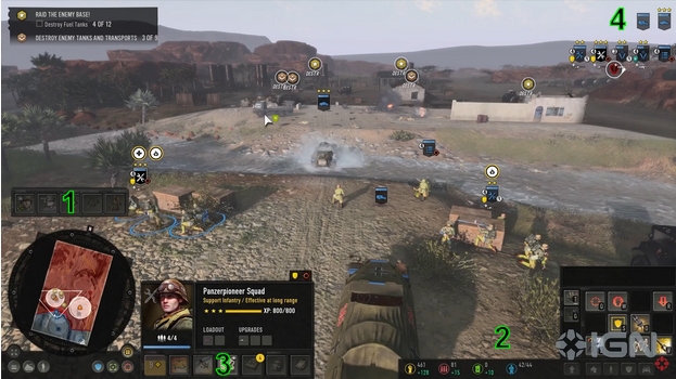
- I would move Call-ins(1) and Commander(3) above stats (2). Another option would be make Call-Ins vertical and move them to the left of the minimap.
- Units in upper right(4) need flipped. You will always have way more infantry then vehicles, so Inf should be on top of the screen out of your view. I also liked these being at the bottom near the minimap so you can select, see, and move units all within a small area. But I think that was an option correct?
- The selection detail pane (3) should be resized. The Portrait can remain the same size but the details should be about 60% of that height. And the upper right buttons should be on the left side. This would create an easy to see thru portal to the center of the screen.
Since I did not play it, I could be completely wrong of course


 United States


 Lion king
 Private Mok


 보드카 중대
  Heartless Jäger