Bayeux

Posts: 1467 | Subs: 4
Posts: 155

Posts: 1820 | Subs: 2
Posts: 479

Posts: 1820 | Subs: 2
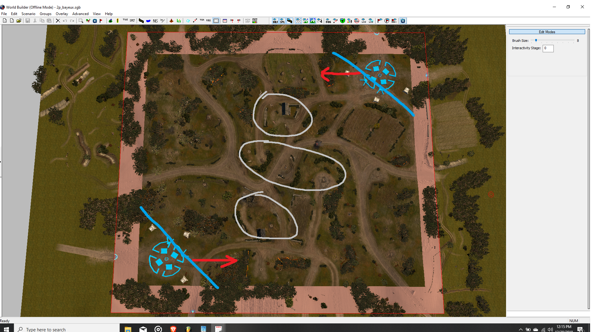
As seen with the blue stripes, cutting the maps corners to make the map feel smaller.
Grey circles would be the areas I would focus on mostly, specially the hedges and cover.
Feel free to draw your own thoughts on a fresh canvas HERE.


Posts: 1820 | Subs: 2
Biggest issue tends to be the houses on both sides of the map on each players cutoff for their closer fuel. I would say you can keep the building but maybe move the far fuel closer or at least reduce the number of windows so they are easier to clear for factions that don't have non-doc flamers. Houses could also just get removed in general and it would probably be fine.
Thanks for the feedback!
Posts: 773
Thanks for the feedback!
You need to do something about the NW VP as currently the only way to access it from south is either through a funnel or a huge diversion via mid. Why its there I will never know, same as the fuel for the northern spawn.
Too many gimmicks for the sake of trying to create obvious ambushes.
Posts: 999 | Subs: 1
My initial plan right now, is to make the map feel smaller as this seems to be the biggest problem for now. I drew a plan, to bring bases more closer to each other as seen by the red arrows. In theory, units will take less time arriving to the battlefield and shorter retreat times.
i think the reduction in size and inter-base distance will greatly improve the overall playability of the map. however, what do you think about moving the bases closer together in the vertical instead of the horizontal direction? not sure if i'm alone with this, but due to the way the position / default angle of the camera is set up i prefer maps that have spawns in the east/west over those with north/south layout (i hate to start in the north and am usually too lazy to rotate the camera 180°, which also messes up my orientation on the map).
Posts: 2159 | Subs: 2
Novgorod is basically North/South as well and a 1v1, but I have not heard anything at all about the camera angle. Maybe I should change that as well

Generically my thoughts are North/South gives the widest view of the front line. And many players rotate to this view. So setting it up North/South means they only have to rotate the camera 50% of the time. However, on 16:9 and 21:9 ratio monitors (most everyone uses these ratios) you have a hard time seeing long range units since they can fire further than you can see.
So I now favor about a 45 degree view. This is the best balance between width of front line and the depth required to see long range weapons.
Posts: 2159 | Subs: 2


Posts: 1820 | Subs: 2

Posts: 2159 | Subs: 2

Posts: 2159 | Subs: 2
SCENARIO -> CAMERA PROPERTIES

Posts: 1820 | Subs: 2
I would offer some suggestions but, apparently, I have no idea what 1v1 players like. If you convert it to a 4v4 maybe I can offer some ideas
What does it supposed to mean? Someone told you this to keep away from 1v1 perspective?
One idea: Since the layout is done already, you could just move the bases closer to each other and then change the default camera angle in the worldbuilder.
SCENARIO -> CAMERA PROPERTIES
Good tip! thanks for that.

Posts: 2159 | Subs: 2
What does it supposed to mean?
No one likes any maps or map changes I have made in the 1v1 pool. But somehow the two 4v4 maps we made were the most popular maps being played when they came out. With the addition of Nordwind and time for the maps to become boring, they may not be the most popular anymore. Time will tell.
Side note: I have a 2v2 map I was looking at, since we need 2v2 maps badly. But with the response I am getting from the 1v1 pool, I think I will scrap it. No more 1v1 or 2v2 maps from me. I feel it would also be about the size and play style to Einhoven. Which to me is one of the best 2v2 maps. But I dont see Einhoven getting a million plays either. So clearly, I dont know what 1v1 or 2v2 players want. More Kharkov and Rails for them I guess

I have reworked Novgorod Outskirts quite a bit. Fixed some things that may have been more annoying than technical. So if Novgorod gets a better response, I may rethink the 2v2 map. But Novgorod is a winter map, so probably not.

Posts: 1820 | Subs: 2
My friend, think of it as this. I created for the reason of creating something, the joy of it, excitement, sense of an accomplishment. Over the years I've learnt to filter out the helpers from the talkers. Don't pay much attention to people who just don't like it. As Bayeux has clearly shown, some people just don't like it, may it be the size, cover, buildings, first game loss on it etc. So I hope you make your projects come to light. Keep creating man and have fun while doing it.

Eindhoven was a map I made for vcoh like 10 years ago. I kinda just copy pasted it to coh2 worldbuilder and did some tweaks there. I don't remember signing up for a mapping competition with it, it was picked from the workshop I believe. So I just got lucky that it got picked and people liked It I guess. 10 years ago, the chances of someones map getting into a game was basically slim to none, so I kinda created maps for myself and my clan(WmD). Original map was created with 1v1 in mind, it was deemed too big for 1v1. Coincidence? hah. Maybe I should make Bayeux a 2v2 map. I feel today there's this pressure on map makers - backlash can be sad and funny at the same time. But #believe! listen to the right criticism and you just might make the next best thing, be it from 1v1 to 4v4.

Posts: 2159 | Subs: 2


I love mapping and will always do it. But a lot of what I try to do here is figure out what people want in a map.
Right now we have a bunch of people making maps that do not have years of experience making maps. When the map is done they will find out if they "got lucky" and made a map the players want or not. My goal is to figure out what players want now, so these maps are started on the right path. So I am constantly looking at maps and trying to create some sort of metric to measure their success with. Distance between bases, distance to major points, width of map, size of engagement areas, etc.
Many of the complaints we get are for things that other popular maps do. If you put a house near a vital point people will freak out. Yet many maps in rotation have houses on vital points. No one complains. Faymonville for example has a house on every fuel and VP. The VPs are even large full health stone houses!!! No one cares. Top played map and is used in tournaments.
And from the limited feedback we get from top players etc, figuring out what they like/want is impossible. So it is a waste of time to even try to make a good 1v1 map. All we can do is guess. Or adjust to the small vocal minority that complain, which may ruin the map for the ones who do not complain.
Each player has their own wants. Some want a small fast map, some want a large map. Some want it open so units can move and flank, some want it closed off and lane based. So I look to the most played maps. Crossroads is good sized map and is open enough to let players move and flank. Kholodny is almost a lane based map. Moving side to side is almost impossible. The map is also huge. These are two completely different maps, yet both get a lot of plays.
Another thing is what SiphonX stats show. Right now we do not have data for map plays by rank. So adjusting a map to purely play numbers means we could be adjusting it for low rank players and ruining it for top rank players.
The only people who can make a good map into a perfect map are players. But they do not seem to care or maybe do not even understand why they like the map. So we will continue to crank out random maps and pray they are liked.

Posts: 1820 | Subs: 2
John Lydgate:“You can please some of the people all of the time, you can please all of the people some of the time, but you can’t please all of the people all of the time”.”
Your commitment is there, all the power to you! Just don't let others opinions hold you back on what you would like to create. If you ever need any help, reach out to me on steam!


Posts: 55
My problem with the map is the top side rather than the bottom:
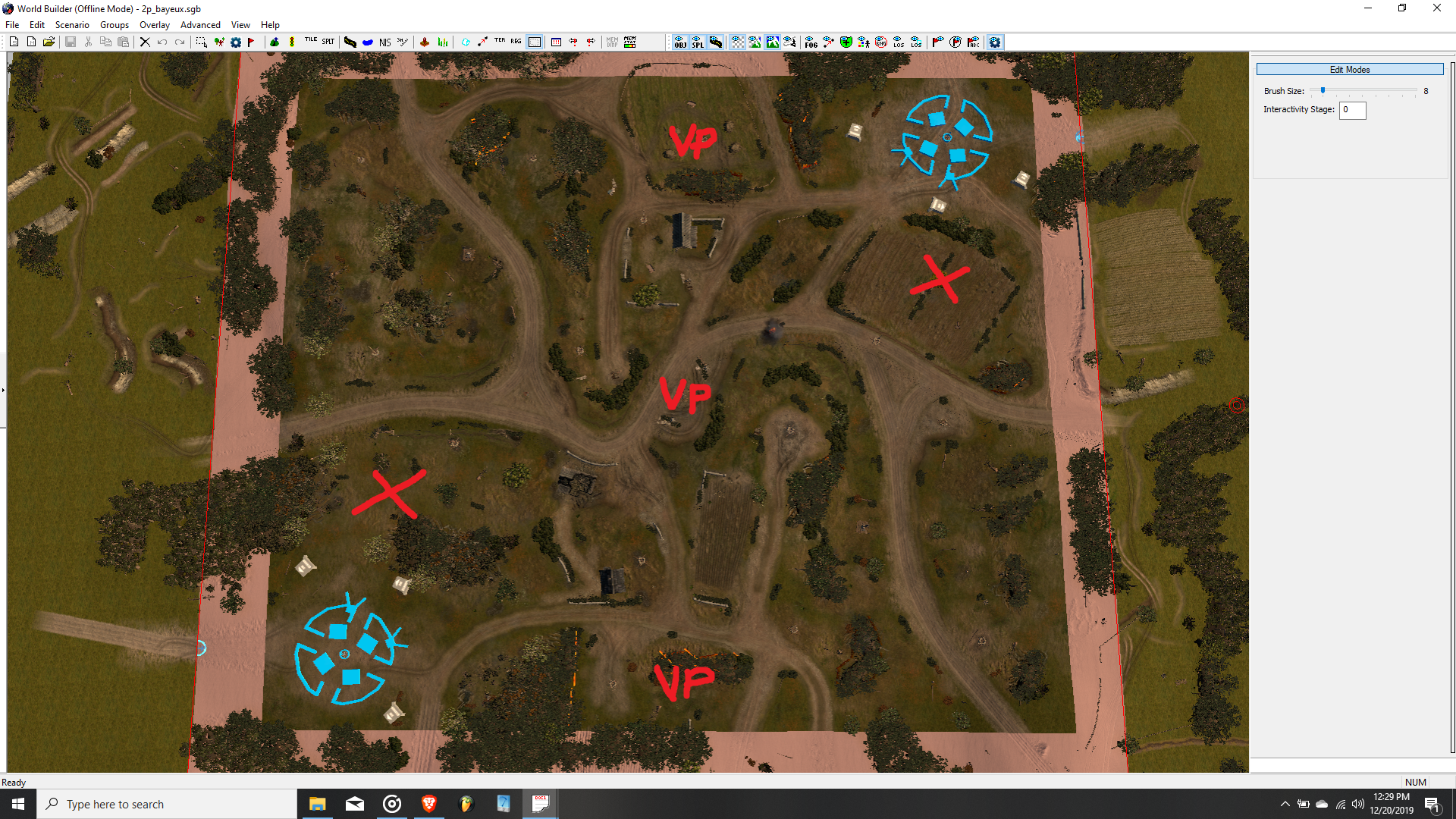
1-Currently the fields (the ones I circled with black) on the top serves no other purpose other than adding extra walking time for top side's units. The one on the right side doesn't even have a resource point and even though the one on the left has one, it's as uncontested as much as far left and far right resource points. Eliminating these useless parts of the map or somewhat making them valuable should be the first thing to do IMO.
2-The second problem is how easy for the bottom side to flank defences of top side in the middle VP. Now, this wouldn't have been a problem if it was as equally as easy to flank bottom side's defences as well. But this isn't the case. Open field and lack of cover (for the attacking side) on the part I circled with red makes that part really easy-to-defend but very difficult to attack. So, either making the top side as easy-to-defend as the bottom side or making the bottom side difficult to defend by shortening the distance between sight blockers (of the attacking side) and green cover (of the defending side) would be a good solution.
The last one isn't a problem but a question, what's the point of that sight blocker in the green circle? Maybe it's a measure against MG nests on the cut-off house? If that's the reason, I think it doesn't help at all. If anything, it makes pathing a nightmare when I want to retreat with my tanks from middle VP.
Livestreams
 |
|
|
24 | ||
 |
|
|
16 | ||
 |
|
|
6 |
Ladders Top 10
-
#Steam AliasWL%Streak
- 1.43163.872+9
- 2.59382.879+7
- 3.800454.638-1
- 4.13044.747+4
- 5.313114.733+9
- 6.370253.594+6
- 7.284162.637+2
- 8.17951.778+2
- 9.17773.708+3
- 10.371284.566-1
Replay highlight
-
 cblanco ★
 -
 보드카 중대
-
 VonManteuffel
 -
 Heartless Jäger

Board Info
11 posts in the last week
73 posts in the last month
Welcome our newest member, Hjefflm
Most online: 2043 users on 29 Oct 2023, 01:04 AM


