'
- Red and Blue was win and has become iconic for Company of Heroes, why fuck with it?
Honestly I wouldn't say that it's iconic for CoH, look at Team Fortress 2 and Halo, and they're R&B
But I get your point. I wouldn't want any of my units to be camouflaged in the trees because they're green too.
Comparing the CoH2 ui with the vCoH ui, the VP bar looks better in the vCoH ui. It was really clear and that white huge font was screaming "cap the vp! cap the vp!" Now we have 2 bars and it's hard to decide which one to look at. (I'd rather keep the numbers, sometimes bars may look equal but in fact you're losing)
The timer there could be a really nice addition, but I fear that it's going to be distracting. I'm not sure why, but I feel it has something to do with concentrating on the action and not your bed-time (I know it's a stop-watch, but things like "omg its 1 hour" kinda kill the moment of the game seeming to last longer)
I actually like the ability icons for CoH2. With the hotkey there, it's much easier for my free left hand to select the ability while my right hand homes onto the target. I also like the change in style; new style, new place.
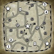
The minimap for CoH2 looks like a child drew it (ok, it may be a bit of an exaggeration). In vCoH it looks like a recon plane flew over it, took a picture, then commanders outlined the territory sectors. Speaking about sectors, the really huge ones in the CoH2 minimap look way too huge.
The commander abilities look awkward in CoH2, if they were unlocked CoHO-esque why not just put them where they were in CoH? For me, it looks "closer to home". But honestly I'll have to play with the abilities there first to say anything more.
About the ping buttons, is that the only one there? (Near mini-map, bottom right). I still wish there were 3 ping icons. It used to be a code, without having to type out what you really mean. Like Red: I'm artying here, stay clear. Yellow: Enemy spotted around here, and White: Move there please
I have mixed feelings about the resource bar. Since it freed up some space for the bridge (which feels much more comfortable for me when i visualize the text gone), it could work. And just how I read left to right, I read up to down too. And the Manpower-Munition-Fuel order is practically ingrained in me right now. So it could work. My other feelings is that too. I could make a quick comparison by just swiping my eyes towards the bars and I can easily see all of their values, one on top of the other. Here, I have to look across.
This is all I'll say now. Got stuff to do.


 cblanco ★
  보드카 중대
  VonManteuffel
  Heartless Jäger