Here are a few screenshots from Coh2 and Coh3. All pics are taken at 2k res and max texture setting.
COH2 ELST OUTSKIRTS 1
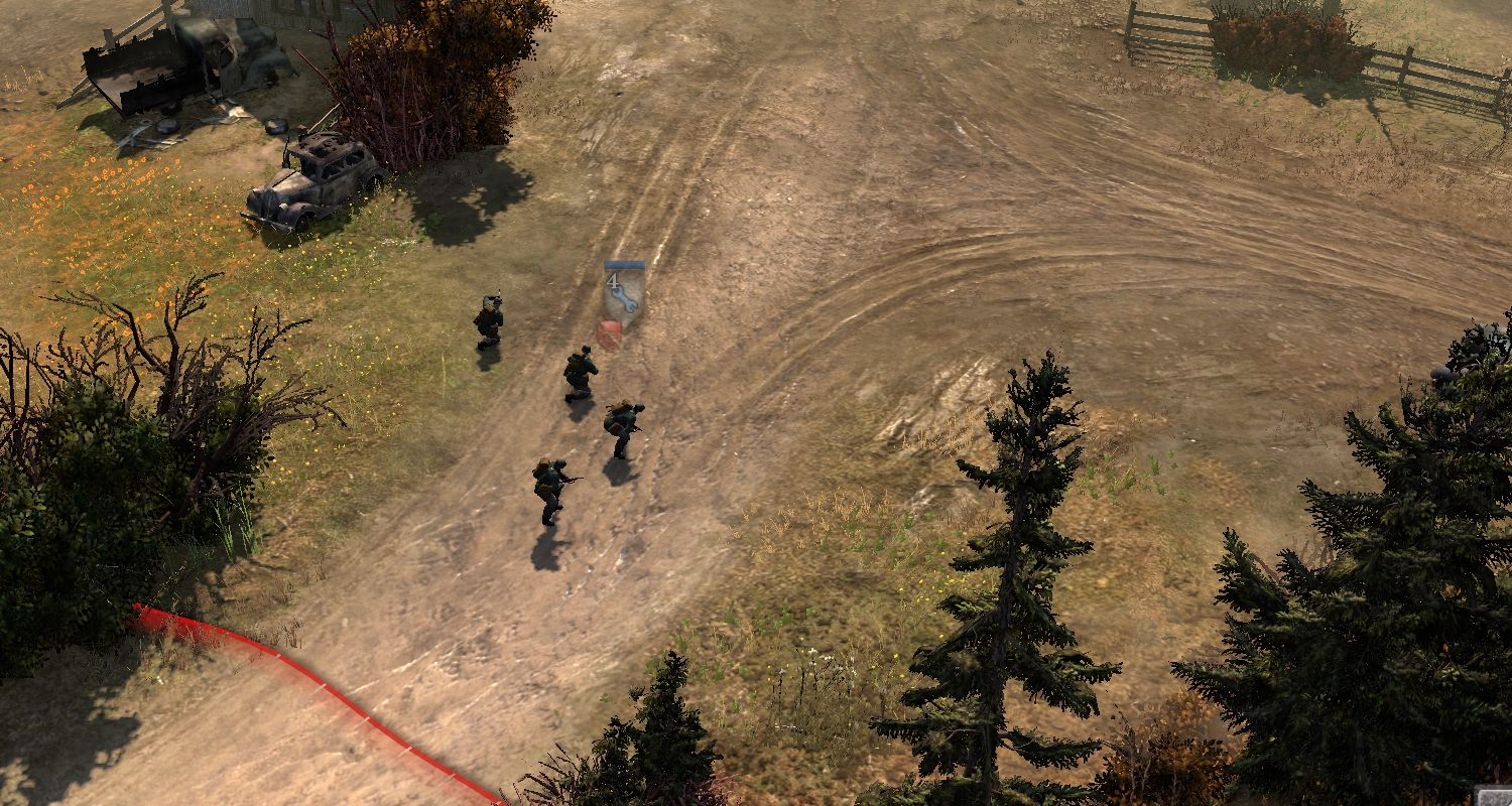
COH3 ELST OUTSKIRTS 1
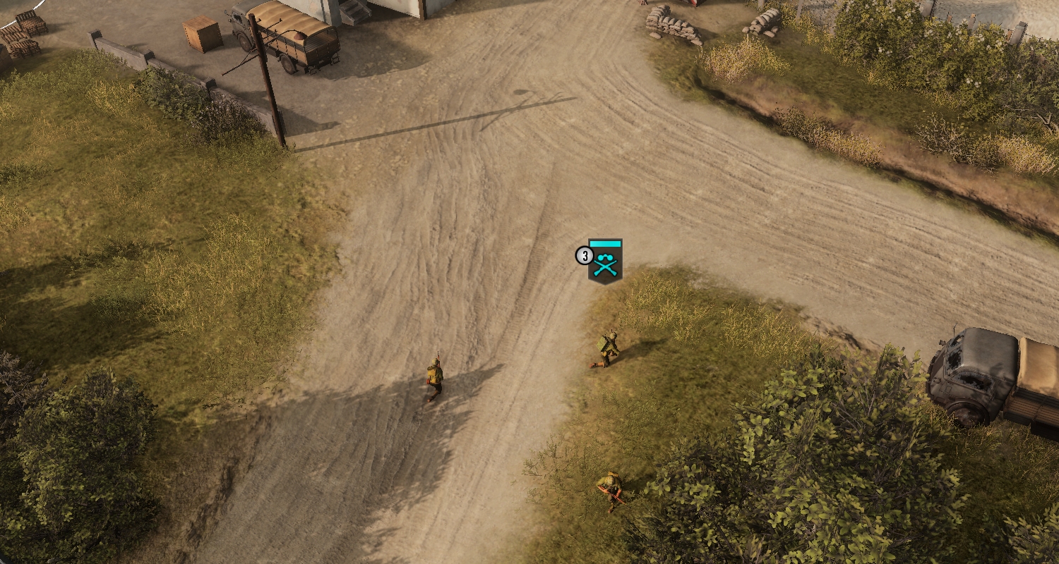
COH2 ELST OUTSKIRTS 2
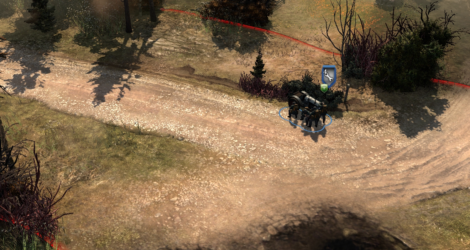
COH3 ELST OUTSKIRTS 2
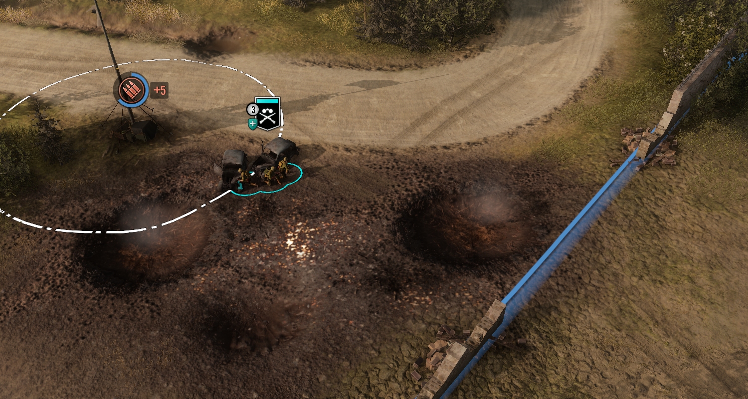
RESOLUTION COMPARISONS
TEXTURES
Coh2 textures are softer. They have a lower Texel/Meter value. Meaning there are less texture pixels per meter of terrain.
This makes the units standout more. They pop out of the picture more. Because their outlines are always crisp by nature. This crisp outline stands out against the blurry textures they are standing on.
Coh3s higher Tex/M means the ground is as sharp as the unit outlines. The camera also appears to be further out (or units are smaller) which also makes their outlines harder to pick out visually.
The stones on the Coh2 roads are blurry white patches. The stones south of the road in Coh3 are sharply rendered huge rocks.
SPECULAR LIGHTING
Coh2 textures use specular lighting. Coh3 barely uses it and you have to be directly facing the sun to see them. Coh2 metal objects appear more real. Their are glints of highlight on the tread paths on the road.
Coh3 has higher resolution and almost no specular lighting. Everything looks fake and made out of chalk.
In Elst Coh2 #2, the road and rocks are all being lit by the sun. They are brighter. Coh3s road has no specular light at all. It looks like a flatly lit diorama.
SUMMARY
- Units stand out better in Coh2 due to softer textures and lower camera.
- The Coh2 lower res textures tell your brain you are far away and cant see much detail. Coh3s sharp textures tell your brain you are right on top of this thing and can see all of its detail.
- The smaller Coh3 models on top of the detailed terrain tell your brain, these units are very small. Because they are small but I can see detail in the ground. Your brain sees this disparity and calcs that the units are about the size of a rabbit.
- The lack of specular lighting in Coh3, tells your brain this is not real. These textures do not interact with the lights of the world.
OPINIONS
Coh3 looks amazing. If they added specular lighting it would be fantastic. The added detail is much more realistic. Some map textures could be retouched to reduce their size/detail, especially road splines.
I see reviews all the time where people are complaining the camera is too zoomed in. The camera is actually further out in Coh3 than Coh2. But the texture detail and model sizes are tricking peoples brains into thinking it is more zoomed in. We should also assume a lot of players want Steel Division level of zoom outs, so their complaints are legit.
People say "This is a mobile game!". Again the disparity in texture detail to model size throws off the realism. The lack of specular lighting also makes the game look flat and not real.
Coh2 - Coh3 Graphics Comparison
14 May 2024, 22:27 PM
#1
Posts: 2145 | Subs: 2
15 May 2024, 01:52 AM
#2
Posts: 1379
Looking at the comparison, the shadows in coh 3 are soo faint.
15 May 2024, 03:02 AM
#3
Posts: 2145 | Subs: 2
The shadow darkness is a setting in the Worldbuilder.
On cloudy or high humidity days the light gets diffused and the ambient light goes up. So shadows are lighter because light is reflected/refracted and going around the shadow casters.
That is one of the things Relic did that I dont know much about or see any difference. They added a lot more light modeling code/settings. Strange to spend so much time on lighting and then disregard Specular, which is way more important.
vCoh and Coh2 also have settings to make the textures look wet. This does not exist in Coh3. The settings are there, but they do nothing. That is the stuff that makes me sad for Coh3. Will this little stuff ever get added? Maybe. Maybe not. But we got a skin store and leaver penalties.
15 May 2024, 20:32 PM
#4
Posts: 3145 | Subs: 2
This makes me beg the question if such a comparison can also be done with the original CoH.
It'd be interesting to see the color difference between the 3 because I definitely feel like the first is way darker and realistic, to me at least.
16 May 2024, 10:28 AM
#5
Posts: 3114 | Subs: 2
As Rosbone said, I think the lighting settings are different in both versions of the map. CoH3 has more cloudy/overcast setting, whereas Elst in CoH2 appears to be a sunny summer day. Maybe a shadow comparison with a sunny map on CoH3 would have been better. Also, the sun has changed its position between CoH2 and CoH3 Elst. Just to be totally correct, the camera angle towards the sun should be roughly similar, because it will affect reflections.
This doesn't change Rosbone's conclusion though. CoH3 looks a bit flat overall, and in my layman's opinion lighting seems to be a major issue. The texture and model quality is pretty nice overall.
The main problem that CoH3 has is that CoH2, with all its faults in gameplay and design, is actually an absolutely astonishing game in terms of aesthetics and feel. Matching this level of quality is hard for any game, so CoH3 now gets criticized for not being picture perfect, while overall still being solid.
16 May 2024, 16:58 PM
#6
Posts: 224
That's the real problem - aesthetics is so much more than just how something looks, or visual fidelity, graphics quality, etcetera. With enough time anyone can make an ultra high-resolution model of something with a ton of detail, but if that model is shown in poor lighting with glitchy animations and so on, it's going to look worse than something comparatively lower in quality in a more artistically-unified environment.
The overall feel of a game can get you to overlook areas where the developers have economized. I never noticed the tanks did not have round wheels in Company of Heroes 2 until someone mentioned it here - tiny details become less relevant when they add up to an overall good-quality whole. It is always the sum of the parts as opposed to the individual parts themselves, and that is why I still really don't like Company of Heroes 3. The individual parts might be good, or even better in some respects than Company of Heroes 2, but it doesn't add up to a unified whole that I find to be worth playing.
PAGES (1)
1 user is browsing this thread:
1 guest
Livestreams
7 | |||||
842 | |||||
17 | |||||
6 | |||||
6 |
Ladders Top 10
-
#Steam AliasWL%Streak
- 1.831222.789+37
- 2.595215.735+10
- 3.34957.860+14
- 4.1101614.642+2
- 5.305114.728+1
- 6.916405.693-2
- 7.273108.717+24
- 8.721440.621+3
- 9.1041674.607-2
- 10.17146.788+1
Replay highlight
VS
- cblanco ★
- 보드카 중대
- VonManteuffel
- Heartless Jäger
Einhoven Country
Honor it
9
Download
1233
Board Info
526 users are online:
526 guests
0 post in the last 24h
8 posts in the last week
37 posts in the last month
8 posts in the last week
37 posts in the last month
Registered members: 49092
Welcome our newest member, dreilandechode
Most online: 2043 users on 29 Oct 2023, 01:04 AM
Welcome our newest member, dreilandechode
Most online: 2043 users on 29 Oct 2023, 01:04 AM