Login

russian armor

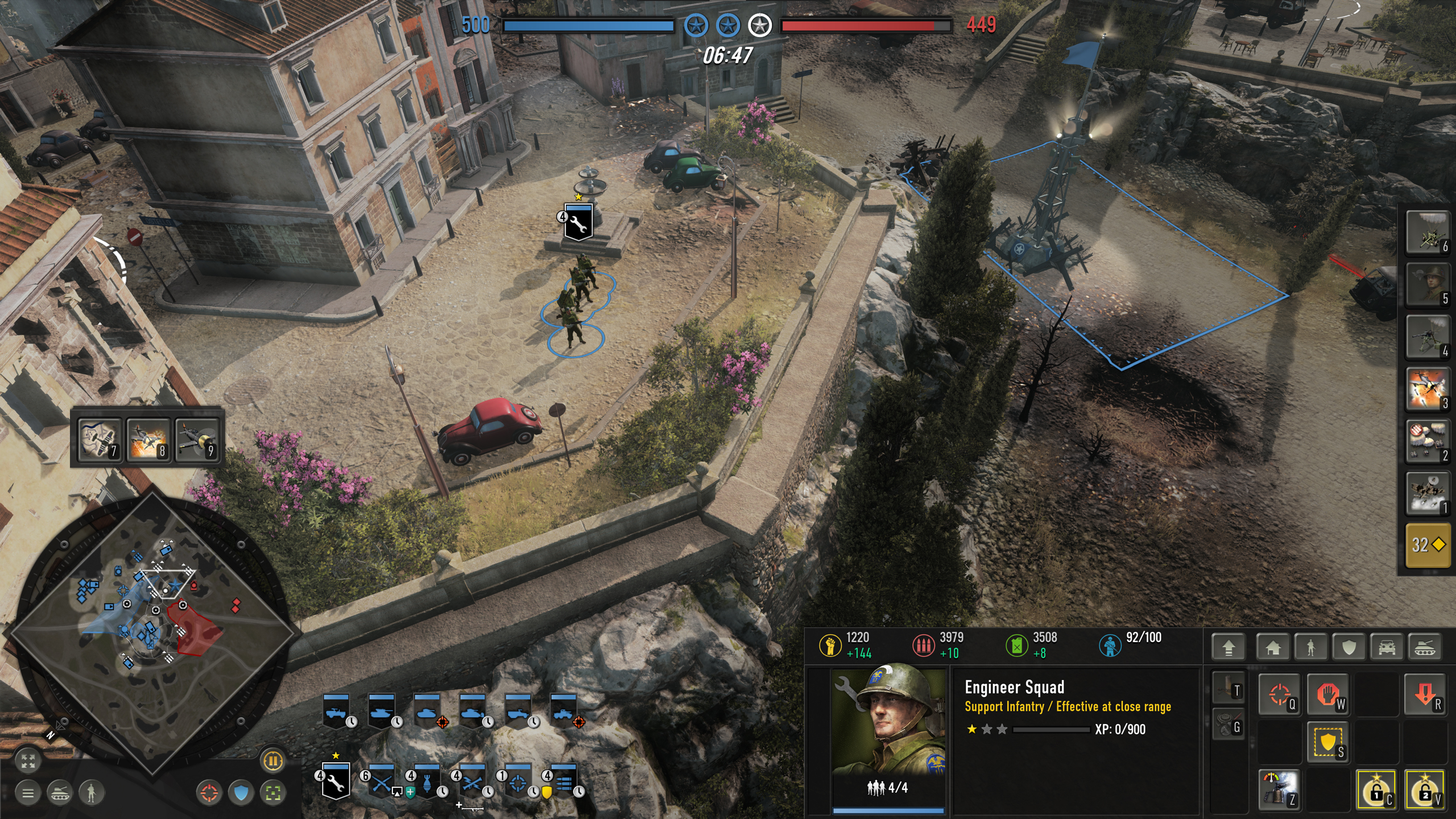
First look of the new UI

27 Sep 2022, 20:40 PM
#21
avatar of SturmtigerCobra
Patrion 310

Posts: 964 | Subs: 11

Sorry to say but Relic staff needs to be purged and have the COH license given to a more competent studio.

Relic & SEGA management is either corrupt or naive fools. Here is the proof by following the money;

Relic and other ESG studios are not profitable without outside investments.
In the Austrian business cycle this is called malinvestment, leading to stock market bubbles such as dot-com bubble.
https://en.wikipedia.org/wiki/Malinvestment

As this ESG stock market bubble crashes (a feel-good scam), many studios will go down with the sinking ship.

Watch this Joe Rogan interview with Adam Curry. Watch from 6:40 as he explains how ESG scores and malinvestment increase shareholder value.


On a positive side of things. Some western billionaires push back against the ESG scam most notably Elon Musk and Vivek Ramaswamy's Strive Asset Management (which include billionaires Peter Thiel & Bill Ackman)

Why ESG Is the Biggest Scam of the 21st Century | Vivek Ramaswamy;


https://www.forbes.com/sites/bobeccles/2022/08/26/drilling-into-drlls-top-10-holdings-a-woke-analysis/
On August 10, 2022, Strive Asset Management launched “Strive U.S. Energy ETF” (DRLL). Just two weeks later on August 24 it already an impressive $268.45 million in assets under management. Strive was founded by the now well-known and ever visible anti-ESG/anti-Woke Mr. Vivek Ramaswamy


Most of the predatory corruption in both US and China is coming from the corporate world. This is "We The Corporation" and military-industrial complex.

If WW3 goes kinetic it'll not be country vs country. It'll be "We The Corporation"/military-industrial complex vs everyone else. US + China is ground zero as they are both fighting the same enemy that has hijacked the country from within.
28 Sep 2022, 02:26 AM
#22
avatar of nigo
Senior Editor Badge

Posts: 2238 | Subs: 15

6 Oct 2022, 00:15 AM
#23
avatar of pigsoup
Patrion 14

Posts: 4301 | Subs: 2

Too floaty, too many edges. I would prefer CoH 1 and 2's method of having almost everything at the bottom of the screen.
7 Oct 2022, 21:01 PM
#24
7 Oct 2022, 21:22 PM
#25
avatar of ltaustinpowers

Posts: 69 | Subs: 1

Why is it so difficult for Relic to create a simplistic and useful UI. I spent 5 minutes in MS paint and provided a cleaner look and more screen space used for controlling units. I left the VP tickets as a super rough edit to show how much space their current bar is taking up.


There is still a ton of unused space in the tool bar that can be used for unit information, tool tips, or whatever else you want. You should also be able to change the transparency of the UI background and/or hotkeys/commander abilities.
8 Oct 2022, 05:13 AM
#26
avatar of Spanky
Senior Strategist Badge

Posts: 1820 | Subs: 2

I think the new version looks good. Unit icons being next to the Minimap is a proper workflow update. No more do I have to scroll from one corner to the other, to give orders on the minimap. Super nice.
8 Oct 2022, 06:31 AM
#27
avatar of PatFenis

Posts: 240

Why is it so difficult for Relic to create a simplistic and useful UI. I spent 5 minutes in MS paint and provided a cleaner look and more screen space used for controlling units. I left the VP tickets as a super rough edit to show how much space their current bar is taking up.


There is still a ton of unused space in the tool bar that can be used for unit information, tool tips, or whatever else you want. You should also be able to change the transparency of the UI background and/or hotkeys/commander abilities.


I like this alot, good job!
8 Oct 2022, 06:40 AM
#28
avatar of PatFenis

Posts: 240


What immediatly came to my mind was the weird use of screen space. Lots is wasted on the bottom right. For some reason the pop cap looks odd to me, got no reason for that. And the abilities slapped over the minimap look out of place imo.

Edit: also left to the unit portrait, there is just an empty bar for no apparent reason. I wonder what the idea with that is
8 Oct 2022, 12:51 PM
#29
avatar of Gdot

Posts: 1166 | Subs: 1

Getting there for sure.

Would like to thank Relic for taking the time to revisit these items, listening to the community and putting in the effort to make sure the release is as good as can be.
8 Oct 2022, 17:04 PM
#30
avatar of Mithiriath
Director of Social Media Badge

Posts: 830 | Subs: 3

9 Oct 2022, 12:31 PM
#31
avatar of Rosbone

Posts: 2144 | Subs: 2

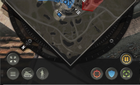
Does anyone know what these buttons by the minimap are?


Looks like:
- Full Screen minimap
- Settings Menu
- Idle Tank
- Idle Inf
- Attack here
- Defend Here

Then what are the other 2? Square with dot and Circle with pause bars.

Coh2's biggest issue when playing with mutli-lingual people is asking for recon. At a bare minimum we need Attack, Defend, and Recon. More ping options would be even better like WARNING you are being flanked or there is a blob here.

This is one of the things that would really help balance out arranged teams vs randoms.

It may get overwhelming if players are all pinging at the same time. So each ping should also have an option:
- Mute the sound for this ping.
- Dont show this ping.
- Show an abbreviated animation for this ping.
9 Oct 2022, 14:04 PM
#32
avatar of Mithiriath
Director of Social Media Badge

Posts: 830 | Subs: 3

I would say:
  • Tactical map;
  • Menu;
  • Next idle vehicle;
  • Next idle infantry;
  • Attack here;
  • Defend here;
  • Capture here? If it's like CoH 1;
  • Tactical pause;

It could be cool to also have an "indicator ping" who can stay on the map to indicate mine emplacement for example.
26 Oct 2022, 16:49 PM
#33
avatar of donofsandiego

Posts: 1379

snip


Incredibly based post, yet Doctor B.S. hasn't commented on it. For shame.
26 Oct 2022, 17:02 PM
#34
avatar of donofsandiego

Posts: 1379

Coh2's biggest issue when playing with mutli-lingual people is asking for recon. At a bare minimum we need Attack, Defend, and Recon. More ping options would be even better like WARNING you are being flanked or there is a blob here.


Men of War has had this sh!t for AGES. It is NOT that hard to have a button that you press for generic ping, then hold for a selection wheel of more in depth messages that are LOCALIZED. (I.E. "I'm on my way" "Enemies here!" and it shows up as the other players' native language on their screen).


It may get overwhelming if players are all pinging at the same time. So each ping should also have an option:
- Mute the sound for this ping.
- Dont show this ping.
- Show an abbreviated animation for this ping.


Agree. And pings should have a colored button/ number at the top so you know who made the ping. In addition you should be able to mute pings from specific other players. Maybe it defeats the point, but if you're the kind of dude that pings the fuel points when the game starts, I'd love to mute your pings because I know you're going to be trying to micromanage everyone.

It could be cool to also have an "indicator ping" who can stay on the map to indicate mine emplacement for example.


This would be awesome.
26 Oct 2022, 17:07 PM
#35
avatar of SkysTheLimit

Posts: 3423 | Subs: 1


It could be cool to also have an "indicator ping" who can stay on the map to indicate mine emplacement for example.

Hell yes to this. Would even be useful in 1v1, I have repeatedly pinged a spot for myself before just so I wouldn't forget where a teller was
1 user is browsing this thread: 1 guest

Ladders Top 10

  • #
    Steam Alias
    W
    L
    %
    Streak
Data provided by Relic Relic Entertainment

Replay highlight

VS
  • U.S. Forces flag cblanco ★
  • The British Forces flag 보드카 중대
  • Oberkommando West flag VonManteuffel
  • Ostheer flag Heartless Jäger
uploaded by XXxxHeartlessxxXX

Board Info

718 users are online: 718 guests
1 post in the last 24h
7 posts in the last week
39 posts in the last month
Registered members: 49062
Welcome our newest member, Mclatc16
Most online: 2043 users on 29 Oct 2023, 01:04 AM