snip
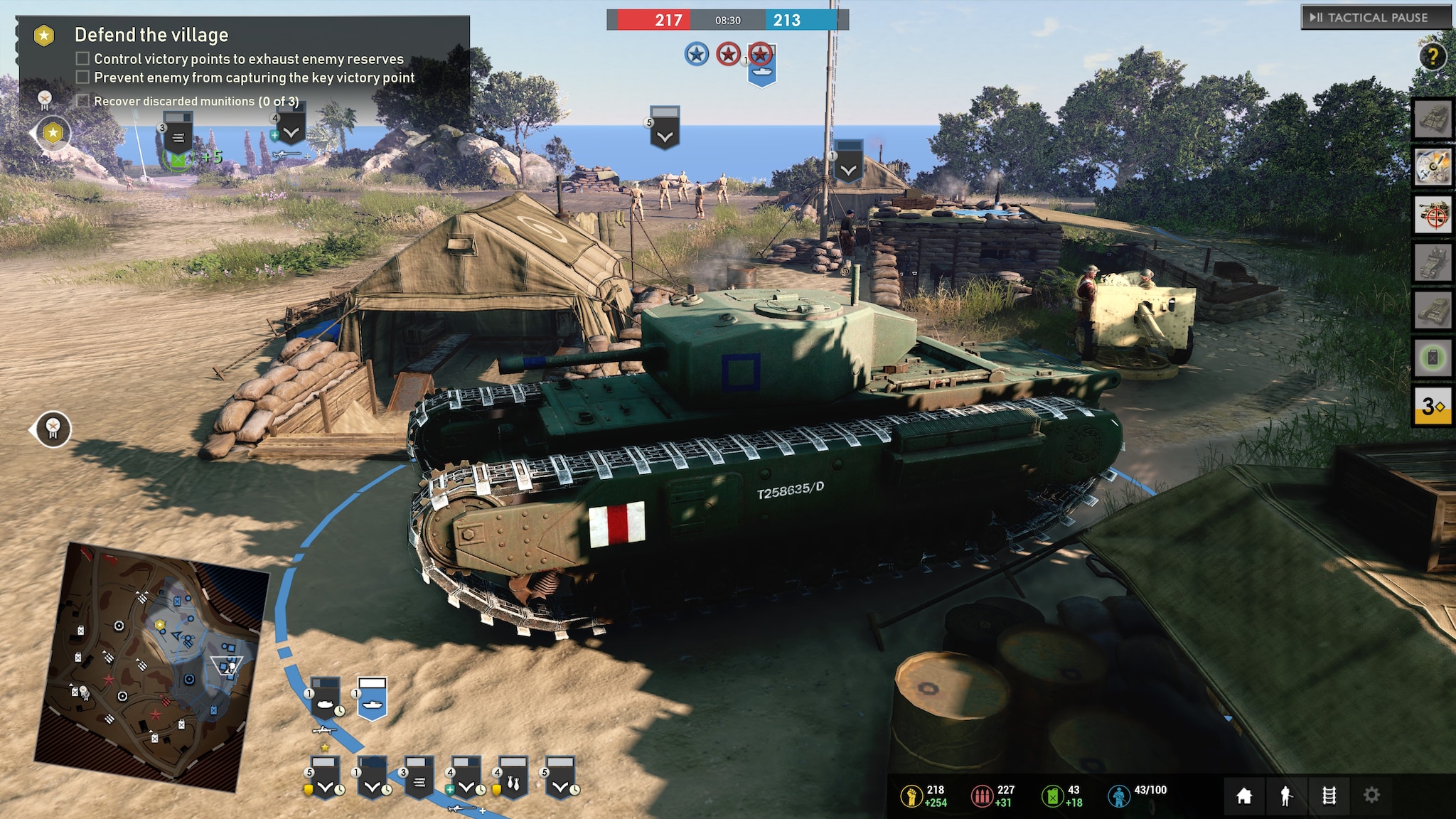
Couldn't play the pre-alpha yet, but judging by the UI of your screenshot I find this atmospherically bad too.
The UI looks like modern computer productivity programs: clean, sleek, orderly - and sterile.
Yes, I can see most of the information I want, but not in a pleasant way. Just look at the CoH2 UI: Gritty metal plates that have been nailed together. The top right menu are buttons that I can press to request units and abilities. So are the commander abilities. VP bars have a Somewhat similar function. Unit symbols are not great, but at least to me they look a bit like shoulder patches or so with the slight grey. It feels like I'm the commander in the HQ watching using some machine to give orders or maybe even sitting in a command vehicle while the reports come in. At least these are my associations.
CoH3? Colorful VP bars that are super generic they could be the health bar in a FPS. The whole top bar looks like it was thrown together in 5 minutes without any style. The abilities to the right also look very "flat". The current task looks like the info panel in basically every other modern game. Bottom resource bar is the same as well: Just dull.
Yes, the UI gives all the information you need. At the same time it does not set any tone, any feeling, any atmosphere. It is as sterile as it can get.
I am the kind of person that would always go for functionality over design, but there is no reason to eradicate any design and go for the most basic option possible. I also don't like that the right border of the window is used for UI either. Why space out all the information over the whole display? It could be all at the same spot, so if I need all basic information, I just look there and not at 3/4 different points. The commander abilities should be on the bottom too. If I want to target them to a specific spot, a horizontal alignment guarantees the overall shortest route to clicking the button and then clicking on the map, potentially even the mini map.
To end on a good note: It is good that finally the unit symbols are next to the mini map. This makes the most sense: Click on a unit and see it highlighted on the map without needing to traverse your eyes across the whole screen.
These are small things, but they do make the UI better. But since it is an alpha, I hope they still work heavily on the UI. I'd really prefer a more atmospheric one.


 cblanco ★
  보드카 중대
  VonManteuffel
  Heartless Jäger