Alliance of Defiance

Posts: 1138 | Subs: 2

Posts: 1138 | Subs: 2
Now, the map generally looks great, placement of details, objects, splats and everything is awesome, several leagues ahead of what I could pull off.
However, what sticks out for me negatively every time I see match played on that map is that - in particular in the center - there are several rounded or even circular features that simply don't look like anything that would exist in the real world. Ever. Always breaks the immersion for me.
Examples:
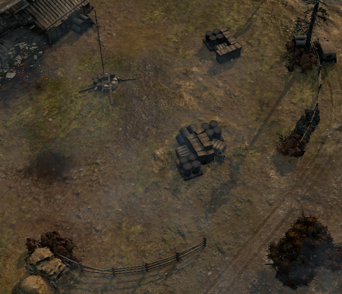
Why are the fences round? Nobody would build them like this...
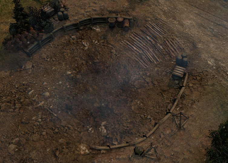
And then there are several of these things on the map. What are those? I figure defensive works of some sort? Why are those round? I get slit trenches, but why would you build something round like this? If they are defensive positions of some sort, I figure the sides with the timber is supposed to be the side that you take cover behind and fire from. However, several of those timbered walls face trees/obstacles/something, so...
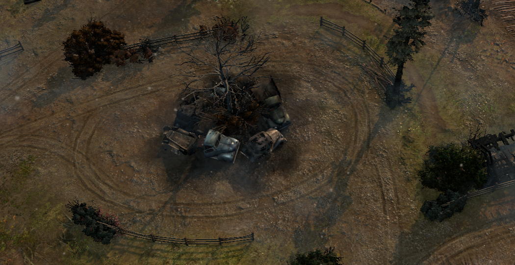
How would this be a thing? So, there is a tree in the middle of nowhere that for some reason the local farmboys like to drive around in circles at times? And this seems to be regular thing, the farmers around that place even built their fences elliptically (why?) around it?
If there would be one of these, ok. But the center of the map is packed with these circly thingies. Is this an hommage to crop circles or something?

Again, overall great and popular map, and nobody cares but me, so whatever...
Posts: 2458 | Subs: 1
I think the map is getting reworked currently so some more feedback would be good. I already gave whiteflash my feednack via discord so not much sense in posting it here again.

 19
19 Posts: 1295 | Subs: 1
Alright, I guess I am the only one that has this issue, and it is not even about the gameplay aspects but rather the visuals.
Now, the map generally looks great, placement of details, objects, splats and everything is awesome, several leagues ahead of what I could pull off.
However, what sticks out for me negatively every time I see match played on that map is that - in particular in the center - there are several rounded or even circular features that simply don't look like anything that would exist in the real world. Ever. Always breaks the immersion for me.
Examples:
Why are the fences round? Nobody would build them like this...
And then there are several of these things on the map. What are those? I figure defensive works of some sort? Why are those round? I get slit trenches, but why would you build something round like this? If they are defensive positions of some sort, I figure the sides with the timber is supposed to be the side that you take cover behind and fire from. However, several of those timbered walls face trees/obstacles/something, so...
How would this be a thing? So, there is a tree in the middle of nowhere that for some reason the local farmboys like to drive around in circles at times? And this seems to be regular thing, the farmers around that place even built their fences elliptically (why?) around it?
If there would be one of these, ok. But the center of the map is packed with these circly thingies. Is this an hommage to crop circles or something?
Again, overall great and popular map, and nobody cares but me, so whatever...
Thanks for the feedback, most maps are squary so I decided to go roundy on this one
 no real rhyme or reason for it but your point is well taken and the feedback is appreciated
I don't think it's very popular. It is better than some 2v2 maps and that is the main reason it doesnt get vetoed for me but that isnt saying much considering the terrible state of the 2v2 map pool.
I think the map is getting reworked currently so some more feedback would be good. I already gave whiteflash my feednack via discord so not much sense in posting it here again.
I do appreciate the feedback blvckdream. And AOD has always been a popular map, as the data reflects.
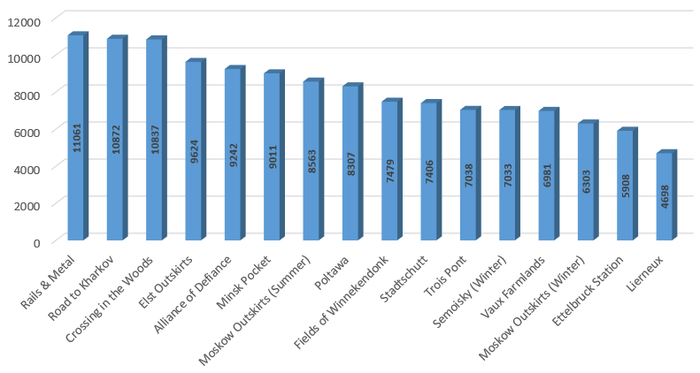
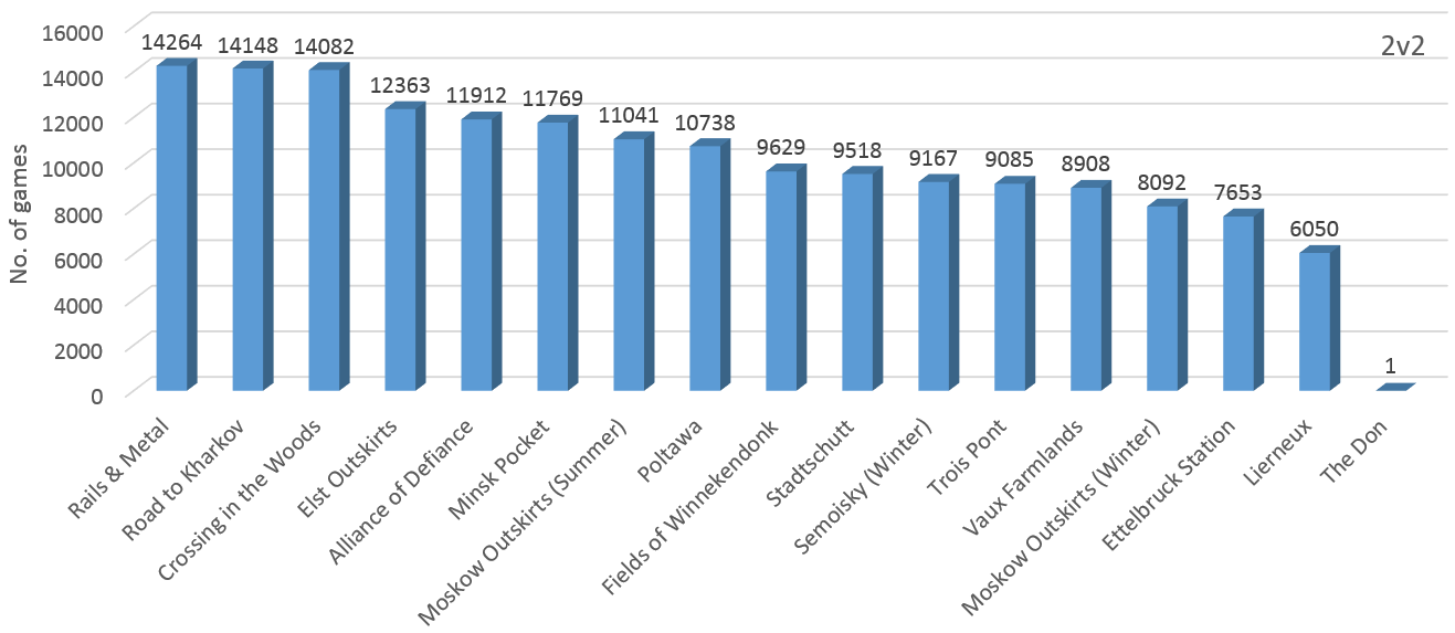
Also more changes coming as you mentioned based on very high level 2v2 players:
Link to the new version of the map here! feedback and replays are appreciated on this one!
https://steamcommunity.com/sharedfiles/filedetails/?id=1930412878
Posts: 2458 | Subs: 1
I do appreciate the feedback blvckdream. And AOD has always been a popular map, as the data reflects.
Road to Kharkov is the most played 2v2 map because people like narrow chokepoint maps that don't require much movement. Just look at all the popular custom maps in workshop. Yet anyone who likes to play coh2 as it is meant to be played (instead of playing towerdefence) dislikes the map.
Plus as I said, Alliance of Defiance is still one of the more playable 2v2 maps and thus not vetoed. Considering there are maps like Lierneux, Poltawa, Minsk, Rails and Metalls and Road to Kharkov in the map-pool there are just other maps that need to be vetoed instead.

 19
19 Posts: 1295 | Subs: 1
Posts: 306
please remove them, i dont think yellow cover should be such a nuisance
Posts: 323 | Subs: 1
what i hate about alliance of defiance is those goddam undestructable barrels (they blow up but the rest remains), they keep on blocking shots (isu shots basically evrything), and fuck up pathfinding
please remove them, i dont think yellow cover should be such a nuisance
this plus 100000000000000000000000000

 19
19 Posts: 1295 | Subs: 1
what i hate about alliance of defiance is those goddam undestructable barrels (they blow up but the rest remains), they keep on blocking shots (isu shots basically evrything), and fuck up pathfinding
please remove them, i dont think yellow cover should be such a nuisance
screenshot? if something is that bad i wana know!
always feel free to PM me w feedback guys if ya find something really broken

Posts: 2167 | Subs: 2

I always notice when a fence is made of several different types of fence. Something no one would ever do. But it looks way more real when you have a mixture of fence objects. Later I started to think that the different sections make it feel like it has been there for a long time and was patched or changed. So it feels older and therefore more real. But having a single stretch of fence looks fake??? Its weird.
Lets pray for more objects in COH3.
Posts: 306
screenshot? if something is that bad i wana know!
always feel free to PM me w feedback guys if ya find something really broken
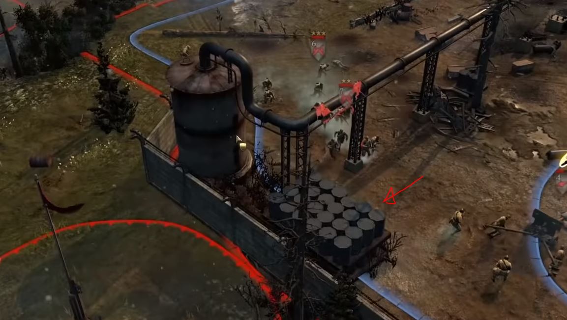
its basically all the barrels* in the first picture, it seems like they cant be destoyed completly, theres also one on the next to the wall of the house compound somewhere on the level of the mid vp
*the barrel models which you can see in the first picture, that are standing up, the vertical ones seem fine
Edit: Basically you can roam around with T70 in a KI match and shoot all those barrels and see which ones leave smth behind. Those block shots and are undestructable, just try out with barrels in the first picture of Syphon X

Posts: 1467 | Subs: 4
Only the rusted ones, and the ones without the wooden platform do not persists throughout the game.
There are plenty of objects like this.
Just like accoutrements (the artillery shells) actually deal damage when they explode.

Posts: 1138 | Subs: 2
It is what I always say about COH2 maps. If you make it like a real world it does not look real in game. It feels more real when it has things like a suitcase or a cast iron tub in the middle of a field
I always notice when a fence is made of several different types of fence. Something no one would ever do. But it looks way more real when you have a mixture of fence objects. Later I started to think that the different sections make it feel like it has been there for a long time and was patched or changed. So it feels older and therefore more real. But having a single stretch of fence looks fake??? Its weird.
Lets pray for more objects in COH3.
Not sure how that relates to my point... The fence lines do not look unreal because of the objects that they are made out of, but because of the shape of the line. Unless the farmer is some sort of crazy or an artist or both you will not find fences curved like that.
On your point: Well, fences just made out of the same object would look sterile. It would look fake because these fences are made by hand. A guy hammers a thick piece of wood into the ground, takes four big steps and then plunks down the next post. And ultimately, he will nail some more or less random pieces of wood to those somewhat irregular post or wire them up, depending on what type of fence is used. There will be a random element to that (that's for farmland where a fence is about what it does and not how it looks; in a park or formal garden you would expect fence to be more regular and sterile...).
So, yeah, having some type of random variations of the same type of fence in a fenceline will look more natural. But for this purpose, you typically have different objects for the same type of fence. If you don't have that, putting some random scrub here and there helps breaking up the otherwise regular fence.
Btw, I always find it surprisingly hard to make something look random

Putting random types of fences in the same line, however, would look stupid.

Posts: 2167 | Subs: 2
Not sure how that relates to my point...
I was trying to say that sometimes the stuff that makes no sense looks best. I was not disagreeing with your point. Just saying stuff like the tree with the vehicles around it seems not natural. But it feels natural/random/realistic.
As for the trench areas, they make a map look like a huge battle has taken place here and adds history. But having the trenches rotated would block pathing. Just a thought.
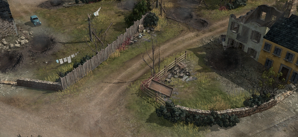
TROIS PONT
Here the fences dont make a lot of sense. But it looks correct or should I say natural. More real or organic.
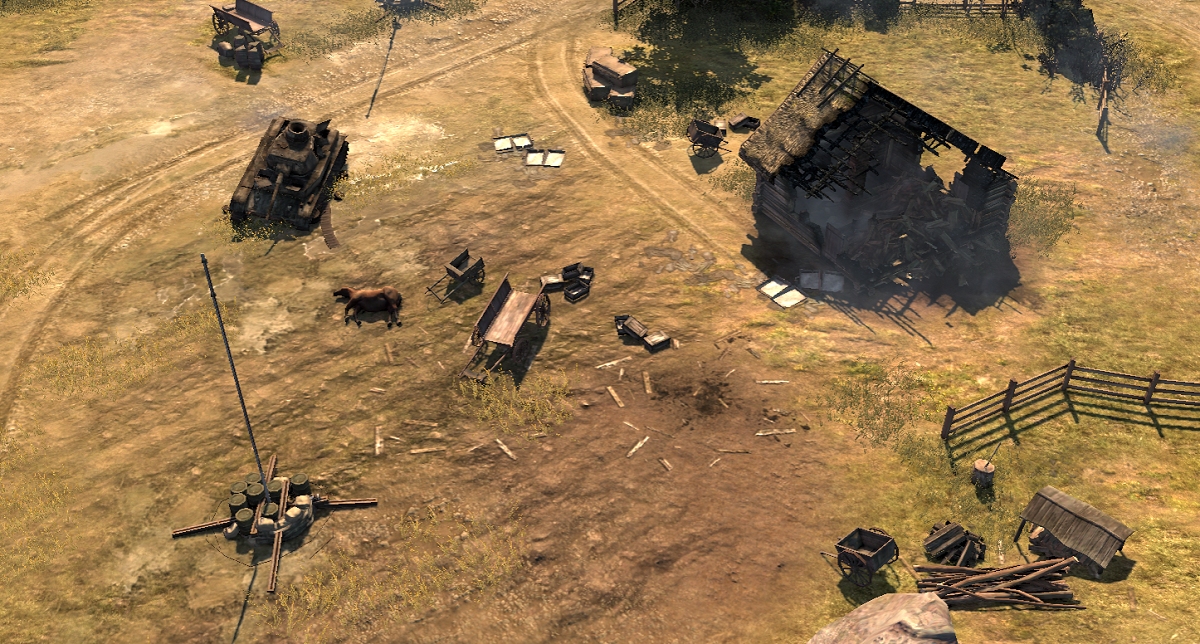
KHOLODNY
This area looks like someone just randomly made a palette of objects then forgot to place them where they should be. But somehow it looks realistic to a degree.
Posts: 129
That said I've noticed some collision problems? Near the top fuel pt has a lone car wreck feature that seems to be invulnerable and blocks shots 100%. I had a t70 shoot at a mg at about a screen away with that lone car wreck in between it. The car wreck even when destroyed blocked the t70 shot 100% over 10+ shots.

Posts: 1138 | Subs: 2
I was trying to say that sometimes the stuff that makes no sense looks best.
Ok, got you!
Just saying stuff like the tree with the vehicles around it seems not natural. But it feels natural/random/realistic.
Well, I'm not bothered by the tree and the cars. There might be some justification for somebody ditching some wracks there. Also, it is not sticking out much as everything is just dark grey/black. What get's to me are the elliptical tracks around it and the elliptical fences. To me, that does not look natural/random/realistic at all.
As for the trench areas, they make a map look like a huge battle has taken place here and adds history. But having the trenches rotated would block pathing. Just a thought.
Yeah, I realize that they should make it look like a battlefield. And of course the way they are laid out is supposed to lend itself to gameplay. But with the masses of circles to me they look artificial (not as in "man-made", but in "mapper made"
 )
)
TROIS PONT
Here the fences dont make a lot of sense. But it looks correct or should I say natural. More real or organic.
I wouldn't say they don't make sense. The wall/fence combination on the right probably would also look good if it would have been wall all the way. But you can totally justify it looking this way: There are two different houses on the left so it is likely that they belong to two different properties. So maybe one of the owners wanted stone and the other didn't or couldn't afford it.
And for the stone wall/wooden wall on the left: Again seems plausible. The low stone wall is likely supposed to be the front side of that property. The stone wall is there to make the house look good and was probably built when the house itself was built. The wooden wall on the right is purely functional and needed to be higher so the people on the street to the right can't observe what is happening in the garden. Also, the wall doesn't need to be representative as it is to the side and likely was built later on anyways.
KHOLODNY
This area looks like someone just randomly made a palette of objects then forgot to place them where they should be. But somehow it looks realistic to a degree.
Yeah, this is something that I'm also not too happy with. Especially Kholodny, but there are other ones in particular on the vanilla maps... Not sure what this is supposed to be. The arrangement of buildings and streets doesn't make it look like a functional village. And the area is cluttered with just random stuff and this makes it look like the people living there left like 20 years ago.
The specific scene you picked out is not too bad, though. Ok, so there is the small shed with the wood and the cart on the bottom right. Seems plausible that that is where this was stored. And then we have the two carts, the dead horse and a couple of boxes: Well, maybe the people living there wanted to pack up their stuff and flee, but obviously something hit the house, and the splat seems to indicate another explosion, so maybe either an air or artillery strike hit the carts, scattered the boxes loaded on the carts and killed the horse?
That said, all the clutter is basically background noise; sure, you can look at it in detail but it is not that eye-catching, UNLIKE THE MASSIVE CIRCLES on AoD

Ok, I guess I think to much about this stuff....

 19
19 Posts: 1295 | Subs: 1

Posts: 306
I adore the caliber and content of the discussion thus far
sarcasm spotted?
 are you gonna adress the barells?
 19
19 Posts: 1295 | Subs: 1
sarcasm spotted?are you gonna adress the barells?
100% genuine
 , will look into all
 19
19 Posts: 1295 | Subs: 1
its basically all the barrels* in the first picture, it seems like they cant be destoyed completly, theres also one on the next to the wall of the house compound somewhere on the level of the mid vp
*the barrel models which you can see in the first picture, that are standing up, the vertical ones seem fine
Edit: Basically you can roam around with T70 in a KI match and shoot all those barrels and see which ones leave smth behind. Those block shots and are undestructable, just try out with barrels in the first picture of Syphon X
These types of barrels cant be destroyed completely on the map, the small 4pack ones can be.

Livestreams
 |
|
|
37 | ||
 |
|
|
32 | ||
 |
|
|
8 | ||
 |
|
|
8 | ||
 |
|
|
20 | ||
 |
|
|
1 |
Ladders Top 10
-
#Steam AliasWL%Streak
- 1.816139.854+4
- 2.47069.872+5
- 3.902305.747+2
- 4.244100.709+1
- 5.408214.656+3
- 6.347136.718-1
- 7.371195.655+1
- 8.742449.623+3
- 9.403289.582+1
- 10.12857.692+8
Replay highlight
-
 cblanco ★
 -
 보드카 중대
-
 VonManteuffel
 -
 Heartless Jäger


