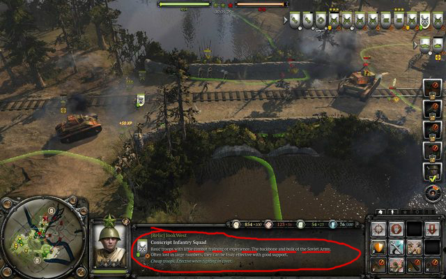
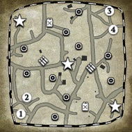
First look: Company of Heroes 2 in-game UI

Posts: 487 | Subs: 1
Posts: 246
Posts: 173
 15
15 Posts: 1708 | Subs: 2
The resource bar has changed slightly. Team unit markers are on as well it looks like.
They also mention they are making changes based on alpha feedback

Posts: 3293

Posts: 1620 | Subs: 2

Posts: 1679 | Subs: 5
The compact layout of the resource display in vCoH is much more user-friendly.
Posts: 486
Also the UI is way too cluttered for my taste. If there's a "show/hide unit status" and such toggle options then I'll be all OK with it.

Posts: 117
The resource display still sucks. It occupies too much horizontal space, you can't take in your entire resource situation at a single glance. Instead, you have to pan your eyes across a rather large area.
The compact layout of the resource display in vCoH is much more user-friendly.
Yes something is wrong with that resource display, not sure what
 .Also is there too much stuff on right side or is it just my late night feeling ^^
Posts: 119
The colors doesn't contrast as much either which makes it hard to make out quickly. In CoH it's red, yellow and dark brown with a grey/black background making it stick out a lot. Here the colors are all light making it look grainy and hard to see.
+1
The colors are horrible for someone as colorblind as me. Couldn't read or write about it in the alpha forums (no access yet). The vCoH colors were perfect (as seen in my avatar). I hope they offer different colors, or at least a colorblind-friendly mode.
The unit shields in the top right corner are a great addition for me, I always forget my idle units.

 5
5 Posts: 16697 | Subs: 12

Dunno why a sentence describing the unit (that you will probably only read once) has to run across the entire width of the middle UI box. I'd much rather have it boxed in, with some kind of blank box remaining (like in COH) where a streamer could put their webcam or a sponsor overlay. It will look bad if overlays will have to crop these sentences in half.
Posts: 119
It will look bad if overlays will have to crop these sentences in half.
Can't you just fill the entire box with an overlay?
I doubt they will add a compact-UI, classic-UI or stream-friendly-UI. We can hope though.

Posts: 82
Posts: 119
I don't like how they got rid of the unit kill count broken down by type, though - it's helpful to be able to tell whether the M8 or the Rifleman squad killed the enemy motorcycle, for instance, and when you just have a number for your kill counter, you can't find that out.
They said that the unit portrait gets mouse roll overs, so maybe the kill count can be expanded to see a more detailed break down.
 5
5 Posts: 25
+1
The colors are horrible for someone as colorblind as me. Couldn't read or write about it in the alpha forums (no access yet). The vCoH colors were perfect (as seen in my avatar). I hope they offer different colors, or at least a colorblind-friendly mode.
The unit shields in the top right corner are a great addition for me, I always forget my idle units.
+1
I posted this link also on the main companyofheroes forum as well. I totally agree with the colors. I am colorblind to RED/GREEN combination. It's actually quite common in males up to 10% of the population. However with RED/BLUE, practically no one has this problem! Why alienate up to 10% of the player base? Just go back to the COH1 colors RED/BLUE. Please Relic!
Here are the stats on color deficiency.
http://www.colour-blindness.com/general/prevalence/
Posts: 55
Yes something is wrong with that resource display, not sure what
I remember i had some confusion with resources in alpha too. Colours are too pale, that's one thing. It's also too clumped up, symbols have same lenght to left and right number. It needs some separation. Best thing would be put it like in original, vertically right to the mini-map though. This wall of text so pointless. Unavailable commander abilities are hard to read also. Damage engine marker or whatever it is, is strange. No idea what's red dot between cover and retreat marker on enemy's infantry ( for the fatherland or other doctrinal bonus? ). Whatever it is, it's so small. Icon on top of tank just saying it's tank lol. Russian sniper has g43 symbol, t70 has medium tank symbol, propably sherman. Sneaky relic thought no one will find out.

 9
9 Posts: 2072 | Subs: 1
Posts: 11
I hope there's a way to see how many kills each unit has. Also, I think having a "bio" for each unit is kind of silly.
There is, there's a counter in the upper right corner of a unit portait.
@Wifidi
There is an "attack here" button near the lower right corner of the minimap, so I guess that's something

Posts: 55
 15
15 Posts: 1708 | Subs: 2
Livestreams
 |
|
|
30 | ||
 |
|
|
17 | ||
 |
|
|
9 | ||
 |
|
|
6 | ||
 |
|
|
2 | ||
 |
|
|
1 | ||
 |
|
|
1 | ||
 |
|
|
1 |
Ladders Top 10
-
#Steam AliasWL%Streak
- 1.655231.739+15
- 2.842223.791+5
- 3.35157.860+16
- 4.599234.719+7
- 5.934410.695-1
- 6.278108.720+29
- 7.307114.729+3
- 8.645.928+5
- 9.10629.785+7
- 10.527.881+18
Replay highlight
-
 cblanco ★
 -
 보드카 중대
-
 VonManteuffel
 -
 Heartless Jäger

Board Info
12 posts in the last week
25 posts in the last month
Welcome our newest member, Eovaldis
Most online: 2043 users on 29 Oct 2023, 01:04 AM


 Failure is always an
 It's a happy

 To make most awesome thing in universe combine


