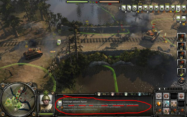
Dunno why a sentence describing the unit (that you will probably only read once) has to run across the entire width of the middle UI box. I'd much rather have it boxed in, with some kind of blank box remaining (like in COH) where a streamer could put their webcam or a sponsor overlay. It will look bad if overlays will have to crop these sentences in half.
Total waste of space indeed. After a few games who needs an units tutorial ? And still it takes the most important place in UI, wtf ?! COH camera is already very close to the ground, everyone has accepted that as a part of the gameplay, but keep diminushing game's readability with X-large UI is just dumb.
I'm glad they apparently decided to makes units's icons permanently displayed (main flaw in COH1 UI if you ask me) ---> they should be in place of the worthless unit description.


 cblanco ★
  보드카 중대
  VonManteuffel
  Heartless Jäger