Login

russian armor

(2) Nexus

10 Jul 2018, 04:35 AM
#1
avatar of WhiteFlash
Senior Mapmaker Badge
Benefactor 119

Posts: 1295 | Subs: 1

V0.2.2 (1-31-19)

Codename Nexus is a 1v1 competitive map designed for ladder COH2. The official name is unknown as of now.
____________________________________________________________________

V0.2.2 CLICK HERE AND THEN HIT SUBSCRIBE TO OBTAIN THE MAP

It will automatically update itself as I push new versions to the public. You only have to do this one time.
____________________________________________________________________

V0.1.0: This release is sloppy as it was thrown together in 1 week, but it is definitely playable. It is worth giving it a play thru as it is definitely complete enough to test.

V0.1.2: There are too many changes to list. Please give it a try, massive overhaul.

V0.1.3: Sectors overhauled, southern building was discovered collapsing on tanks an killing them when they were at full health (never seen that before) so it was replaced. Other aesthetic upgrades and pathing improvements.

v0.1.4: Northern area overhauled, sectors tweaked slightly all around, pathing improvements, aesthetic improvements, base entrances tweaked, tweaked cover. This version shows promise.

V0.1.5: (map was being constantly updated for Impromptu Tournament)Bases moved closer to points, hallway stone walls in south opened up for light armor, VPs moved to be closer to bases, some walls revamped, chimney removed from south powerplant, norhern most building entrance glitch fixed, northern houses weakened drastically.

V0.1.6: New sector layout crossroad cutoffs moved closer to center, munitions is now able to be cutoff from fully engulfed center hybrid point, map adjusted to allow points to be moved as stated and to make muni cutoff accessible, north left house position adjusted and wall to the south of it adjusted to make it vulnerable, added small wall section south of that area, southern most building moved further south and area adjusted. added the signature pile of destroyed vehicles in the south, removed some potentially unnecessary objects on map to allow better shot line of sight and pathing.

^^^These improvements come to you as a result of the improvised tournament. Thanks to all who watched or participated.

V0.1.7: Removed height change on rail line thru the entire map, pathing adjustments, further reduced objects on map to improve light vehicle pathing and reduce the number of shot blockers. This version will be improved and updated multiple times in the runup to the Grudge Match Tournament.

V0.1.8: Mirrored some more cover appropriately, modified an area where units could get stuck (fixed now), some aesthetic improvements, improved base bunker location and coverage, modified north buildings to have more health to balance them w the south buildings. These improvements will be featured in the Grudge Match #2. More feedback is appreciated!

V0.1.9: Modified sector locations to make the map flow much better, cover modified and objects removed to make the map flow better. muni cutoff sector attached to base sectors. buildings in north health increased. aesthetic improvements. removed central road red cover.
____________________________________________________________________

Please post replays in this forum or msg me on steam when you are playing so i can OBS. Replays and observing live games is the most valuable form of feedback. If you have suggestions or thoughts on the map design post here as well. The current design is very fluid so things will change rapidly as data is accrued. Your time is appreciated.

-WhiteFlashReborn
0.2.2
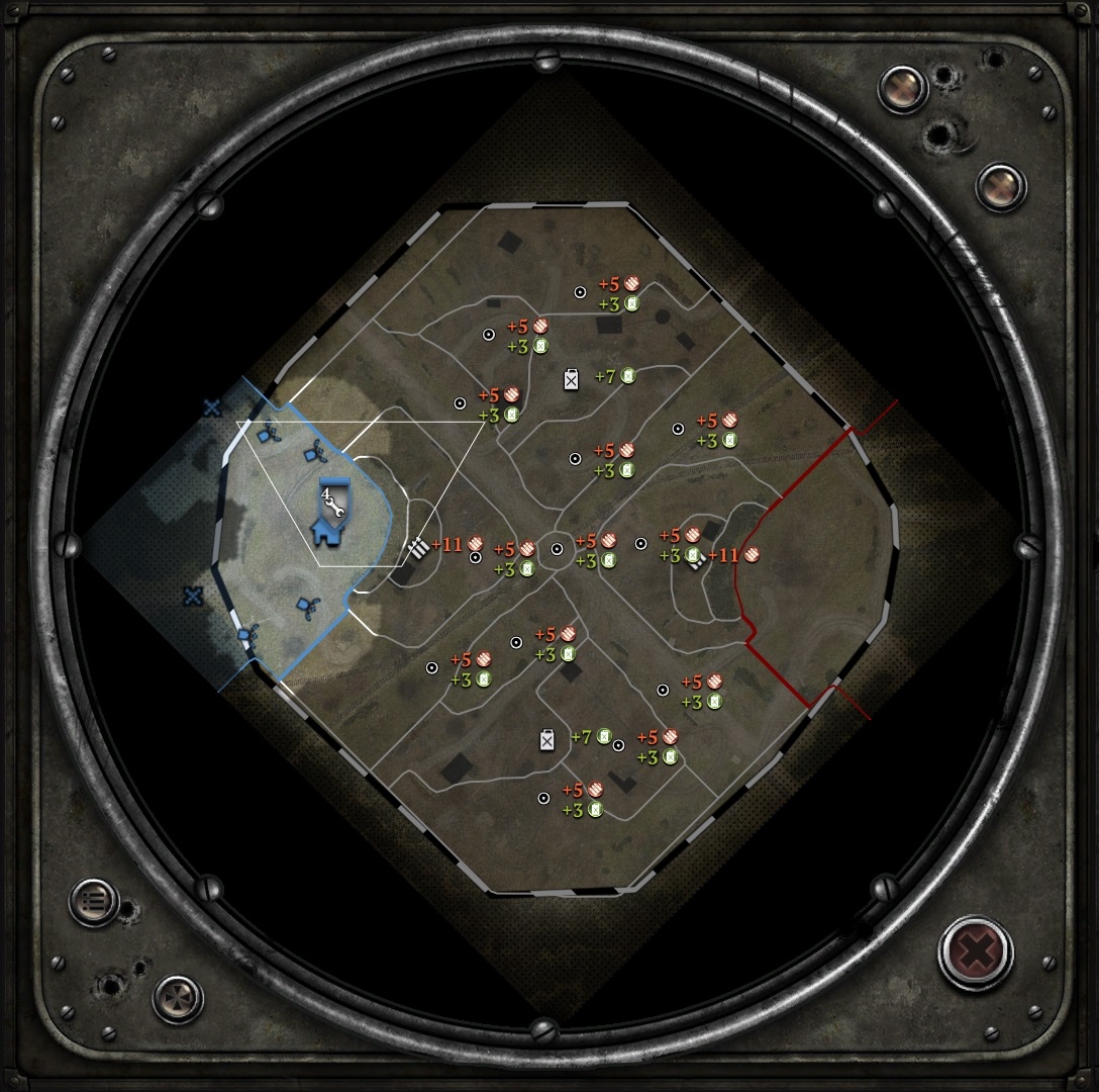
0.2.2
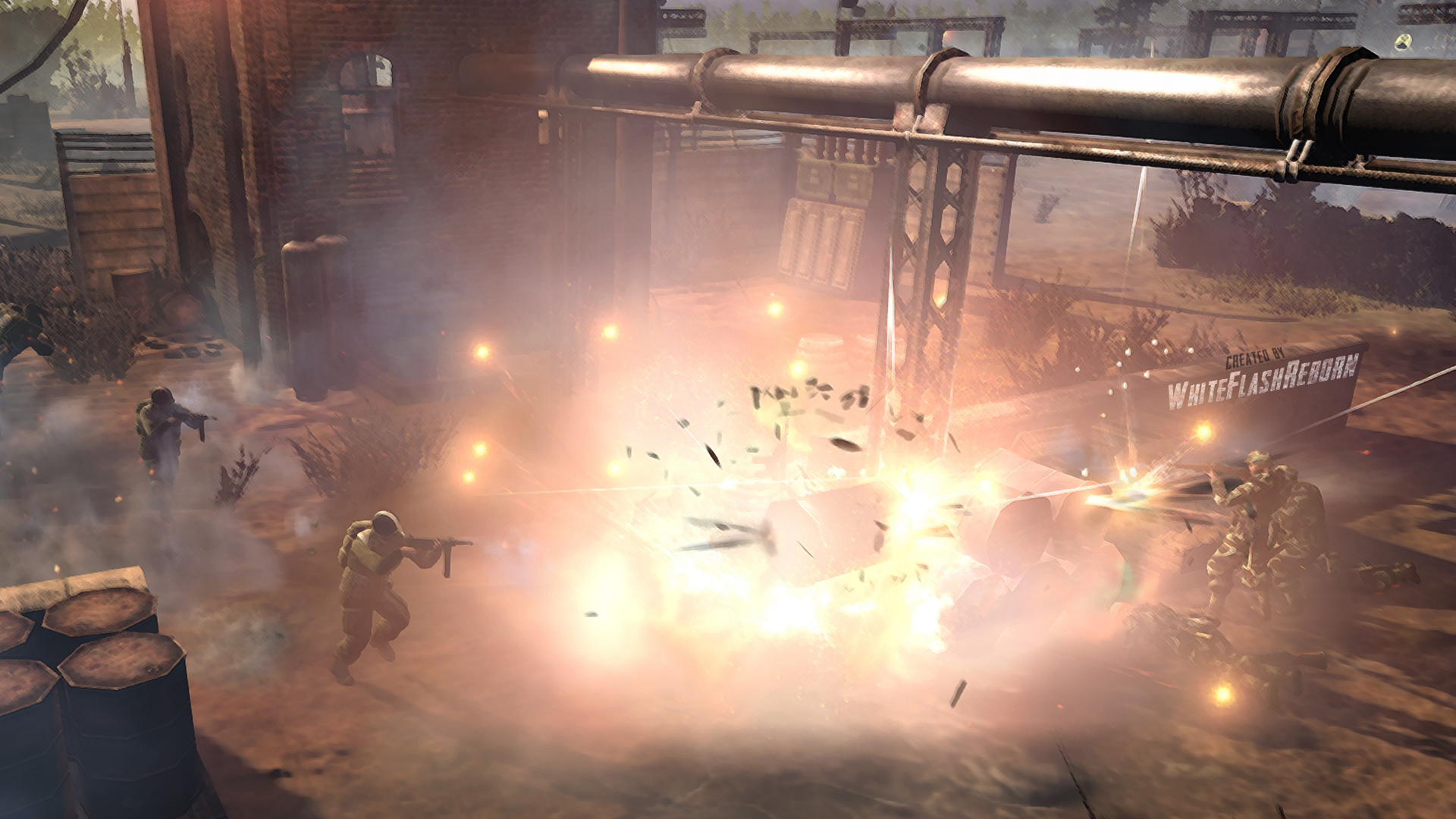
Loading Screen
0.1.6

0.1.6

0.1.6

0.1.6

0.1.6

0.1.6
10 Jul 2018, 13:13 PM
#2
avatar of empirescurropt

Posts: 708 | Subs: 1

first symmetric map on coh2 !
looks great really so if any one wants to try out just add me on steam!
in my opinion maps make a huge role in coh2 so i hope to see more balance maps !

keep the good work WhiteFlash ! its time cosuming its tought!

will try the map today but not sure if im the right person to discuss balance haha but looks good so if you got time we can do some games!
Phy
10 Jul 2018, 13:38 PM
#3
avatar of Phy

Posts: 509 | Subs: 1

Looks very nice. Needs further test but its promising. Good job :)
10 Jul 2018, 22:36 PM
#4
avatar of blvckdream

Posts: 2458 | Subs: 1

We tested this map and I am sorry to say it but I am personally not a fan of it at all.

I don´t like the main cut offs, they are almost completly in the open for some reason. Just empty areas without much cover. Next to red cover roads too which seems a bad idea. Seems hard to contest enemy fuel cut off. There needs to be be more cover in the cut off areas.

I also don´t like the muni point outside base but with no exit to get there easily. So you have to walk around the base just to cap muni that is right next to it. Seems weird to me. Maybe move the muni points somewhere else and make this a regular ressource points?

Not a fan of all these buildings next to northern and southern fuel/VP area.

I know the map is not really big but to me it feels very hard to contest several area of the map because the northern area and southern area are isolated by this huge red cover road, which makes it hard to move units around. The map felt to me like it really promotes campy/static play too because of that.

Layout of the ressource points needs a rework too, just feels like a chore to cap all the points. Overall the map lacks the simplicity that good COH2 maps have.
10 Jul 2018, 22:47 PM
#5
avatar of WhiteFlash
Senior Mapmaker Badge
Benefactor 119

Posts: 1295 | Subs: 1

We tested this map and I am sorry to say it but I am personally not a fan of it at all.

I don´t like the main cut offs, they are almost completly in the open for some reason. Just empty areas without much cover. Next to red cover roads too which seems a bad idea. Seems hard to contest enemy fuel cut off. There needs to be be more cover in the cut off areas.

I also don´t like the muni point outside base but with no exit to get there easily. So you have to walk around the base just to cap muni that is right next to it. Seems weird to me. Maybe move the muni points somewhere else and make this a regular ressource points?

Not a fan of all these buildings next to northern and southern fuel/VP area.

I know the map is not really big but to me it feels very hard to contest several area of the map because the northern area and southern area are isolated by this huge red cover road, which makes it hard to move units around. The map felt to me like it really promotes campy/static play too because of that.

Layout of the ressource points needs a rework too, just feels like a chore to cap all the points. Overall the map lacks the simplicity that good COH2 maps have.


I recommend playing more than a handful of games before these conclusions are reached. Its easy to make assumptions and "feel" certain ways because of wins or losses. Especially on a new map and before more than a few games have been played. Post replays please! Thanks

Also "Overall the map lacks the simplicity that good COH2 maps have." it isnt my intention to make a simple map. Simple maps rapidly become stale. This is a competitive map so it will be complex in the potential scenarios and approaches players will be able to take. Good COH1 or 2 maps are never simple.
10 Jul 2018, 23:07 PM
#6
avatar of blvckdream

Posts: 2458 | Subs: 1

If that is true why is Crossroads so popular? About as simple as a map can get, yet well thought out and open to lots of different cap orders, strats etc...The first time I played on it I already liked it because it just makes sense the way it's designed.
10 Jul 2018, 23:20 PM
#7
avatar of WhiteFlash
Senior Mapmaker Badge
Benefactor 119

Posts: 1295 | Subs: 1

Give it more than a handful of tries. Keep in mind this is a first draft, the crossroads that exists today didnt look much like its first draft, and this was thrown together in ~7 days, I normally spend about a month before releasing a first draft.

Post replays too please.
11 Jul 2018, 04:49 AM
#8
avatar of Luciano

Posts: 712

11 Jul 2018, 05:54 AM
#9
avatar of Rosbone

Posts: 2145 | Subs: 2

I have not played on the map but was curious how it compared to Crossroads which is such a fun map to play. I am not saying make crossroads 2 in this post :)


CROSSROADS
Crossroads has two great things that I think make it perfect to play on:
1. Just the right amount of sight blockers placed in locations that allow you to make aggressive moves. You can push up to a line of blockers and look around. Then push if it is safe. You can also really push hard and overextend, to some degree, because there are enough blockers that you can move behind one and escape.
2. There are more points than normal. The cool part about this game is feeling like you are doing something. That is the main tactile feedback that you are making things happen. So every push is rewarded with an immediate new point taken. And since there are more points, the next point is always near by and the point after that is near by. So you are not locked into going in one direction. This lets you adjust your strategy on the fly. If you planned to go left and then run into an overpowering force just turn right instead and cap that direction. On large maps with poor layouts you have to engage, retreat, or walk the 45 seconds to the next point. That whole 45 seconds you are falling behind on teching and panic sets in. You never feel like you are accomplishing anything and have limited options.

NEXUS FEEL
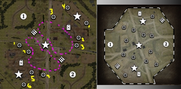
I think Blvckdream was feeling how empty the center of the map is (pink areas). That in combination with the munition being way out of the way. With the points being all pushed out to the corners the map feels very large. Units are walking for long periods of time before they are actually "doing" anything. So players may miss that feeling of accomplishment.

Since the points are pushed so far out, you have to go ALL-OR-NOTHING to one side and hope you do well. If you do not do well, you will retreat and then be way behind on teching. And then hope you do not smash your head on the next side because it will be gg if you do. Crossroads always feels like you can cap enough to come back. It is never all or nothing.

NEXUS MAP CONCERNS
I do not play 1v1 much, but the buildings around the fuels could be cause for concern. Hard to say if a top level player would camp a house with an MG. Seems like a waste of resources at that level.

Having 6 points on the EAST side and offsetting it with the fuel more on the WEST side could be an issue for some.

Just my quick thoughts. Hope that made some sense and hope it helps get us another great 1v1 map! Oh, and Luciano likes trains.
11 Jul 2018, 06:33 AM
#10
avatar of Luciano

Posts: 712

https://www.coh2.org/replay/81325/nexust-test-1

We tested the map with Brosras and both agreed that the middle house is too dominant and it will punish certain factions that have less acess to indirect fire like brits.

The map also felt too big compared to the avarage competitive 1v1 map.

Personally apart from those things I felt that the vps were too far.
11 Jul 2018, 07:47 AM
#11
avatar of blvckdream

Posts: 2458 | Subs: 1

jump backJump back to quoted post11 Jul 2018, 05:54 AMRosbone


NEXUS FEEL
I think Blvckdream was feeling how empty the center of the map is (pink areas). That in combination with the munition being way out of the way. With the points being all pushed out to the corners the map feels very large. Units are walking for long periods of time before they are actually "doing" anything. So players may miss that feeling of accomplishment.

Since the points are pushed so far out, you have to go ALL-OR-NOTHING to one side and hope you do well. If you do not do well, you will retreat and then be way behind on teching. And then hope you do not smash your head on the next side because it will be gg if you do. Crossroads always feels like you can cap enough to come back. It is never all or nothing.

NEXUS MAP CONCERNS
I do not play 1v1 much, but the buildings around the fuels could be cause for concern. Hard to say if a top level player would camp a house with an MG. Seems like a waste of resources at that level.

Having 6 points on the EAST side and offsetting it with the fuel more on the WEST side could be an issue for some.

Just my quick thoughts. Hope that made some sense and hope it helps get us another great 1v1 map! Oh, and Luciano likes trains.


Agree with all of that. Even though the map isn´t big the important points are so far spread out that you feel like you can´t really contest all of it. This is something that Crossorads does very well, it´s designed in a way that allows you to contest all the important areas of the map at the same time. On Nexus this feels impossible. The VPS especially are so hard to contest, I can see how games will really really drag out on Nexus because you can always hold on to one VP.

There is also this "tunnel-like" pathway in the south, that I really really dislike.
11 Jul 2018, 08:47 AM
#12
avatar of Sturmpanther
Lead Strategist Badge

Posts: 5441 | Subs: 36

I know feedback should be always with postive and negative stuff, but I had no time for that right now. And since you wanted staff about what is wrong on this map:
Enjoy :P And I just woke up xD

11 Jul 2018, 17:19 PM
#13
avatar of WhiteFlash
Senior Mapmaker Badge
Benefactor 119

Posts: 1295 | Subs: 1

Thanks for the replay Luciano, thanks for the general feedback all. The specific advise is valuable and appreciated, however if you've played any games at all its far more valuable to have replays to analyze. Please post them! Thanks again
A_E
12 Jul 2018, 10:57 AM
#14
avatar of A_E
Lead Caster Badge
Donator 11

Posts: 2439 | Subs: 6

What is the reasoning for the +11 muni not being cutoffable?
13 Jul 2018, 00:42 AM
#15
avatar of WhiteFlash
Senior Mapmaker Badge
Benefactor 119

Posts: 1295 | Subs: 1

Im considering it A_E ;)

Currently there was a massive overhaul to the map. V0.1.2 Released. Give it a go and post replays everyone! Your time is appreciated.
13 Jul 2018, 08:21 AM
#16
avatar of ikab

Posts: 40

In my opinion, one of the reasons Crossroads is so good is that there's no meaningful buildings overlooking major resource points. This is a common theme in many "good" 1v1 automatch maps: The only buildings that exist are the ones that overlook VPs. At worst, there's a single weak building overlooking one of the important resource points in an easily counterable position. Maps where this largely holds true: Langres, Faymonville, Crossing, Kholodny.

I think that Buildings in 1v1 only serve to slow down the game and there isn't really a place for them in 1v1 other than MG nests overlooking VPs. Buildings being next to VPs isn't so bad because most of the mid to late game action happens around VPs so it can be interesting seeing players playing around these buildings with tanks, vetted infantry and support weapons. On resource points though, Buildings will favour whatever player spawns closer to the building because that player will be the one to reach the building first and hold the resource point. For example, on Lost Glider where the South player, who is closer to every meaningful building on the Map, has a large advantage because of exactly this. The worst offenders are maps that put buildings on cutoffs or have buildings everywhere (Lost Glider, Arnem Checkpoint, Westwall, Kharkov) leading to large parts of the map which are difficult to take and thus necessitate slow gameplay.

Buildings on resource points also force gameplay around these buildings a lot earlier because you NEED to hold resource points to get into the game whereas you can largely ignore VP positions for a good part of the early game and then deal with entrenched building VP positions when you're ready with light vehicles and tanks. Forcing early game infantry fights around buildings is dull because whoever gets to the house first has a distinct advantage in the engagements. This usually means whatever side spawned closer.

The guaranteed green cover Buildings provide mean squads outside the building can usually only deal with Buildings at long range. Pair this with the fact that you can leapfrog out of buildings to delay engagements means that early infantry gameplay around Buildings leads to the slowest early game engagements by far and are simply tedious to play because they always play the same way.

tl:dr Please don't add buildings to maps, building gameplay in COH 2 1v1 is probably the worst aspect of the game. Just put green cover unless it's over a VP, then you can put a building.
13 Jul 2018, 13:39 PM
#17
avatar of empirescurropt

Posts: 708 | Subs: 1

Sturmpanther- it's right i agree it im but im not a big fan of all this buildings for a 1v1 map.. seems a map for indirect fire will be time consuming just to clear all those buildings !
15 Jul 2018, 02:48 AM
#18
avatar of WhiteFlash
Senior Mapmaker Badge
Benefactor 119

Posts: 1295 | Subs: 1

V0.1.3 Released. (see first post to obtain the map)

Give it a go and post replays everyone! Your time is appreciated.
15 Jul 2018, 15:53 PM
#19
avatar of luvnest
Strategist Badge
Patrion 39

Posts: 1094 | Subs: 20

gonna check it out and leave my thoughts here later
17 Jul 2018, 04:31 AM
#20
avatar of WhiteFlash
Senior Mapmaker Badge
Benefactor 119

Posts: 1295 | Subs: 1

V0.1.4 released (see first post to obtain the map) I feel strongly this map will lead to a high quality 1v1 ladder map. This version shows a lot of promise.

Give it a go and post replays everyone! Your time is appreciated.
1 user is browsing this thread: 1 guest

Ladders Top 10

  • #
    Steam Alias
    W
    L
    %
    Streak
Data provided by Relic Relic Entertainment

Replay highlight

VS
  • U.S. Forces flag cblanco ★
  • The British Forces flag 보드카 중대
  • Oberkommando West flag VonManteuffel
  • Ostheer flag Heartless Jäger
uploaded by XXxxHeartlessxxXX

Board Info

565 users are online: 565 guests
0 post in the last 24h
8 posts in the last week
34 posts in the last month
Registered members: 49107
Welcome our newest member, Falac851
Most online: 2043 users on 29 Oct 2023, 01:04 AM