New Community Map Feedback Thread
Posts: 2723 | Subs: 1


Posts: 278 | Subs: 1
Posts: 12
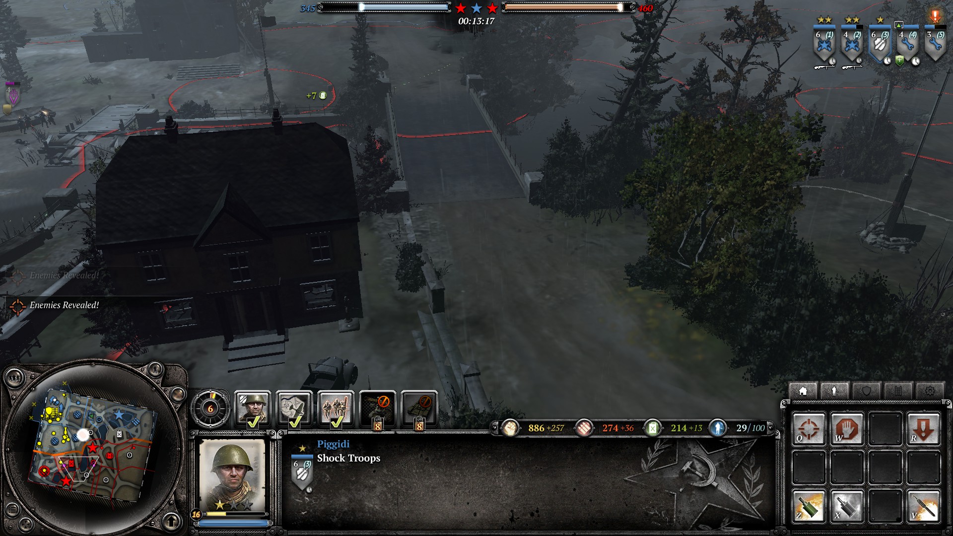
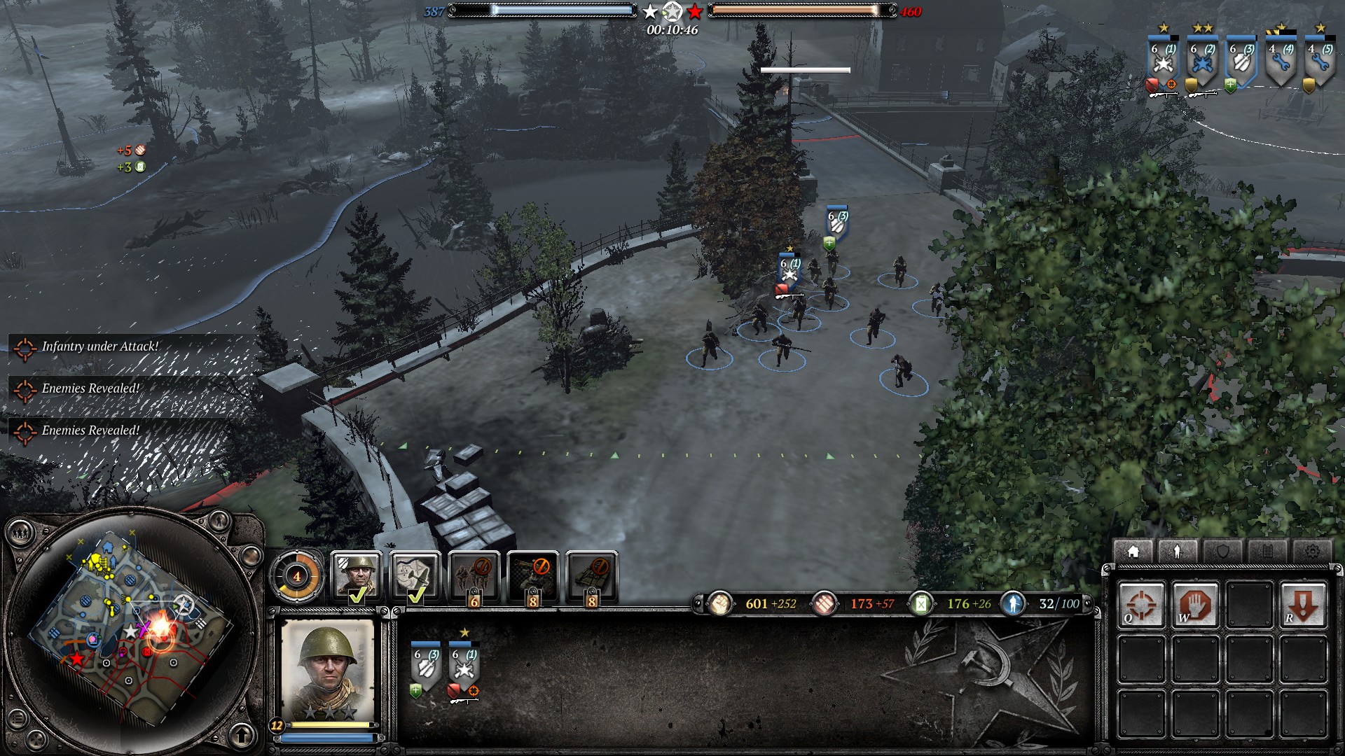
Wait so which map is that that you posted a screenshot of? it looks like the layout and shape of Crossroads but I thought you were talking about Westwall?
It's Westwall v2 from the workshop, not v1 from the live game.
Posts: 2723 | Subs: 1

Posts: 278 | Subs: 1

I saw a lot of Westwall games and perhaps the 3rd cutoff would add even more cutoff gameplay and would reduce the combat value of the VP points because u can cutoff all sectors with easy movements u cant by garrisoned MGs.

 5
5 Posts: 93
Generally i have to say that i mostly don’t like them and have most of them unchecked to avoid having to play them.
I really appreciate the effort and dedication by the creators of these maps but i feel that there has been a too great emphasis in creating something different, new and unique in almost all of these maps.
If your aim is to make something that has not been done before, there is of course a bigger risk of failure involved than if you would just stick to the things that have been working before.
Of course there are benefits of a variety in maps with different layouts, sizes, settings and themes but in my personal opinion i would rather play a good map for the 1000th time than having to play a map that is less good just for the sake of a change.
Again i don’t want to piss the map makers off and just want to give an honest feedback which unfortunately is mostly negative in my case. Of course all this is only my personal opinion.
Market Ruins :
A map that looks beautiful with its detailed and unique Town setting.
But: I generally dislike the very narrow vertical map layout - my feeling is that quadratic or horizontal maps simply work better in coh2.
I feel that lots of ruins that cant be entered in a map is frustrating since you cant figure out at first glance which buildings are usable and which are not. This also holds true for Caen and Refinery.
Vehicle pathing is a big issue in Coh2 which causes some frustration. A good map would be one that avoids areas that could intensify the pathing issues. I feel that this map makes vehicle use unnecessary difficult.
I don’t think that this map should be in the auto-match rotation.
Westwall :
I kind of like this map and had some good games played on it.
The same thing i wrote about pathing in Market Ruins also hold true here in the central Area.
Those dragon teeth are causing lots of trouble with vehicles and are frustrating. Their placement is a choice that makes sense with the theme of the map but it just does not work in game-play.
My idea of a good map is that it makes it as easy as possible for the player to make out what is happening on the battlefield. This map has a light that throws little to no shadows and on top of that some fog. both these things make it unnecessary hard do see what is going on.
This map is a little too big for my taste. I simply like maps with sizes from 320x320 to 384x384 better.
Bombarded Refinery
Again a lovely designed Map in a industrial setting that was missing so far. There is an industrial themed map in COH1 - Sturzdorf. And despite it being not very well liked in the community, its design was a rather good balance between open areas and areas with buildings. On top, it had a good system of roads acting as firing lanes and ways to travel the map efficiently with vehicles.
Bombarded Refinery is lacking this balance since it is mostly a close quarter map and has little building play. It has the same building problem as Market Ruins with ruins not being able to being identified as not being able to hold garrisons.
Maps that lack open spaces and or firing lanes are not for my taste.
I don’t think that this map should be in the auto-match rotation.
Rüstungswerke:
This is a beautiful map that has two huge problems: Pathing in the factories is a nightmare and the high walls of the factories and all its beams and cranes are obstructing the vision from the default view. The Idea of this map is new and bold but it just does not work as a map in coh2.
I don’t think that this map should be in the auto-match rotation.
Bryansk Forest:
Gorgeous Map! so beautiful that I still have it selected even though I personally dislike its core design.
It has excessive red cover in the north and a labyrinth in the middle and south where you can hardly see a thing because of the very tall trees. It also lacks any form of building play - an essential part of the coh2 game-play. Still I believe that if you would cut down a lot of trees in the middle or south area and place 2-3 buildings this could make for a good map.
Caen:
I had some good and sometimes very unusual games on this map. Again I dislike the idea of having to search for usable buildings between all the ruins. I see the problem: if you want to create a city map that does not have only garrisons (which would make for an incredible boring game play) you simply make only some of them usable. my solution would be: don’t make a city map - rural maps work just fine.
I don’t like the lighting with the fog and rain and diffuse light since it makes it harder to see the units. I feel that the map is a little too big for a 1v1 map.
Apart from that its the extremely exposed cut off points that make this map play differently than most of the existing ones. especially the northern cut-off can be incredibly hard to defend or to retake once the attacker got hold of the building north to it,
Halbe:
I did not play it yet, But from just looking at it i find i hard to believe that i will like it. The author just wrote in another thread : „My idea was to make something new„. Again i can totally understand the mindset from which this is coming, but as a player who has been playing the coh series since almost 10 years i would definitely not be here if i was looking for something new. I would be thrilled if i got a new map that was simply better as the existing ones or if i got one that was just as good as the existing ones with some minor variations.
 4
4 Posts: 4301 | Subs: 2
- (2)Halbe
- (4)Lisores River
- (4)Prypiyat Sector
- (4)Schilberg Outskirts
- (4)Elst Outskirts
 4
4 Posts: 4301 | Subs: 2
- Lisores River:
I get the intention: The middle is a big swaths of red covers which is bad but you balance it out by making many, many crossings which all of them cannot be covered at the same time.
But I think it's a wee bit too much and what non red cover crossings are basically a long exposed bottleneck situations like these:


essentially making crossing them as much of a risk as the red cover crossings.
also a natural barrier that divides the map in half naturally encourages arty fest. The vast width of red cover area also means tumultuous retreat path which discourages crossing into enemy's half of the map - you can control which part to cross from, but when retreating, you are most likely to use the two central shallow river part.
I would suggest more yellow covers and bigger archipelago land masses in the river area.
Posts: 2635 | Subs: 4
Permanently BannedPosts: 37
(2)Halbe, need fix that open space at road, its to open, to many red covers, do author test somthing in road like destroyed a military convoy ? that can give cover at road. Or there was cover, but was removed ?
I tried different things, which didn´t work well at all. Adding too much cover caused diverse path finding issues, but removing the whole red cover destroyed the feeling of the map. So my current plan is to add a few "corridors" to the Autobahn by replacing some splines with splats and normal ground textures without cover penalties. So any idea where I could place them for optimal balance? Maybe by adding some additional wrecks too?
Posts: 2272 | Subs: 1
Posts: 2635 | Subs: 4
Permanently Banned
I tried different things, which didn´t work well at all. Adding too much cover caused diverse path finding issues, but removing the whole red cover destroyed the feeling of the map. So my current plan is to add some "corridors" to the Autobahn by replacing some splines with splats and normal ground textures without cover penalties. So any idea where I could place them for optimal balance? Maybe by adding some additional wrecks too?
About "corridors" place need more feedback, coz maybe some troube or opinion can be from playerstyle. I will be asnwer later, when test it more.
Posts: 911
Heavy tanks can't cross the bottom right bridge, the pathing doesnt let them.

Posts: 559
Lisores River:
Heavy tanks can't cross the bottom right bridge, the pathing doesnt let them.
Confirmed. Wehr and OKW Panthers are also blocked. The bridge is crossable for Heavies from the south but they cannot pass through the north.

Posts: 952 | Subs: 3
Lisores River:
Heavy tanks can't cross the bottom right bridge, the pathing doesnt let them.
Confirmed. Wehr and OKW Panthers are also blocked. The bridge is crossable for Heavies from the south but they cannot pass through the north.
Many thanks for spotting this! I'll try to catch the author and get a fix in soon.
Posts: 911
Confirmed. Wehr and OKW Panthers are also blocked. The bridge is crossable for Heavies from the south but they cannot pass through the north.
I found that they could not cross from the south either. There seems to be an invisible barrier on the north side of the bride. Heavies approaching from the south can cross 99% of the bridge but cant exit it. At least thats what i saw.
PS British Heavy tanks arnt included, and i didnt test Pershing.

Posts: 952 | Subs: 3
I found that they could not cross from the south either. There seems to be an invisible barrier on the north side of the bride. Heavies approaching from the south can cross 99% of the bridge but cant exit it. At least thats what i saw.
PS British Heavy tanks arnt included, and i didnt test Pershing.
I've run some tests, and it appears the author left an object at water-level under the bridge that blocks pathfinding. It might only be tiny, but that's all it takes to stop the largest of vehicles.
I'll see if we can get this fixes ASAP.
 4
4 Posts: 4301 | Subs: 2

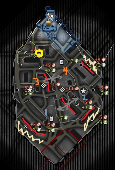
I feel this map feels a bit tight not because there arent open spaces but because the Building Sectors are way too long and divides the map too much. Since the map is not steppes-open, players are going to be presumably positioned like indicated and their path to each other will be blocked by the two long building blocks. So they either have to go around all the way back or through the very centre ground getting spotted, etc etc.
The other building blocks away from the centre are also too long, making those beige colour area unsuited for use - sure, they can be used to flank but they are just cornered into the tightest space. So nobody would go there except to cap the resource points.
The same is not the case in NorthWest Sector(Northwest Sector indicated in yellow) where the area is not too 'tight' because there is an opening indicated by the circle. So that area do serve a purpose either than to just have a cap point there.
I think that would be the gist of my suggestion for all the indicated building blocks. I know most of them have a building so that normal infantry can pass through but in the late game, i feel the map should open up a bit more for bigger armies with vehicles: My suggestion is reassemble a respectably wide part of those building blocks with rubbles and shot blockers that can be crushed by medium vehicles+.
p.s. I want to hear people's opinion about the capping circles. Not about coh1 system v. coh2 system but about the size of them. I feel their size are just too big. It is so hard to get around undetected because the capping circles give you away and they are just darn too big. I think they can at least half smaller.

Posts: 1467 | Subs: 4
I feel this map feels a bit tight not because there arent open spaces but because the Building Sectors are way too long and divides the map too much. Since the map is not steppes-open, players are going to be presumably positioned like indicated and their path to each other will be blocked by the two long building blocks. So they either have to go around all the way back or through the very centre ground getting spotted, etc etc.
The other building blocks away from the centre are also too long, making those beige colour area unsuited for use - sure, they can be used to flank but they are just cornered into the tightest space. So nobody would go there except to cap the resource points.
The same is not the case in NorthWest Sector(Northwest Sector indicated in yellow) where the area is not too 'tight' because there is an opening indicated by the circle. So that area do serve a purpose either than to just have a cap point there.
I think that would be the gist of my suggestion for all the indicated building blocks. I know most of them have a building so that normal infantry can pass through but in the late game, i feel the map should open up a bit more for bigger armies with vehicles: My suggestion is reassemble a respectably wide part of those building blocks with rubbles and shot blockers that can be crushed by medium vehicles+.
p.s. I want to hear people's opinion about the capping circles. Not about coh1 system v. coh2 system but about the size of them. I feel their size are just too big. It is so hard to get around undetected because the capping circles give you away and they are just darn too big. I think they can at least half smaller.
All though everything you put down is valid in one way or another, the distance traveled from each point to the next is exactly the same (or at worst within 5m of each other), this is why there is no division in the middle of the long building rows (as I spent about 2 months testing it after tightropes cast, and there was no way it was going to realistically work), as it would entirely redo pathing and the complete dynamic of the map would change, which would lead even further to the "tightness" you describe as the building rows serve to hinder movement in a lot of ways.
Those flanks are used quite often, btw, from players used to the map. You get large scale vehicle flanks due to the way the mid plays. Unless you enjoy beating your head off the enemies defenses and letting them get arty.
Making medium crush rubble would require the entire map being redone as it would be all or nothing, if it isn't consistent throughout the map people complain like no tomorrow, although it was something I thought about originally, it won't make sense to the average player that casually plays and will be even more frustrating. I thought of putting the crosses across the long building rows in the mid with medium crush, but it is not consistent. (players just think that all rubble is crushable), so I didn't implement it as that was the feedback I received during the last few months of testing.
Also the capture points should be able to be smaller, but right now the standard is a radius of 18-20, very few points can be pulled down smaller, unless you put it directly next to indestructible objects (building rows, groves) and half it from there.
 4
4 Posts: 4301 | Subs: 2
this map reminds me of (6) pavlov's house.
Livestreams
 |
|
|
18 | ||
 |
|
|
16 | ||
 |
|
|
119 | ||
 |
|
|
8 | ||
 |
|
|
4 | ||
 |
|
|
2 |
Ladders Top 10
-
#Steam AliasWL%Streak
- 1.831222.789+37
- 2.35057.860+15
- 3.1110614.644+11
- 4.921405.695+5
- 5.634229.735+8
- 6.276108.719+27
- 7.306114.729+2
- 8.262137.657+3
- 9.1045675.608+3
- 10.722440.621+4
Replay highlight
-
 cblanco ★
 -
 보드카 중대
-
 VonManteuffel
 -
 Heartless Jäger

Board Info
6 posts in the last week
34 posts in the last month
Welcome our newest member, manclubgayote
Most online: 2043 users on 29 Oct 2023, 01:04 AM


