Login

russian armor

(2) Surazh

13 Jul 2016, 22:10 PM
#1
avatar of Invictus
Donator 11

Posts: 138

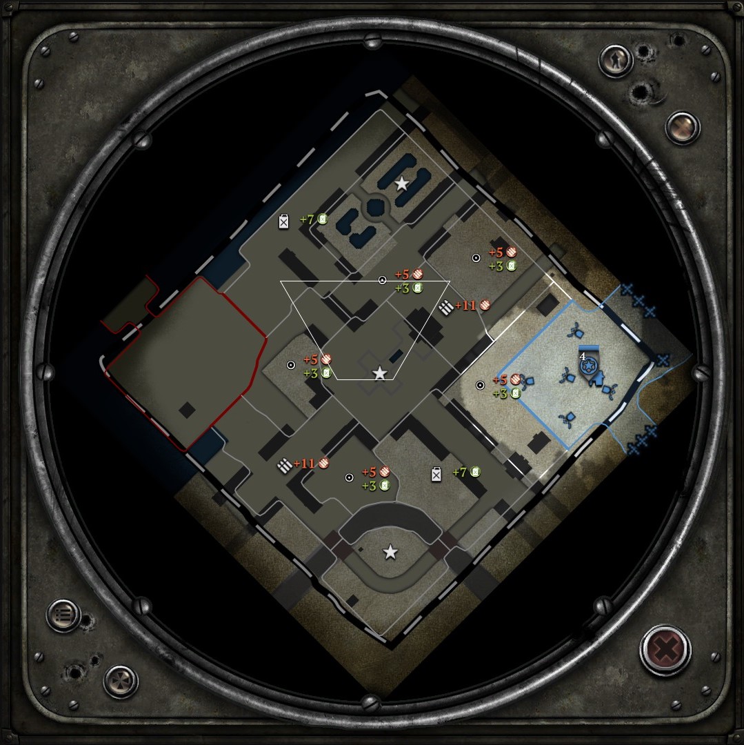
Updated my old map "(2 - 4) Surazh" to a 1v1 for the contest, changed allot actually...
Lots of the buildings have been replaced with destroyed ones that your troops can't enter.
Balanced the map some more (addes some space at player "2's" position).
Added splats and splines +action markers and many more.

Steam workshop link


Hope you enjoy it and let me know if you find anything that should be adjusted :)
13 Jul 2016, 23:00 PM
#2
avatar of medhood

Posts: 621

Looks like a fun map to play, I might try to get a friend to play on it with, if you dont mind can you upload a picture of the minimap that also shows the territory points?
14 Jul 2016, 11:56 AM
#3
avatar of Invictus
Donator 11

Posts: 138

14 Jul 2016, 16:18 PM
#4
avatar of Al ONE

Posts: 24

Looks nice, but you will need more manpower points (around 5 per player).

happy mapping
14 Jul 2016, 20:09 PM
#5
avatar of Invictus
Donator 11

Posts: 138

It's 8 now so 4 per player, looks close enough for me :) (the victory points are manpower points when not playing VPC).

The map will get to crowded I think with more points... I can always try but I think I'll leave it like this for a little longer
19 Jul 2016, 03:10 AM
#6
avatar of Tric
Master Mapmaker Badge

Posts: 1467 | Subs: 4

Here is the feedback that I gathered from looking around the map myself, and having some viewers playtest it during the stream.

  • 5 Territory points are far to few, it severely handicaps certain factions and needs to be adjusted the recommended amount of 10, you may be able to get by with 9 or 8, but it really should be along the standard unless excessive play testing shows that there is no imbalance due to the resource income reduction.
  • The cutoffs need completely redone outside both bases.
    • The eastern base, has a base mg that holds the cutoff for free
    • The eastern base only has 1 cutoff that then loses the entire map, would this changed to two separate cutoffs to make the opposing player choose to cutoff the fuel, or the munitions, not the entire map
    • The western base features no cutoff, and both the munitions and the fuel are directly tied to the base sector, making for longer decap times for the opposing player in comparison to themselves
    • The western base also features an ambient building inside the base, this is extremely imbalanced due to ambient unit call ins (infiltration commandos, JLI's, Falls, ect; ) and just needs to be removed

  • The overall map feel for buildings is that they have entirely to much health overall in key positions allowing players to just camp buildings and hold sectors map with little to no threat.
  • You can maintain the visual feel of the map by making the buildings below the 50% entity health overlay and making them un-garrisionable, as you did with some of the buildings already.
  • Currently the map favors the eastern most base as it is able to garrison the very large full health building in the middle of the map and hold it for most of the game quicker than the other player. Either it needs its health drastically reduced or the pathing needs adjusted to make it viable for both players to rush.


Overall I enjoyed the map, but these things above all need addressed, when they are please let me know so I can review the map again.

If you need anything else please let me know.
19 Jul 2016, 03:15 AM
#7
avatar of medhood

Posts: 621

I played on your map on Trics stream, I found the size is an issue and flanking Mortars and other artillery units is hard to pull off with infantry units forcing the playing to get his own indirect

So if you can expand the size of the map that would be great

There is too many healthy buildings you can garrison thus leading to the battle of the house with infantry from both sides fighting each other while hiding in a house

Speaking of buildings reduce the health or remove buildings on cutoffs to prevent "hahaha I have an MG on your cutoff you lose"

The Townhall building provides an advantage for player in the top right spawn while garrisoned as the other player has no choice but to charge it on mostly open ground or run around to flank

It doesnt provide as much advantages to the bottom player as the top right players approaches are either covered by shotblockers or theres buildings he can easily garrison

The cutoff for the top right is covered by an MG which is fustrating when harassing of flanking as you pretty much get suppressed for no reason

Visually its a nice map though
19 Jul 2016, 16:49 PM
#8
avatar of Invictus
Donator 11

Posts: 138

Dear Tric and medhood,

At first, thank you guys for taking the time to play and review my map.
I've made allot of maps in my time, but there's still allot to learn!

5 Territory points are far to few, it severely handicaps certain factions and needs to be adjusted the recommended amount of 10, you may be able to get by with 9 or 8, but it really should be along the standard unless excessive play testing shows that there is no imbalance due to the resource income reduction.
Added 2 extra point, there's now 7 (+3 victory points), any more would make the map to crowded I'm afraid. But I'll keep looking for options.

The cutoffs need completely redone outside both bases.
Added a high wall on the western base and some high bushes on the eastern base. adjusted the angle of the MG's so they are no longer facing the cutoff in a straight line.

The eastern base, has a base mg that holds the cutoff for free
Same as the line above.

The eastern base only has 1 cutoff that then loses the entire map, would this changed to two separate cutoffs to make the opposing player choose to cutoff the fuel, or the munitions, not the entire map
Added a second cutoff to the eastern base.

The western base features no cutoff, and both the munitions and the fuel are directly tied to the base sector, making for longer decap times for the opposing player in comparison to themselves
Added cutoffs and moved a munitions point so it's no longer directly connected.

The western base also features an ambient building inside the base, this is extremely imbalanced due to ambient unit call ins (infiltration commandos, JLI's, Falls, ect; ) and just needs to be removed
Removed.

The overall map feel for buildings is that they have entirely to much health overall in key positions allowing players to just camp buildings and hold sectors map with little to no threat.
All buildings have reduced health, the ones with much damage on them have even more less health.
Let me know if it's better like this or if they need to be even lower.


You can maintain the visual feel of the map by making the buildings below the 50% entity health overlay and making them un-garrisionable, as you did with some of the buildings already.
Replaced 2 or 3 buildings with un-garrisionable ones. The health of the rest has been reduced.

Currently the map favors the eastern most base as it is able to garrison the very large full health building in the middle of the map and hold it for most of the game quicker than the other player. Either it needs its health drastically reduced or the pathing needs adjusted to make it viable for both players to rush.
Health of the building in the center has been reduced, let me know if this low enough.

Again thanks for the reviews and I hope it is now a nicer map to play!
19 Jul 2016, 17:20 PM
#9
avatar of LordRommel
Senior Mapmaker Badge

Posts: 278 | Subs: 1

About the map economy:
I dont know where i have read it but you have to use always 10 manpower, 2 fuel and 2 munition points to balance the ingame economy. Less points will cause resource problems and more points could be added by adding this special map points like observation outpost, healing point or repair station point.
But the 10 mp, 2 fuel and 2 munition rule is a kind of fixed rule for ranked maps (as far as i know).
19 Jul 2016, 18:25 PM
#10
avatar of Zyswen

Posts: 149 | Subs: 1

looks gr8 i will try :thumb:
19 Jul 2016, 18:41 PM
#11
avatar of Invictus
Donator 11

Posts: 138

Dear Tric,

After watching your stream I've made some more adjustments.
The amount of water spawners has now been reduced to 4 instead of 7.
2 more manpower points have been added to the map.

19 Jul 2016, 19:39 PM
#12
avatar of Tric
Master Mapmaker Badge

Posts: 1467 | Subs: 4

Dear Tric,

After watching your stream I've made some more adjustments.
The amount of water spawners has now been reduced to 4 instead of 7.
2 more manpower points have been added to the map.


AH! Thank you for noticing that I forgot to put that in my feedback. 2 is the furthest you should be trying to push it, as the water sources will destroy optimization. I will take some time this weekend to get another review in and see what I can do. Would you also be able to upload a zipped file of the .sgb's and post it here, in the submission thread, or just pm with it. There are things that I can't see from just in game and would like to see if there is anything else in the WB. You don't have to do this, just makes me life easier.

Thanks
3 Aug 2016, 09:35 AM
#13
avatar of Tric
Master Mapmaker Badge

Posts: 1467 | Subs: 4

Changes from the second playtest have been wonderful!

There are however some issues that remain.

  • Vision is currently possible through some of the building ruins, try using the sight blockers to keep from units seeing each other in undesired places.


There will be other issues that we can iron out as the map receives more playtesting. Overall I feel the map plays much better and the changes from here on will apply mainly to site blocking, pathing, and general map balance.

9 Aug 2016, 10:52 AM
#14
avatar of Invictus
Donator 11

Posts: 138

Alright, just came back from vacation, will look into the issue you've described to me!

Thanks!
16 Aug 2016, 08:59 AM
#15
avatar of Tric
Master Mapmaker Badge

Posts: 1467 | Subs: 4

Feedback from the Fifth Wave:

  • Pathing along the large wall near the mansion needs opened up to accommodate light vehicle pathing, as of right now you have to go all the way around. I would open it up to around 5-7m


Will be adding it to the testing pool.
17 Aug 2016, 21:48 PM
#16
avatar of Invictus
Donator 11

Posts: 138

jump backJump back to quoted post16 Aug 2016, 08:59 AMTric
Feedback from the Fifth Wave:

  • Pathing along the large wall near the mansion needs opened up to accommodate light vehicle pathing, as of right now you have to go all the way around. I would open it up to around 5-7m


Will be adding it to the testing pool.


it has been edited
16 Sep 2016, 10:58 AM
#17
avatar of Invictus
Donator 11

Posts: 138

Last changes have been made since the last round of feedback.
1 user is browsing this thread: 1 guest

Ladders Top 10

  • #
    Steam Alias
    W
    L
    %
    Streak
Data provided by Relic Relic Entertainment

Replay highlight

VS
  • U.S. Forces flag cblanco ★
  • The British Forces flag 보드카 중대
  • Oberkommando West flag VonManteuffel
  • Ostheer flag Heartless Jäger
uploaded by XXxxHeartlessxxXX

Board Info

948 users are online: 948 guests
2 posts in the last 24h
8 posts in the last week
40 posts in the last month
Registered members: 49076
Welcome our newest member, nashvilledigitalgrou
Most online: 2043 users on 29 Oct 2023, 01:04 AM