Login

russian armor

Tournament Map (2) Eszterháza (WiP)

8 Mar 2015, 11:46 AM
#1
avatar of ofield

Posts: 420

(2)Eszterháza is a highly symmetrical map for competitive and Tournament purpose. The map is still "work in progress" regarding the details, gameplay-wise it is also subject to change depending on the feedback.

map size: 256x256 (same as "Crossing in the Woods", "Kholodnaya Ferma")


The map is designed to:
  • neither favor a faction nor a starting position.
  • offer Long Range and close Range Combat.
  • offer regions for tank and infantry battles

    Resources are distributed equally over the whole battlefield.

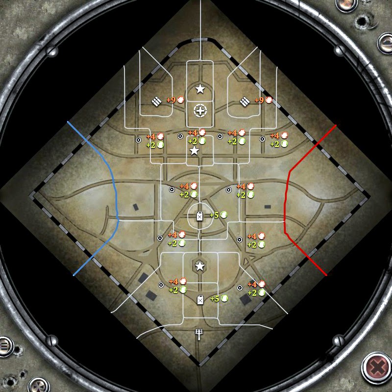
    Tac Map overview (updated 13th of march)


    Additional Screenshots


    Tactical Intention:

  • The Northern Castle ruins offer a lot of cover, sight and move blockers and favour close range units
  • The middle is more open but can be flank from several sides, yields no resources, but is a strategic valuable defensive position and offers a base for impanding attacks on cut offs.
  • The South favours long range and is very accessable for medium and heavy tanks.

    Steam Workshop link (2) Eszterhaza
    Steam Workshop link (4) Fertod
    I appreciate any feedback.

    Trivia:

    The map is based on the Castle Eszterháza in Fertőd, Hungary. It is not a 1:1 copy tho.


    UPATE CHANGELOG 13th of March:

    -Loading background added.
    -Tactical Map adjusted.
    -Sector overhaul.
    -Atmosphere settings changed.
    -Tons of details added.
8 Mar 2015, 12:06 PM
#2
avatar of Thunderhun

Posts: 1617

Wow....never thought I'd see a hungarian map

+1, gonna try this out. :)
8 Mar 2015, 14:20 PM
#3
avatar of luvnest
Strategist Badge
Patrion 39

Posts: 1094 | Subs: 20

Damn, I like where this is going. Going to check it out once I get back home.
8 Mar 2015, 14:28 PM
#4
avatar of ofield

Posts: 420

Haha thx Luvnest. To be honest, I am watching your stream every now and then. I noticed your desire for symmetrical maps, so i decided to fix this "issue" :D I would be glad if you can provide feedback to make this map what it wants to be.
8 Mar 2015, 14:37 PM
#5
avatar of luvnest
Strategist Badge
Patrion 39

Posts: 1094 | Subs: 20

Yeah, awesome!

I never really understood why Relic is so fond of those asymmetrical maps in the map pool right now as they always favour one side or another. Symmetrical maps on the other hand can be balanced and beautiful at the same time.

Gonna provide feedback as soon as I can.

8 Mar 2015, 15:02 PM
#6
avatar of Lotolo

Posts: 10

Permanently Banned
Distance too much big between Fuels, it's not a good map.

And why every side for each player.

The result is that you will go with your army in one side, and your pio for exemple cap the other side.

But the ostheer pio > soviet pio.
8 Mar 2015, 17:35 PM
#7
avatar of ofield

Posts: 420

You are free to suggest an alternative sector layout :)
8 Mar 2015, 17:37 PM
#8
avatar of Burts

Posts: 1702

Dont listen to Lotolo FailFish
9 Mar 2015, 20:49 PM
#9
avatar of TheChillty

Posts: 210

I watched Luvnest stream this map and I completely agree with what he said: -The map itself looks great but the middle is so huge but yet so unimportant so there won't be any main battles there. You will only divide your army to both sides wich is no fun for neither faction.

Solution: A fuel point should be in the middle. Munition points is very nicely set and the cut offs are good! The VP's should be located the same way they are on Kholdony Ferma Winter. Locating 2 VPs in the north on each side of the fuel point will bring the action close to the top and the middle while the bottom will be less important and only an area of harrasment. This will bring much better flow to the map and make it much more action filled!

Still a very nice and balanced map :)
9 Mar 2015, 22:52 PM
#10
avatar of luvnest
Strategist Badge
Patrion 39

Posts: 1094 | Subs: 20

Thanks Chillty, really nothing more to add. Gonna play it again next time.
10 Mar 2015, 00:44 AM
#11
avatar of ofield

Posts: 420

based on ur feedback, a rough sketch for the new sector layout. Tell me what you think!

>>Tactical Map<<

One note regarding the middle, i think the people in the stream yesterday assumed, that one can simply wire the catwalks and deny the capturing of it. You actually can capture inside the water. you also can vault over the smaller walls.
10 Mar 2015, 09:14 AM
#12
avatar of TheChillty

Posts: 210

Very good! This is excactly how I saw it in my mind :) I think that map will be very great with much better flow
13 Mar 2015, 12:45 PM
#13
avatar of ofield

Posts: 420

Updated released, see OP above for details.
21 Mar 2015, 22:27 PM
#14
avatar of ofield

Posts: 420

UPDATE:

(4) Fertod, 2v2 version of Eszterhaza

Map Size: 288x288

Workshop


27 Mar 2015, 09:30 AM
#15
avatar of LemonJuice

Posts: 1144 | Subs: 7

i really like this map. the only possible suggestion i have is to rotate the camera 45 degrees because aesthetically i feel like diagonal lines are much more pleasing to look at than vertical/horizontal
27 Mar 2015, 14:35 PM
#16
avatar of ofield

Posts: 420

i really like this map. the only possible suggestion i have is to rotate the camera 45 degrees because aesthetically i feel like diagonal lines are much more pleasing to look at than vertical/horizontal


Thx for your feedback, i guess it's a personal preference, but i like the camera angle as it is. And there is always the possibility to rotate the camera ingame.
14 Apr 2015, 22:04 PM
#17
avatar of ofield

Posts: 420

little teaser


0 user is browsing this thread:

Ladders Top 10

  • #
    Steam Alias
    W
    L
    %
    Streak
Data provided by Relic Relic Entertainment

Replay highlight

VS
  • U.S. Forces flag cblanco ★
  • The British Forces flag 보드카 중대
  • Oberkommando West flag VonManteuffel
  • Ostheer flag Heartless Jäger
uploaded by XXxxHeartlessxxXX

Board Info

414 users are online: 414 guests
0 post in the last 24h
5 posts in the last week
33 posts in the last month
Registered members: 49153
Welcome our newest member, Wilmor89
Most online: 2043 users on 29 Oct 2023, 01:04 AM