4 things that would make CoH2 instantly better
Posts: 2425
Permanently BannedPosts: 67
Unfortunately, it feels like a lot of the desired mechanical changes aren't going to be implemented.
What I'm really hoping for is the things that appear to be the easiest to change, such as the UI and such, will be fixed/improved. A tac map with some actual "tac" would be nice, a resource system that's visually clear, a more detailed mini-map, etc. I'd think these types of issues would be small beans and relatively easy to implement, then add or remove/revise as feedback comes in.

Posts: 1620 | Subs: 2
Posts: 1164
I think those are actually some of the hardest to fix - stuff like upkeep and so on can be fixed just by changing numbers in some spreadsheet. Changing the UI requires artists to draw new assets, UI programmers to program new UI elements, UI designers to make sure they work for different resolutions, etc. I think it's far more work to change something like the UI and for that reason I'm not to sanguine on the chances of large changes, although the feedback has been so resoundingly in favor of changes that maybe Relic will listen (they did move the commander UI from its location in the Alpha).
having some experience in the UI design process (albeit not a whole lot) i can second that.
even minor changes to the UI have to go through the whole "pipeline" (don't forget QA either).
changing stuff like a panthers penetration is very easy, the only stuff they probably do is discuss it beforehand. from experience i can tell that most of the balance testing is done later on live anyway MVGame
Posts: 2425
Permanently BannedI know observer mode and the limitations of the vCoH adopted replay interface are poor formsupporting community casting.

Posts: 642
Could someone list some of these UI issues people are referring to
I know observer mode and the limitations of the vCoH adopted replay interface are poor formsupporting community casting.
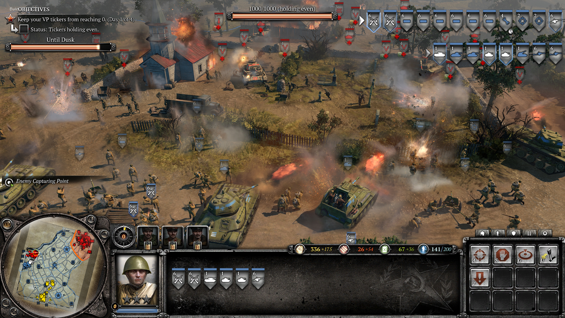
Cons of the new UI:
-Resources are shown in a horizontal order, instead of vertical. Makes it difficult to read.
-Information is all over the place: in vCoH, you had the minimap, pop cap and resources on the left side, neatly packed.
-Big, huge, useless bar in the middle that just shows a description of the unit. A description that has no impact on the game.
-Vehicle damage is shown in very small, almost distorted icons that are difficult to discern.
-The small shield for multiple selected units, as well as the tab contorl to switch through them, is gone, making micromanagement more difficult.
-Experience points appear on top of the unit killing enemies, instead of on top of enemy's killed. Most of the time, you don't notice that XP, due to this very reason.
Pros:
-Better unit shields on top right. Easier management.
-Small tooltip on top of veterancy stars in unit's portrait, telling you what that vet level does (useless, since vet is very irrelevant, and not very unique to the unit).
Posts: 2425
Permanently BannedI disagree on the xp popup. Makes more sense to me that it appears on the unit that received it, rather than the model that attributed it. I can see how this can be problematic when the unit receiving it may be off-screen, but it simply makes more "sense" that its on the receiving unit, especially in engagements where multiple units are focus firing, where you would then otherwise have no visual que as to which unit is receiving that xp.
Vehicle damage gumps are indeed crap, insufficiently differentiated, and, in my experience, if there are several they dont even appear on the horizontal on-field units status bar.
I have to believe the long useless unit decription text wont make it to release.
Removal of in-group selection options is a bad regression. If anything this kind of group differentiation through key micro should be encouraged and developed in favor of players forming keybound groups, to allow the keyboard hand to handle more of the micro and selection.

Posts: 4
I disagree on the xp popup. Makes more sense to me that it appears on the unit that received it, rather than the model that attributed it. I can see how this can be problematic when the unit receiving it may be off-screen, but it simply makes more "sense" that its on the receiving unit, especially in engagements where multiple units are focus firing, where you would then otherwise have no visual que as to which unit is receiving that xp.
Just watched and old vcohcast, in the lack of new coh2-beta gamplay to watch...
I cant belive i didnt notice those xp-popups were missing from coh2.
Its was soooo satisfying seeing the xp just rolling in over targets. And the tracers, my god the tracers, were did they all go?
I do agree that it makes more "sense" to have the xp over the units that is dealing the dmg, but its not very satisfying though... Hope it gets relocated to were it had the most entertainment value.

Sidenote, MORE tracers pls


Posts: 642
Because of the way the game is played, your focus is on the enemy units as you micro.
Moreover, in teamgames, as you watch the enemy, you wont know who got the xp.
The final nail in the coffin is indirect fire, where you are NEVER looking at the firing unit in a real game.
Posts: 391
Posts: 134
Posts: 419

 17
17 Posts: 2838 | Subs: 3
Posts: 111
I also really disagree with whoever said the UI hasn't been improved at all. Some parts look great to me, and I especially find the tooltips for vetrancy really useful. I also find it good how the keyboard shortcuts seem to be layed out slightly better than previous. My number one gripe is also with the resource panel. It just doesn't feel right

Posts: 486
The space around your avatar is pretty empty too, but we don't need to see 20 different statistics around there just for the sake of it. thesamereasonforwhywedontwritelikethis,eventhoughitsavesspace.
Having a clean UI that shows a medium amount of information is way better than a UI with a lot of information, that shows more. That extra information should instead be shown somewhere else. (Like the doctrine overview in CoH 1)

 5
5 Posts: 16697 | Subs: 12
 That would actually be bad-ass.
This picture only makes me think one thing: Cluttered. The beautiful models and terrain are just littered with little bright bits of color. In the snow it's much worse, because everything is white with little bright bits of color. This picture doesn't even show the full extent of it, because there are no red and blue territory lines and capping circles.

Posts: 182
There should be a COH2.ORG skin for the UIThat would actually be bad-ass.
This picture only makes me think one thing: Cluttered. The beautiful models and terrain are just littered with little bright bits of color. In the snow it's much worse, because everything is white with little bright bits of color. This picture doesn't even show the full extent of it, because there are no red and blue territory lines and capping circles.
I definitely agree; the game just looks inconsistent and very busy.

Posts: 1620 | Subs: 2

Posts: 65
Posts: 336
It only makes sense on paper. Experience tells us otherwise.
Because of the way the game is played, your focus is on the enemy units as you micro.
Moreover, in teamgames, as you watch the enemy, you wont know who got the xp.
The final nail in the coffin is indirect fire, where you are NEVER looking at the firing unit in a real game.
The way XP is shown is for good reason. It it irrelevant what unit got the (final) kill. XP matters less to individual units since they gain vet through taking and receiving damage, rather than dealing the (final) blow to an enemy unit. Your overall XP adds up to command points, which are shown in a similar way compared to CoH1.
It just requires a little more micro to see what your units are shooting on. Now, this cant be bad for a game with competitive intentions.
Livestreams
 |
|
|
304 | ||
 |
|
|
24 | ||
 |
|
|
5 | ||
 |
|
|
4 | ||
 |
|
|
2 | ||
 |
|
|
0 |
Ladders Top 10
-
#Steam AliasWL%Streak
- 1.831222.789+37
- 2.601215.737+16
- 3.34957.860+14
- 4.1109614.644+10
- 5.275108.718+26
- 6.305114.728+1
- 7.916405.693-2
- 8.722440.621+4
- 9.261137.656+2
- 10.1041674.607-2
Replay highlight
-
 cblanco ★
 -
 보드카 중대
-
 VonManteuffel
 -
 Heartless Jäger

Board Info
8 posts in the last week
34 posts in the last month
Welcome our newest member, Falac851
Most online: 2043 users on 29 Oct 2023, 01:04 AM


