Login

russian armor

(2 - 4) Einhoven country

23 Nov 2014, 14:15 PM
#1
avatar of Spanky
Senior Strategist Badge

Posts: 1820 | Subs: 2

Einhoven country


Rework


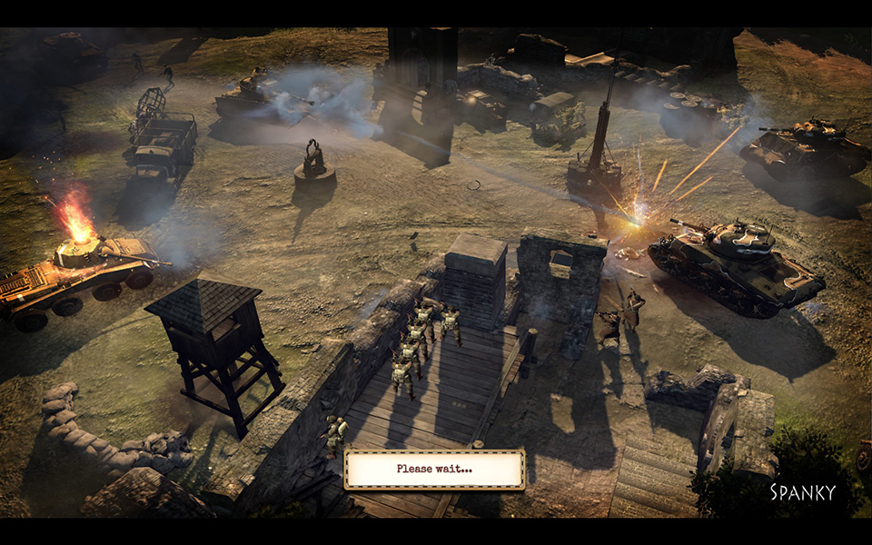
I once had made a map for vcoh, that was called Eindhoven. So i made a fresh polish to it and it went thru alot of changes, basically a different map. I aimed at 1v1 with it, but it seems to be better in 2v2.

Setting


Takes place in a rural area, surrounded by fields, fortress and a bit of forest. For pictures of the map head into the workshop link.

Version: 0.45

! Added more detail.


31 Mar 2015, 07:52 AM
#2
avatar of tuvok
Benefactor 115

Posts: 786

map's in automatch, congrats Spankeh :thumbsup:
31 Mar 2015, 13:08 PM
#3
avatar of nigo
Senior Editor Badge

Posts: 2238 | Subs: 15

congrats Spanky, you deserve that.
1 Apr 2015, 10:47 AM
#4
avatar of Spanky
Senior Strategist Badge

Posts: 1820 | Subs: 2

Thanks guys! Was about time, i can now leave the game with this accomplished. :P

Hope i can fix some stuff with the map if relic agrees.
10 Apr 2015, 23:17 PM
#5
avatar of GreenDevil

Posts: 394

My experiences so far (2v2), I think this map only requires a few tweaks.

The right hand side VP needs its pathing fixed its seems to auto route the south pawn to the north entry point every time.

Both fuel points need to be brought back towards the middle slightly. The right side is not too bad, but the left side feels too far away to even bother trying to harass it from south spawn.

De-clutter the shot blockers, i.e Walls, bush, ditches and choke points around both fuel points. It's far too easy to just lock them down with an MG and few well placed demos, mines etc. Also consider how easy it currently is to just add a few extra strands of barbed wire to completely lock them off.

The map is slightly too wide, but this is touched on earlier.

Remove the houses around the middle. There's no need for two each, maybe put one big house to contest, but that's it. Many houses does not make for good game play around the middle, the fringes of maps are a better location for houses. Alternatively, you could possibly put in some trenches instead. At a minimum the disparity between the quality of houses needs to be fixed, the south spawn has a huge 2 story house with lots of windows when compare with north spawn which has two mediocre houses, one which is a useless wooden death trap and the other a single story house in a pretty useless position. Think about the houses and what you are trying to achieve by putting them there, at the moment they seem to be there for no purpose, especially the north houses.

The left side fuel point needs some work regarding the terrain. The left side design seems rushed and unfinished when compared to the right side. Remove the raised ground with bunkers and ditches and replace it with a house with a farm or something like that. Something that can be contested and fought over needs to go there. As it stands the left side fuel is a freebie for whichever side decides to capture it first, good luck defending it, as it's pretty much unable to be defended in it's current state.

I really think the V shaped walls at the tip of the right side fuel near the munis point needs to be removed and replaced with something like a small fence or a ditch. It's just provides too much of a choke point. I like the look of the mud walls/bombed out buildings, but they really serve no purpose. I think it possible they need to be scaled back. Put one or two small bombed out buildings, but the extent that you have gone to has made the whole area very hard to assault from the North, and easy as pie to defend from the South.

The left side cut off is far more hard to get to and cut off when compared with the right side. THe left side has a fence blocking it and tree lines to go around, where as the right side can simply be cut off by walking down and the road and going into the point and capping it. My point is the left side is a lot easier to defend then the right side. One mine on the north side of the fence to kill the entire squad vaulting the fence is all that is needed on the left side.

Happy to discuss this over TS at anytime.
11 Apr 2015, 02:16 AM
#6
avatar of pigsoup
Patrion 14

Posts: 4301 | Subs: 2

kinda feel a little small for 2v2.
1 user is browsing this thread: 1 guest

Ladders Top 10

  • #
    Steam Alias
    W
    L
    %
    Streak
Data provided by Relic Relic Entertainment

Replay highlight

VS
  • U.S. Forces flag cblanco ★
  • The British Forces flag 보드카 중대
  • Oberkommando West flag VonManteuffel
  • Ostheer flag Heartless Jäger
uploaded by XXxxHeartlessxxXX

Board Info

372 users are online: 1 member and 371 guests
Major Shentypoo
1 post in the last 24h
9 posts in the last week
27 posts in the last month
Registered members: 48810
Welcome our newest member, Laugh461
Most online: 2043 users on 29 Oct 2023, 01:04 AM