Better yet just roll back everything from last 2 years, then we hit the sweet spot
The whole game has now degraded to the point of an unpolished mod with bad art work that you are forced to play
Could CoH 2 do with a cleanup patch?
13 Apr 2020, 11:28 AM
#21
Posts: 129
13 Apr 2020, 11:39 AM
#22

Posts: 1389 | Subs: 1
... with bad art work ...
Is it about UI assets? Then i recommend spread your detailed feedback here: https://www.coh2.org/topic/93861/feedback-on-ui-changes-of-the-game
13 Apr 2020, 12:51 PM
#23
Posts: 129
Is it about UI assets? Then i recommend spread your detailed feedback here: https://www.coh2.org/topic/93861/feedback-on-ui-changes-of-the-game
New tommy smg unit with "SMG" in graffiti font
OKW tiger that doesn't use the skins system
Soviet urban defense commander forward post using UKF forward base model
The new actively selectable UKF medic unit
Custom commander portraits which while nice aren't in line with rest of the designs, don't get me started on how there were perfectly fine unused portraits that were last minute disregarded in favour of custom ones resembling some of the community.
These are just some of the type of content creation that has drastically detracted from the polish of the game, and that the game feels increasingly like a half baked player mod. 2 years ago was around about the time mod team went from tweaking numbers of the game to actively creating content. Don't get me wrong I like new mod content but it should be opt in and not a forced replacement for vanilla while decreasing the finished product feel of the original game.
13 Apr 2020, 14:07 PM
#24

Posts: 1389 | Subs: 1
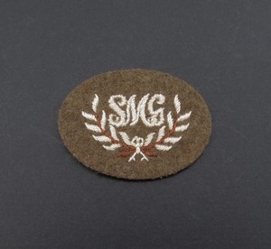
New tommy smg unit with "SMG" in graffiti font
Well, you can adress you complain to British Army, since they used insignia like that for their troops.
These new shieldsymbols are historically accurate,
OKW tiger that doesn't use the skins system
He is not the only one, agreed that it is not good, but it's more about 3D modelling, not art itself.
Soviet urban defense commander forward post using UKF forward base model
They have different model for sure.
Custom commander portraits which while nice aren't in line with rest of the designs, don't get me started on how there were perfectly fine unused portraits that were last minute disregarded in favour of custom ones resembling some of the community.
These are just some of the type of content creation that has drastically detracted from the polish of the game, and that the game feels increasingly like a half baked player mod. 2 years ago was around about the time mod team went from tweaking numbers of the game to actively creating content. Don't get me wrong I like new mod content but it should be opt in and not a forced replacement for vanilla while decreasing the finished product feel of the original game.
If you look at commanders, you will notice, that they are not standardized since 2013. I've proposed my work to make situation better - it was rejected due to low priority, but it still there.

14 Apr 2020, 13:15 PM
#25
Posts: 129
Well, you can adress you complain to British Army, since they used insignia like that for their troops.
He is not the only one, agreed that it is not good, but it's more about 3D modelling, not art itself.
They have different model for sure.
If you look at commanders, you will notice, that they are not standardized since 2013. I've proposed my work to make situation better - it was rejected due to low priority, but it still there.
Just because the British army in real life used it doesn't mean its not a bad design choice for a game icon unit insignia. Since when did real life designs matter anyways, should we swap out obersoldaten signs with swastikas too?
I've seen ur ones where the filters are in line, that looks to me to be atleast a more reasonable effort on the current ones.
14 Apr 2020, 20:59 PM
#26

Posts: 1389 | Subs: 1
Just because the British army in real life used it doesn't mean its not a bad design choice for a game icon unit insignia. Since when did real life designs matter anyways, should we swap out obersoldaten signs with swastikas too?
Bad example, because swastika is forbidden to use. We are speaking here about legal stuff, aren't we?
Real life matter since this game, in terms of design, based on WW2 setting, and you have to accept that. All listed below symbols are based on real symbols as well, and none of them was created by me or other members of the "UI team":
Also, the main goal of shieldsymbol - be UI indicator, which helps you and your enemy understand, which unit is on the screen or which unit are you gonna call-in. From this point of view, this shieldsymbol clearly shows you, that there is infantry section, equipped with SMG.
I've seen ur ones where the filters are in line, that looks to me to be atleast a more reasonable effort on the current ones.
Thank you
14 Apr 2020, 21:41 PM
#27
Posts: 179
Bad example, because swastika is forbidden to use. We are speaking here about legal stuff, aren't we?
Real life matter since this game, in terms of design, based on WW2 setting, and you have to accept that. All listed below symbols are based on real symbols as well, and none of them was created by me or other members of the "UI team":
Also, the main goal of shieldsymbol - be UI indicator, which helps you and your enemy understand, which unit is on the screen or which unit are you gonna call-in. From this point of view, this shieldsymbol clearly shows you, that there is infantry section, equipped with SMG.
Thank you
There are clear differences between the old designs and the new ones though.
The old designs are far cleaner, and make better use of the available white space. The new designs are trying to shove too much into the frame, and it makes it look incredibly busy. Adding the typography doesn't help, as none of the previous icons have them, which makes the new ones look out of place. Even the font is problematic, and looks REALLY out of place when put next to the other icons.
Yes, historical accuracy is great. But if it means we end up with something like this, then I'd prefer we shy away from it. It makes the game more visually confusing to look at, and honestly looks like something a 12 year old would make the first time they got ahold of photoshop.
I have no doubt the UI team could come up with something cleaner if not tied down trying to digitize a patch and make it fit in a 25 pixel, transparent space.
15 Apr 2020, 05:19 AM
#28
Posts: 486
The double chevron Corporal patch of last patch for Assault Sections was EXTREMELY clean and communicative. maybe use other, similar clear badges. Leaving the gun UI on them is still good too, especially the AT tommies. Maybe use the bottom of the Sgt Major chevron for AT Tommies, that has a good use of space, color, and is distinct. Or the Ordinance Sargent.
15 Apr 2020, 08:13 AM
#29

Posts: 4
If you look at commanders, you will notice, that they are not standardized since 2013. I've proposed my work to make situation better - it was rejected due to low priority, but it still there.
Amazing work, thank you. Why didn't relic do this themselves from the start is beyond me.
15 Apr 2020, 10:47 AM
#30
Posts: 129
Amazing work, thank you. Why didn't relic do this themselves from the start is beyond me.
because it wasn't done by relic, the current vanilla game is essentially a mod that overwrites the main game
22 Apr 2020, 14:26 PM
#31
Posts: 309
Really great ideas. Tuning the game up would be awesome
22 Apr 2020, 15:17 PM
#32

Posts: 930
I was going to suggest something like that, a patch with focus on BUGFIXES.
there are still tons in the game, things like british command vehicle ability getting bugged when the vehicle abandon or the 50.cal moving slower on yellow cover.
also all the broken/obsolete tooltips. Even the command tiger who was just introduced is already broken since it says the command aura reduces accuracy.
1 user is browsing this thread:
1 guest
Livestreams
 |
|
|
39 | ||
 |
|
|
10 | ||
 |
|
|
1 | ||
 |
|
|
287 | ||
 |
|
|
18 | ||
 |
|
|
6 | ||
 |
|
|
3 | ||
 |
|
|
2 |
Ladders Top 10
-
#Steam AliasWL%Streak
- 1.43163.872+9
- 2.57980.879+18
- 3.800454.638-1
- 4.313114.733+9
- 5.12744.743+1
- 6.282161.637+1
- 7.371284.566-1
- 8.17773.708+3
- 9.14059.704+7
- 10.17851.777+1
Replay highlight
VS
-
 cblanco ★
 -
 보드카 중대
-
 VonManteuffel
 -
 Heartless Jäger

Einhoven Country


Honor it
14
Download
1356
Board Info
498 users are online:
498 guests
2 posts in the last 24h
16 posts in the last week
75 posts in the last month
16 posts in the last week
75 posts in the last month
Registered members: 53241
Welcome our newest member, Carmenys
Most online: 2043 users on 29 Oct 2023, 01:04 AM
Welcome our newest member, Carmenys
Most online: 2043 users on 29 Oct 2023, 01:04 AM


