I am not sure why this was done but this map went from OK to veto for me.
It´s completly unbalanced now because of how much it favours mobile close to mid range infantry. Before the middle was mainly long range engagements which was good for team weapons which favoured Ostheer and Brits but now it´s full of sight and shot blockers. The factory side was always a unbalanced nightmare for many match-ups but the middle doesn´t compensate for this anymore which is a big problem.
Then you have all the hedges infront of the base which make flanking super easy which again hurts certain factions a lot and helps others which are already strong on the map even more.
Updated Alliance of Defiance
24 Apr 2019, 09:34 AM
#1
Posts: 2458 | Subs: 1
24 Jul 2019, 02:08 AM
#2

 19
19 Posts: 1295 | Subs: 1
Working on some updates to Alliance of defiance now with some updates, gime some feedback boys!
24 Jul 2019, 10:40 AM
#3
Posts: 3032 | Subs: 3
Working on some updates to Alliance of defiance now with some updates, gime some feedback boys!
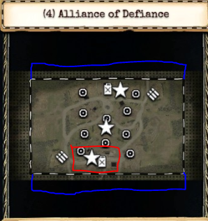
Is it possible to increase the width of the map by a little bit, maybe by 10-20% or so? So basically that there is 2 new paths/sections on this map.
1 at the north (then the north fuel house can get flanked from all 4 sides).
And 1 at south of course, so you have more ways to play around the southern urban section.
So basically the new sections would look like this (BLUE).
I personally also think that the city on the south fuel plays like crap because of all the tall sight- and shotblocking walls (RED)
It makes AT guns super awful to use and CQC units broken on this side of the map. Maybe remove or replace them with something better

sorry if these proposals are too drastical
24 Jul 2019, 11:11 AM
#4
Posts: 2458 | Subs: 1
Very good suggestions. I would also look into removing some of the recently added shot and sight blockers in the middle of the map. They just feel so awkward and out of place. Generally I feel like CQC and mid range units are really too strong on AOD now. That´s probably also why Ostheer is complete garbage on this map and almost unplayable unless you stick to the fuel in the north the whole time.
Maybe look into completely removing the garrison at the northern fuel? IMO rushing garrison in the first seconds gameplay is pretty stupid and was rightly changed on Elst for example. The map has gotten much better because of it.
Maybe look into completely removing the garrison at the northern fuel? IMO rushing garrison in the first seconds gameplay is pretty stupid and was rightly changed on Elst for example. The map has gotten much better because of it.
26 Jul 2019, 02:42 AM
#5

 19
19 Posts: 1295 | Subs: 1
Thanks guys  been debating doing these and many others for weeks now, pulled the trigger on some a while back and tweaking them now, will post pictures soon
 been debating doing these and many others for weeks now, pulled the trigger on some a while back and tweaking them now, will post pictures soon
26 Jul 2019, 04:29 AM
#6

 19
19 Posts: 1295 | Subs: 1
AOD V1.3 changelog. WIP.
https://docs.google.com/document/d/1kLcuc48rOxvzNZU1VKSErBHPUIxbU451J_pN9AKKgvw/edit?usp=sharing
https://docs.google.com/document/d/1kLcuc48rOxvzNZU1VKSErBHPUIxbU451J_pN9AKKgvw/edit?usp=sharing
26 Jul 2019, 08:16 AM
#7

Posts: 19
Permanently BannedAOD V1.3 changelog. WIP.
https://docs.google.com/document/d/1kLcuc48rOxvzNZU1VKSErBHPUIxbU451J_pN9AKKgvw/edit?usp=sharing
Thank you so much for your dedication to makinh great maps!
I’m trying to make my own 2v2 map an I realize now how hard it is. My ground looks like a drawing on my wall from when I was 3
Don’t ask why I still have it
Before and after pics would also be appreciated
PAGES (1)

0 user is browsing this thread:
Livestreams
 |
|
|
19 |
Ladders Top 10
-
#Steam AliasWL%Streak
- 1.831222.789+37
- 2.615222.735-2
- 3.35057.860+15
- 4.1110614.644+11
- 5.276108.719+27
- 6.306114.729+2
- 7.918405.694+2
- 8.262137.657+3
- 9.722440.621+4
- 10.1041674.607-2
Replay highlight
VS
-
 cblanco ★
 -
 보드카 중대
-
 VonManteuffel
 -
 Heartless Jäger

Einhoven Country


Honor it
9
Download
1236
Board Info
820 users are online:
820 guests
0 post in the last 24h
5 posts in the last week
33 posts in the last month
5 posts in the last week
33 posts in the last month
Registered members: 49139
Welcome our newest member, vibhak
Most online: 2043 users on 29 Oct 2023, 01:04 AM
Welcome our newest member, vibhak
Most online: 2043 users on 29 Oct 2023, 01:04 AM


