Login

russian armor

Rzhev Winter 3v3

29 Jul 2018, 02:42 AM
#1
avatar of Rosbone

Posts: 2145 | Subs: 2

A prominent community member has requested this map get looked at.

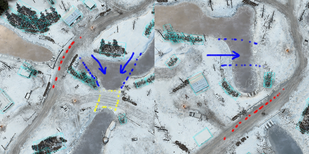
Proposed changes:
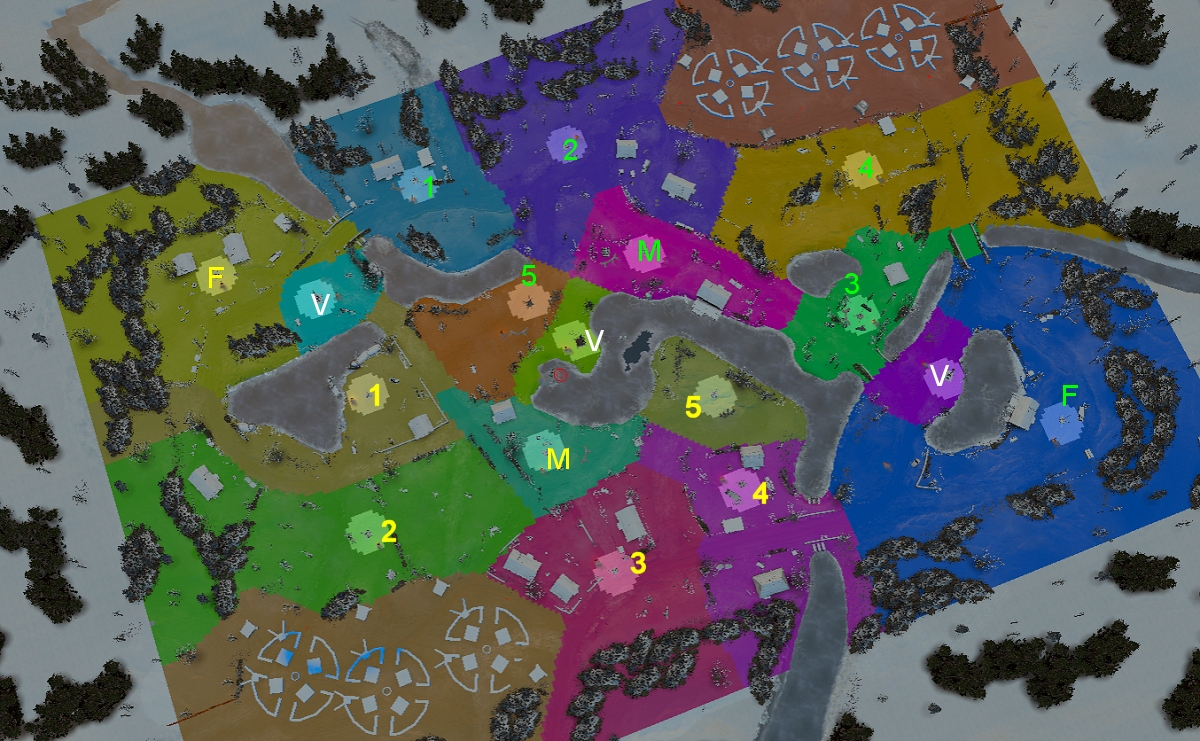
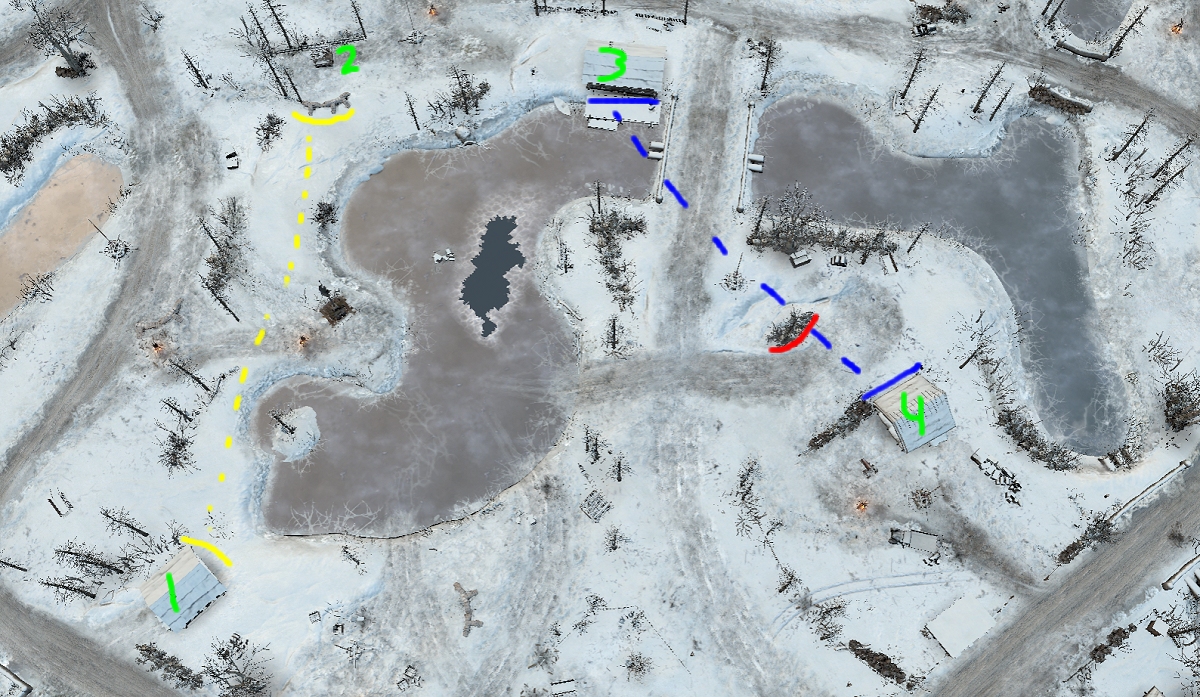
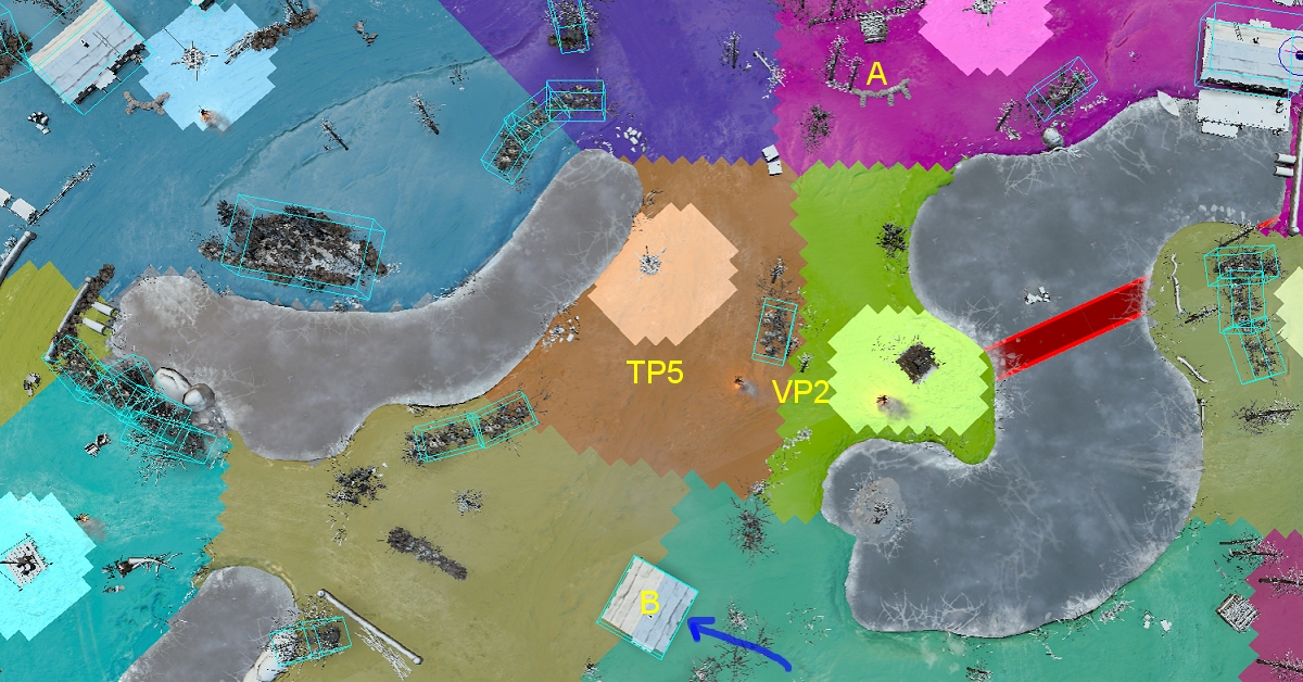
1. Add in the missing territory point (YELLOW 5). Also added sight blocker so point can be contested without house invovlment.


2. Add more land area to middle VP for north. Also added a sight blocker between VP and TP so one MG/AT can not control the whole area.


3. Added some land area (YELLOW) by left VP so north does not have to fight the entire fight on water.


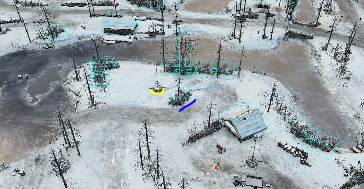
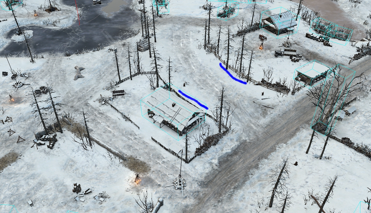
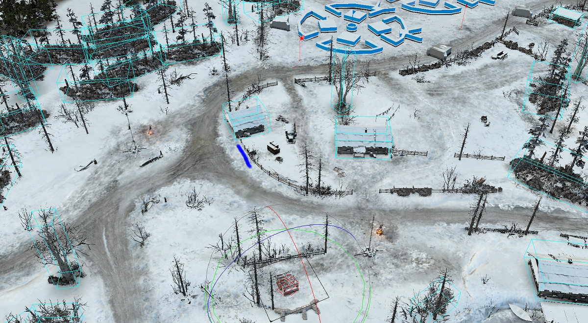
4. Several areas are locked in by fences creating boring dead areas you have to fight around. Fences need new openings (BLUE)


29 Jul 2018, 16:01 PM
#2
avatar of Sturmpanther
Lead Strategist Badge

Posts: 5441 | Subs: 36

jump backJump back to quoted post29 Jul 2018, 02:42 AMRosbone
A prominent community member has requested this map get looked at.


Wondering who is this guy, who cares about 3vs3 and is prominent? ;)

And do a version and i have a look into it.

Yellow
29 Jul 2018, 17:29 PM
#3
avatar of Mongal

Posts: 102

I always veto this map.

They all look like really good changes imo.
29 Jul 2018, 18:57 PM
#4
avatar of nigo
Senior Editor Badge

Posts: 2238 | Subs: 15

You guys are trying to save these horrible maps instead pick new ones from the community or other unused Relic maps.

This is not being done in the interest of the community. I dont know whats the agenda behind on that.


Totally disappointing.
29 Jul 2018, 20:35 PM
#5
avatar of Sturmpanther
Lead Strategist Badge

Posts: 5441 | Subs: 36

jump backJump back to quoted post29 Jul 2018, 18:57 PMnigo
You guys are trying to save these horrible maps instead pick new ones from the community or other unused Relic maps.

This is not being done in the interest of the community. I dont know whats the agenda on that.


Totally disappointing.


Problem is, that the maps i watched from AA were not able to get live in automatch so far. for 3vs3 and 4vs4
29 Jul 2018, 20:36 PM
#6
avatar of MajorBloodnok
Admin Red  Badge
Patrion 314

Posts: 10665 | Subs: 9

jump backJump back to quoted post29 Jul 2018, 18:57 PMnigo
You guys are trying to save these horrible maps instead pick new ones from the community or other unused Relic maps.

This is not being done in the interest of the community. I dont know whats the agenda on that.


Totally disappointing.


Harsh! :(

Rzhev is a fun map, and if the Mappers can make it more balanced, then so much the better, surely? ;)
30 Jul 2018, 00:23 AM
#7
avatar of Rosbone

Posts: 2145 | Subs: 2

(6) RZHEV ROSBONE

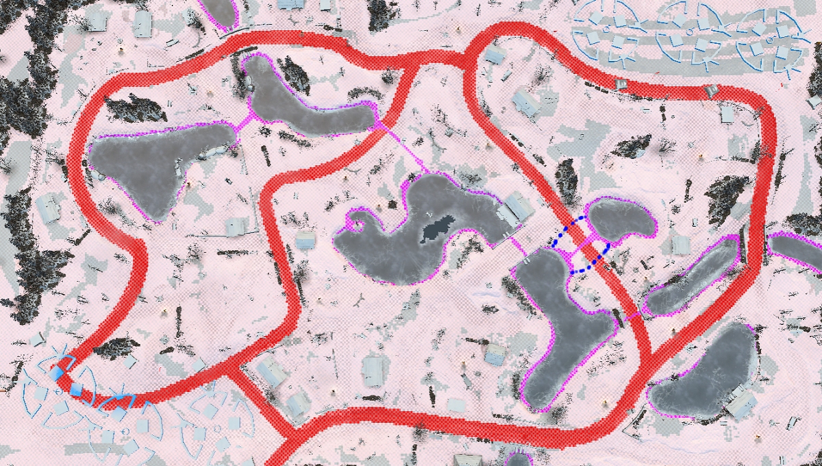
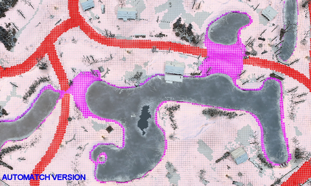
1. When connecting the north territory to the new TP, it was best to connect thru land. Otherwise we would have territory lines under water. It also became obvious that land was needed to keep south from breaking the ice making it impossible to get to the new TP.


2. Cleared several little paths by moving 1 or 2 objects a couple meters, to let AT guns, move thru that area.

3. Reduced the WATER OBJECT count by one and reduced underground water connections in areas to minimum sizes. The purple lines are considered ON WATER and you can not build bunkers, sandbags, etc. In the live version there are two large areas where you cant build.

30 Jul 2018, 07:57 AM
#8
avatar of Sturmpanther
Lead Strategist Badge

Posts: 5441 | Subs: 36

jump backJump back to quoted post30 Jul 2018, 00:23 AMRosbone
(6) RZHEV ROSBONE


3. Reduced the WATER OBJECT count by one and reduced underground water connections in areas to minimum sizes. The purple lines are considered ON WATER and you can not build bunkers, sandbags, etc. In the live version there are two large areas where you cant build.


Point 3.
When i am not wrong on the north side left of the fuel cutoff. You could not sink there. It was a mix between ice and land. Because it got fixed in DBP. But it looked better imo.
30 Jul 2018, 09:21 AM
#9
avatar of Rosbone

Posts: 2145 | Subs: 2

Point 3.
When i am not wrong on the north side left of the fuel cutoff. You could not sink there. It was a mix between ice and land. Because it got fixed in DBP. But it looked better imo.

I do not think you will sink there. It is considered more of a puddle, swamp, or shoreline area. Both of these locations are good spots to build MG bunkers for the north. But you can not.
31 Jul 2018, 09:03 AM
#10
avatar of Loxley

Posts: 223

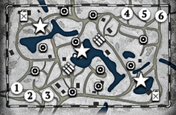
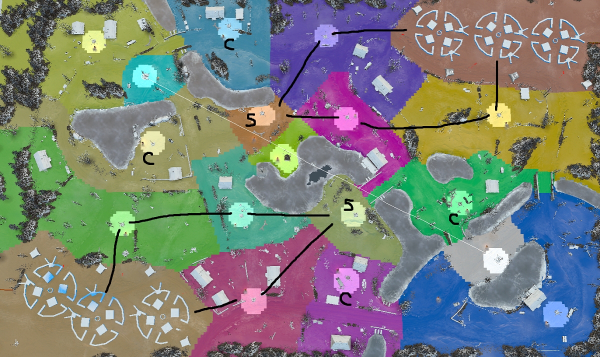
When looking at the picture with the tactical map, I can see that the north side has 4 cutpoints secured (1,2,3,4), the southside has 5 cutpoints secured (1,2,3,4,5yellow).

The 10th cutpoint (5 orange) is also often better defended by southside, so southside has most of the time 6 cuts, while north only 4.

I would move the point 5 orange more to north.
31 Jul 2018, 09:07 AM
#11
avatar of lemmiwinks

Posts: 61

Nigo has a point. I never felt City 17 unbalanced. Why did they take it out? Why did they take out all those maps all? Just give the player the opportunity to veto whatever they want and add all maps. If people don't want to play a map, don't force them! And if they want to play others, let them! I really miss some maps.

Also the south is highly favored on Rzhev atm, I hope the changes will fix that.
31 Jul 2018, 09:25 AM
#12
avatar of Sturmpanther
Lead Strategist Badge

Posts: 5441 | Subs: 36

Nigo has a point. I never felt City 17 unbalanced. Why did they take it out? Why did they take out all those maps all? Just give the player the opportunity to veto whatever they want and add all maps. If people don't want to play a map, don't force them! And if they want to play others, let them! I really miss some maps.

Also the south is highly favored on Rzhev atm, I hope the changes will fix that.


A) no idea what you talk in the resh winter thread about city 17 LUL

B) Resh winter was even worser before. It got already improved. But i am fine with Rosebone changes.
Will look into it deeper and what loxley said this week.
31 Jul 2018, 09:33 AM
#13
avatar of aerafield

Posts: 3032 | Subs: 3

Nigo has a point. I never felt City 17 unbalanced. Why did they take it out? Why did they take out all those maps all? Just give the player the opportunity to veto whatever they want and add all maps. If people don't want to play a map, don't force them! And if they want to play others, let them! I really miss some maps.

Also the south is highly favored on Rzhev atm, I hope the changes will fix that.


You really miss those maps and wonder why they got removed?

City 17 had a ton of balance problems, only the left side was alright. The middle and the right side was a mix of overpowered houses and negative cover(streets) everywhere. And both 2-man teams on each side were so far away from each other... super annoying map IMO.

Lazur factory was a retarded camp map where dynamic play was almost impossible due to flanking routes getting defended very easily. Very boring map.

Montargis Region had horrible resource point design (both fuel depots on same spot, both ammo depots on same spot LOL), 5 VPs!! and a ton of annoying and unnecessary sight and/or shotblockers across the entire map, almost like there was no agenda for the map design of this map, it was a complete mess IMO.

And well, Hill 331 was just Hill 331, that's all that needs to be said :foreveralone:
2 Aug 2018, 12:06 PM
#14
avatar of Sturmpanther
Lead Strategist Badge

Posts: 5441 | Subs: 36

jump backJump back to quoted post30 Jul 2018, 00:23 AMRosbone


1. Why there is green cover for north side??
https://prnt.sc/kdrspx

2. I would move the house more to north side to the fences. and remove the woods things then. This building is very powerful for the bridge. But only for north side.
https://prnt.sc/kdrswv

3. Ice is missing when you start this map LUL xD
https://prnt.sc/kdrtoj

4. On the right side near the new point you put LoS Blockers. I did not checked it ingame, but what kind of vehicles can kill it? Also can Royal Eng blow it away, so that a wickers in the south house has free LoS?

5. I am not sure yet about this new point. You saw what loxley wrote here? I am not sure if i like this point at all. I can see why you want to have it in. But atm i am not convinced yet.

Btw I like the middle with more land :thumbsup:
And the ways on the cutoff points are fine for me as well. Tho it was always funny to put a mine there and then RIP tank xD
2 Aug 2018, 18:19 PM
#16
avatar of Rosbone

Posts: 2145 | Subs: 2

1. Why there is green cover for north side??
2. I would move the house more to north side to the fences. and remove the woods things then. This building is very powerful for the bridge. But only for north side.
https://prnt.sc/kdrswv

The sandbags and bunker(2) mirror the south house(1).
House(3) mirrors house (4). The hedge should be removed so the house by the new bridge is mirrored correctly.


3. Ice is missing when you start this map LUL xD
https://prnt.sc/kdrtoj


4. On the right side near the new point you put LoS Blockers. I did not checked it ingame, but what kind of vehicles can kill it? Also can Royal Eng blow it away, so that a wickers in the south house has free LoS?

Hedges are heavy crush. However you can shoot them with all kinds of stuff to eventually destroy it. Brit engrs will destroy cover. They will not destroy a hedge by itself. So if there are logs, trees, etc nearby then they can destroy the hedge as collateral damage.

EDIT: Brits will destroy hedges the demo just needs to be moved away from the hedge a little. It cannot be placed on impassable areas.


5. I am not sure yet about this new point. You saw what loxley wrote here? I am not sure if i like this point at all. I can see why you want to have it in. But atm i am not convinced yet.
My thoughts:
- Resources are miss matched. Wrong number of resources on map.
- This part of the map is empty. Promotes camping. Forces the boring "Two go left, One go right" everytime.
- The house by the bridge is never used and is visually very cool.

A few little things need to get cleaned up once we agree on the big things.
2 Aug 2018, 21:19 PM
#17
avatar of Sturmpanther
Lead Strategist Badge

Posts: 5441 | Subs: 36


The sandbags and bunker(2) mirror the south house(1).
House(3) mirrors house (4). The hedge should be removed so the house by the new bridge is mirrored correctly.


Hedges are heavy crush. However you can shoot them with all kinds of stuff to eventually destroy it. Brit engrs will destroy cover. They will not destroy a hedge by itself. So if there are logs, trees, etc nearby then they can destroy the hedge as collateral damage.

My thoughts:
- Resources are miss matched. Wrong number of resources on map.
- This part of the map is empty. Promotes camping. Forces the boring "Two go left, One go right" everytime.
- The house by the bridge is never used and is visually very cool.

A few little things need to get cleaned up once we agree on the big things.


- But as you can see if you put a mg in the green cover north side, you have access to the vp and the point left. From the south house you don't have.

- Can you fix the ice in the start?

- I always used the house already in live version in the middle right. Right now with the bridge this building is way more strong. Too strong.

- In live version the fight is around middle vp and the left point yes. So who wins the middle gets 1 more vp and 1 stratagy point as reward.

- About that you say playing right side east is boring. I disagree I have the feeling when i play north side left side. But south east has soo many option to attack :)


3 Aug 2018, 00:51 AM
#18
avatar of Rosbone

Posts: 2145 | Subs: 2

- But as you can see if you put a mg in the green cover north side, you have access to the vp and the point left. From the south house you don't have.
- Can you fix the ice in the start?

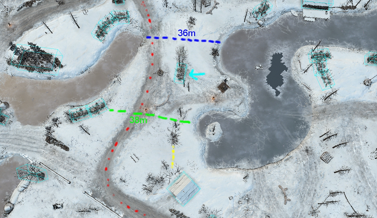
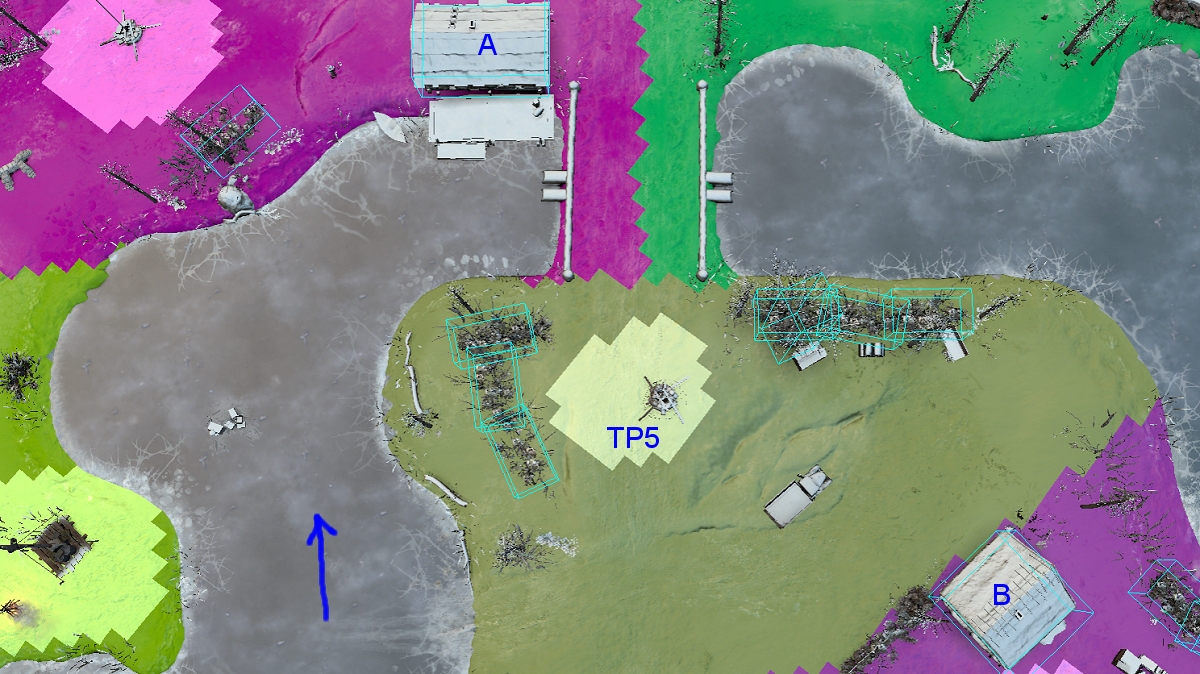
- Moved house B to the left. Both TP5 and VP2 can be taken if MGs are located at A or B. The points are out of range. Each point is around 50m at farthest points from A and B.
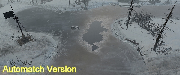
- Also fixed the ice. May want to keep the hole since it shows off the ice refreeze mechanic.


- I always used the house already in live version in the middle right. Right now with the bridge this building is way more strong. Too strong.

- The sight blocker has been removed so both house A and B cover the new TP5.
- Added truck for green cover to mirror the bridge walls.
- Building B was moved North a few meters to get the distances correct.


- In live version the fight is around middle vp and the left point yes. So who wins the middle gets 1 more vp and 1 stratagy point as reward.

- The new TP makes it so you can fight in the middle on a much wider scale. There was never any reason to go east of the middle VP. There were no points. Now you can flank to the right and get a TP for your trouble. Then attack across the water to the left to gain the middle VP. Or push the enemy cutoff to the north east. You have more options than run face first into MGs and AT guns until mortar decides a winner :P
3 Aug 2018, 01:03 AM
#19
avatar of Rosbone

Posts: 2145 | Subs: 2

jump backJump back to quoted post31 Jul 2018, 09:03 AMLoxley
When looking at the picture with the tactical map, I can see that the north side has 4 cutpoints secured (1,2,3,4), the southside has 5 cutpoints secured (1,2,3,4,5yellow).

The 10th cutpoint (5 orange) is also often better defended by southside, so southside has most of the time 6 cuts, while north only 4.

I would move the point 5 orange more to north.

The point was moved north and has been moved a little more north in the latest version. In the original picture post you can see that the point is already north of the "approximate center" of the map (WHITE LINE is from VP to VP). That is why the new TP5 was added south of the white line. The new TP5 in the latest version is more north to balance between buildings now.
3 Aug 2018, 12:20 PM
#20
avatar of Sturmpanther
Lead Strategist Badge

Posts: 5441 | Subs: 36


Its not updated yet or? Can't see it.

- middle vp houses should be ok then, when i see it ingame.
- You convicned me with the ice. Let it there as it was in automatch (sorry^^)
- on the new TP the north house is still too strong. Thats why i said but it back to the fences and remove the small wood things to get place.
It is not only that it covers very well the bridge and co. Units in houses give more View on the battlefield. Or do i miss seeing this?

A. https://prnt.sc/ke8psi

B. https://prnt.sc/ke8qxp
1 user is browsing this thread: 1 guest

Ladders Top 10

  • #
    Steam Alias
    W
    L
    %
    Streak
Data provided by Relic Relic Entertainment

Replay highlight

VS
  • U.S. Forces flag cblanco ★
  • The British Forces flag 보드카 중대
  • Oberkommando West flag VonManteuffel
  • Ostheer flag Heartless Jäger
uploaded by XXxxHeartlessxxXX

Board Info

708 users are online: 708 guests
0 post in the last 24h
8 posts in the last week
37 posts in the last month
Registered members: 49101
Welcome our newest member, Dorca477
Most online: 2043 users on 29 Oct 2023, 01:04 AM