Login

russian armor

1st Crack at Mapping, how does the layout look?

11 Jul 2018, 21:31 PM
#1
avatar of page305

Posts: 26

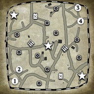
I/m in the draft process of making a map; does anyone see problems with this layout? I'm not looking for top notch balance, I just want to make sure there's nothing glaringly game-breaking. The territory points around center VP are slightly off, this will be fixed to be even.

My main concern is having both resource points on one side in a 2v2 game, is this terrible?

All opinions and criticism welcomed.

Thanks for looking!

Draft 3


Removed cutoffs around corner munitions and distanced cutoffs from base structures.
11 Jul 2018, 22:59 PM
#2
avatar of ShadowLinkX37
Director of Moderation Badge

Posts: 4183 | Subs: 4

Both fuel and munitions cutoffs are almost impossible to push on. You'd basically have to base pin your opponet to even have a shot at the cutoff. This will lead to players just camping the fuel with a single MG and holding it for practically the entire game.
11 Jul 2018, 23:21 PM
#3
avatar of page305

Posts: 26

I very much appreciate your input. Ive made these changes so far: moved corner cutoff outside base to farthest corner from base structure and moved munitions cutoff closer center of map (directly between fuel and munitions.
13 Jul 2018, 10:55 AM
#4
avatar of Lugie
Senior Modmaker Badge

Posts: 327

That layout looks fine for multiplayer. Its all nice and symmetrical and what-not. It should be easier to balance as such.

The real trouble that you're going to face is actually making the guts of the map, heavy cover placement and proper balancing. Once you do that, its even harder making it look good and not obviously the same as the other side of the map.

I dont know what stage of mapping you're at now, but you should always start with the height-map. Its alot easier to build around a near-finished height-map than changing it while building. You'll constantly need to adjust everything and its a pain. Most game-devs get theirs from real locations and modify it slightly.
13 Jul 2018, 12:42 PM
#5
avatar of SupremeStefan

Posts: 1220

jump backJump back to quoted post13 Jul 2018, 10:55 AMLugie
That layout looks fine for multiplayer. Its all nice and symmetrical and what-not. It should be easier to balance as such.

The real trouble that you're going to face is actually making the guts of the map, heavy cover placement and proper balancing. Once you do that, its even harder making it look good and not obviously the same as the other side of the map.

I dont know what stage of mapping you're at now, but you should always start with the height-map. Its alot easier to build around a near-finished height-map than changing it while building. You'll constantly need to adjust everything and its a pain. Most game-devs get theirs from real locations and modify it slightly.

lugie ive got offtopic question what u can say about my map karpacz link below
13 Jul 2018, 14:25 PM
#6
avatar of Lugie
Senior Modmaker Badge

Posts: 327


lugie ive got offtopic question what u can say about my map karpacz link below


Looks good as a fun map, I can see that aesthetic and uniqueness trumped balance during design. It even looks alot better than most workshop maps, good job on the lighting, terrain, and general design. However, there are a few of those early-maker donts.

1. Use more splats! Alot of the ground seems to be samey textures, and because of that the splines look a bit out of place. Almost every workshop map I've seen not done by some really well-known mapper has a distinct lack of splats, and they visually suffer because of that.

2. Its a bit too fuzzy, dont fill every inch of the map with grass (unless its a farm), sparse grass with a good amount of splats looks alot better than spamming either of them, and can keep performance high on older rigs.

3. Use a few more objects, there's plenty to choose from and you can do alot with mixing objects together. Theres a few examples in relic maps that really surprised me, but I cant really explain each one.
13 Jul 2018, 15:07 PM
#7
avatar of SupremeStefan

Posts: 1220

jump backJump back to quoted post13 Jul 2018, 14:25 PMLugie


Looks good as a fun map, I can see that aesthetic and uniqueness trumped balance during design. It even looks alot better than most workshop maps, good job on the lighting, terrain, and general design. However, there are a few of those early-maker donts.

1. Use more splats! Alot of the ground seems to be samey textures, and because of that the splines look a bit out of place. Almost every workshop map I've seen not done by some really well-known mapper has a distinct lack of splats, and they visually suffer because of that.

2. Its a bit too fuzzy, dont fill every inch of the map with grass (unless its a farm), sparse grass with a good amount of splats looks alot better than spamming either of them, and can keep performance high on older rigs.

3. Use a few more objects, there's plenty to choose from and you can do alot with mixing objects together. Theres a few examples in relic maps that really surprised me, but I cant really explain each one.


thank you for your advice
1 user is browsing this thread: 1 guest

Livestreams

unknown 10
unknown 9
Germany 749

Ladders Top 10

  • #
    Steam Alias
    W
    L
    %
    Streak
Data provided by Relic Relic Entertainment

Replay highlight

VS
  • U.S. Forces flag cblanco ★
  • The British Forces flag 보드카 중대
  • Oberkommando West flag VonManteuffel
  • Ostheer flag Heartless Jäger
uploaded by XXxxHeartlessxxXX

Board Info

566 users are online: 566 guests
0 post in the last 24h
8 posts in the last week
34 posts in the last month
Registered members: 49110
Welcome our newest member, jhonnycena0400
Most online: 2043 users on 29 Oct 2023, 01:04 AM