Fields of Winnekendonk
Posts: 38
1. Looks good. Lighting, Overall feel etc.
2. Nice Interesting mid map cutoffs.
BAD
1. Could use a few more sight blockers in Mid so that large axis tanks dont rule the end game.
POSSIBLE CHANGES
1. West VP has buildings, East doesnt. However the buildings are balanced North/South west VP.
2. Corner VPs are a little tight but it breaks up the long range feel of the rest of the map.
3. The ditch/grove between left Cutoff and its next left point feels too long. Would benefit a path between the two. If someone contests the cutoff you have a 2 minute walk to get to it from the left side.
4. Could maybe benefit some small decorative items to be used as sight blockers in mid. To give it more visual pop.
SCORE
9/10 - This map should play very well with a few fixes.
Posts: 42

Posts: 1467 | Subs: 4
As of right now this map seems to favor axis heavily as they should be able to camp the cutoffs no problem and wait it out until heavy armor arrives.

Posts: 2742
My main concern is the location of the fuels. They appear to me just asking for a flak HQ plopping down and an ostheer teammate airdropping resources all day.
I would suggest this:
https://ibb.co/jFkJ6k
The fuels would still be in contestable, but defendable sectors, but aren't also an invitation for a free forward base sector.
The munitions might stand to move as a result, but I think the locations of the fuels might be problematic as they stand currently.

Posts: 1138 | Subs: 2
Thanks to everybody giving feedback as that helped enormously in improving the map! I think I incorporated most of the suggestions in the past rounds. I’m currently working on an updated version using the latest feedback. Great to be able to respond to the comments now

The spoiler contains some background on the map, in case you are interested.
So, on to the most recent feedback:
- The north base needs to cross negative cover roads to reach two of the 3 victory points making it harder to do so
- The trees lining the middle road seem to be a bit much, making Light vehicle pathing a bit frustrating in those areas
- Road has been placed near one of the southern map entry points allowing for faster movement from there
- I wouldn’t mind seeing munitions, fuel, and victory points spread out a bit more instead of all being crammed in the corners. Nice cutoff territories to try and draw the focus to the mid a bit and balance this out
Re 1: Well, not sure how you count… Anyways, I blew up the smaller street close to the east VP now, which could help both sides depending on the situation:
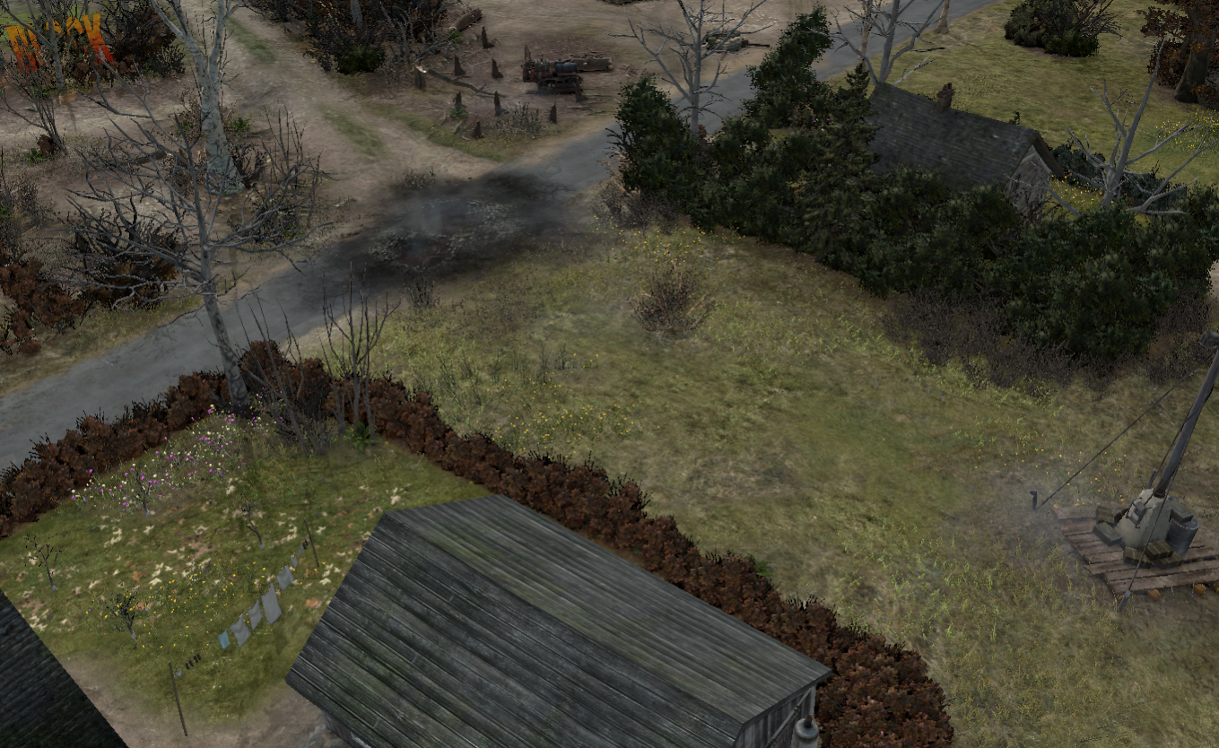
Re 2: I removed some poplars lining the eastern dirt road now, and respaced some of the trees along the main road to improve pathing. Is this more of a general concern or did somebody actually experience problems there when actually playing on the map?
Re 3: Ok, I fixed this in the new version.
Re 4: Yeah, well, as you write the idea is to balance that by the placement of the cut-off. I’m open for suggestions, but I feel that when they would be moved closer to the bases, they would be too hard to contest for the other team. On the other hand, when moving them towards the center, the side with the better long-range units would have an easy time securing them.
after playing this map 3 times in the tourney, im pretty sure its my favorite. Fairly balanced and some nice cutoffs for high level gaming! I will vote for it and hope it will make it into the live game! great work and thanks for your effort! Just one thing to have an eye, i noticed the green cover in the mid is favorable for the north spawn, had a hard time find good natural cover from south for contesting and controlling mid VP
Thanks! It was pretty exciting seeing you play on this map.
Regarding the cover situation in the center: That is actually supposed to be reasonably symmetric. I had a look into it again and found that indeed on piece of cover for north was about 2 meters closer than the equivalent piece in the south. So after some slight adjustments, I have this:
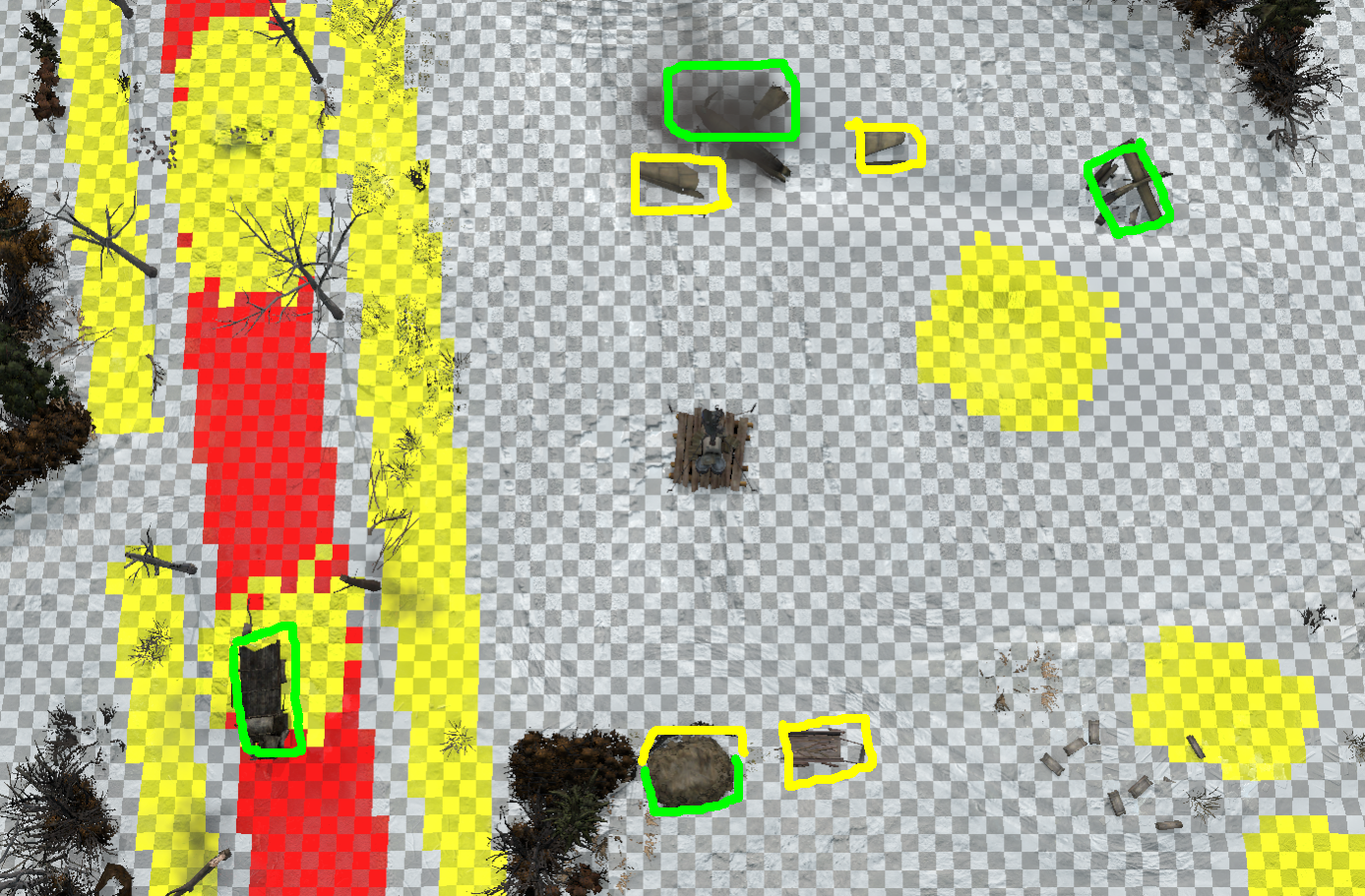
The dung heap in the south is supposed to mimic the planewreck in North. You’d think this works? Or, what doesn’t work about the dung-heap in the current workshop version?
Also – not really related – I was thinking about the strategic points east and west close to the sheds: Currently, they are cut-off by the main fuel cut-offs that you fought over during your matches. I’m thinking about moving the sector boundaries so that cut-off would not cut this point off, only the fuel and points beyond that. This would make being cut-off on this side less punishing.
I guess this would make the map more accessible for the average players; would you think this would be detrimental for high-level play?
Ah, well, I think I found and removed the last remaining splines/splats that produced the snow splashes. Well, you live and learn

I know you guys think that I need to work on the blending and put in more splats and recolor stuff (even though I hope I improved on that front compared with the earlier rounds). Not sure how to go about this, maybe you have some concrete examples of what where I can improve stuff?
Another change I made in current (not-yet-live) version is that I removed the small house on the southern edge of the map. I was never sure if that actually existed already but the new aerial photos show that instead there was a formal farmhouse garden (complete with the typical crossshaped paths, in case you are into gardening
 ).
).Given that the house didn’t have much function anyways, I changed the area to look like this:
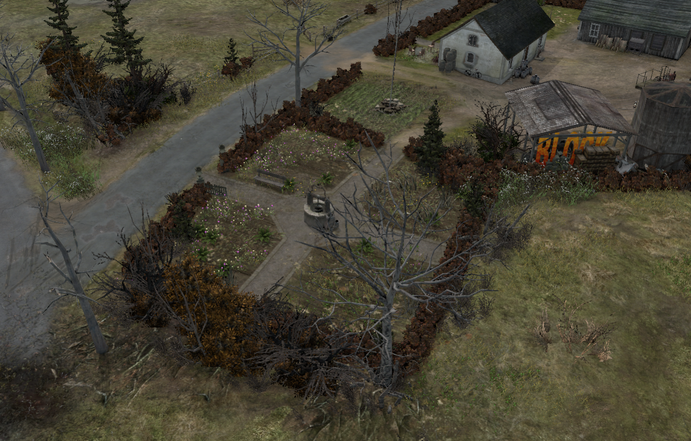
Anybody thinks that that is a problem gameplay-wise?
I also adjusted some parts of the downtown Winnekendonk area in the OOB parts to match the photos and changed the lighting a little bit to give it more of a "dusk" feel.
Posts: 33
Posts: 2159 | Subs: 2

Posts: 1138 | Subs: 2
I like the idea of replacing the house right with some fancy garden, sounds good.
Well, given that the map is supposed to represent early March, so that would be a bit to early for lavish flowers and stuff

Any comment regarding the revised cover situation in mid and the question regarding the strategic point above?
Do not forget, since the contest is over, you could update this on your steam account after changes so people can play it and look around in it. Link?
The idea is good, but I would be afraid that there could be a general mixup between different versions. But the version in the Relic collection has now been updated -> link.

Posts: 1138 | Subs: 2
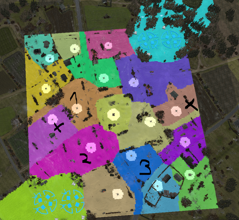
Now the areas marked with scribbled "X"s are not behind the secondary cutoffs (the "1" marks the one for the southern team). It is still behind the main western cutoff (marked with "2"). I figure this makes the map somewhat more digestable for less experienced players, hopefully while not making it less attractive for top teams.
I still have 1-2 days to change it back, so feedback as always appreciated

[some remarks regarding cover around the cut-offs and the fuel points]
First regarding the cut-off cover: Should be more or less symmetrical for both sides; the defending side has green cover, the attackers either can stay at distance in yellow cover, close in and capture while standing in yellow cover, or charge even farther into an awkward position with green cover.
Regarding the fuel:
The western fuel point:
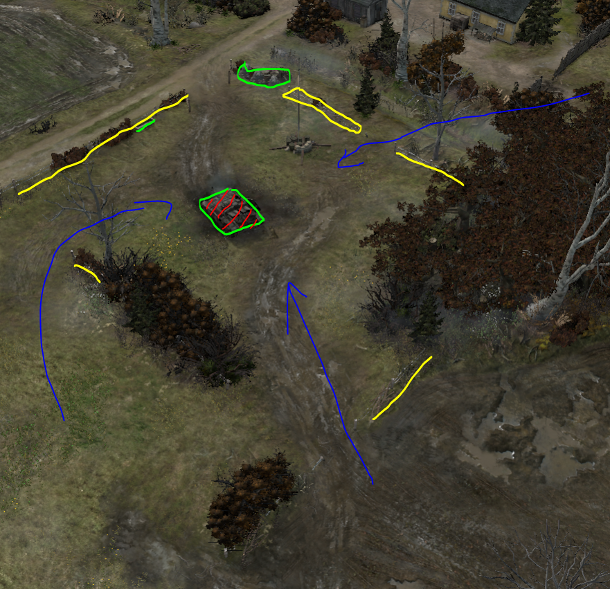
Sturmpanther's concern there was that the green cover for the Northern team (the piles next to the ditch) are too small, but once that team would push up to the tank wreck, it would be hard for the Southern team to push an MG away.
I added some more piles to improve the cover for the North, but rotated and moved the tank slightly to make it less easy to use. More importantly, I added a hedgerow in the meadow that provides an additional flanking route for the southern team (blue arrows), similar to the situation in the East.
The eastern fuel point:
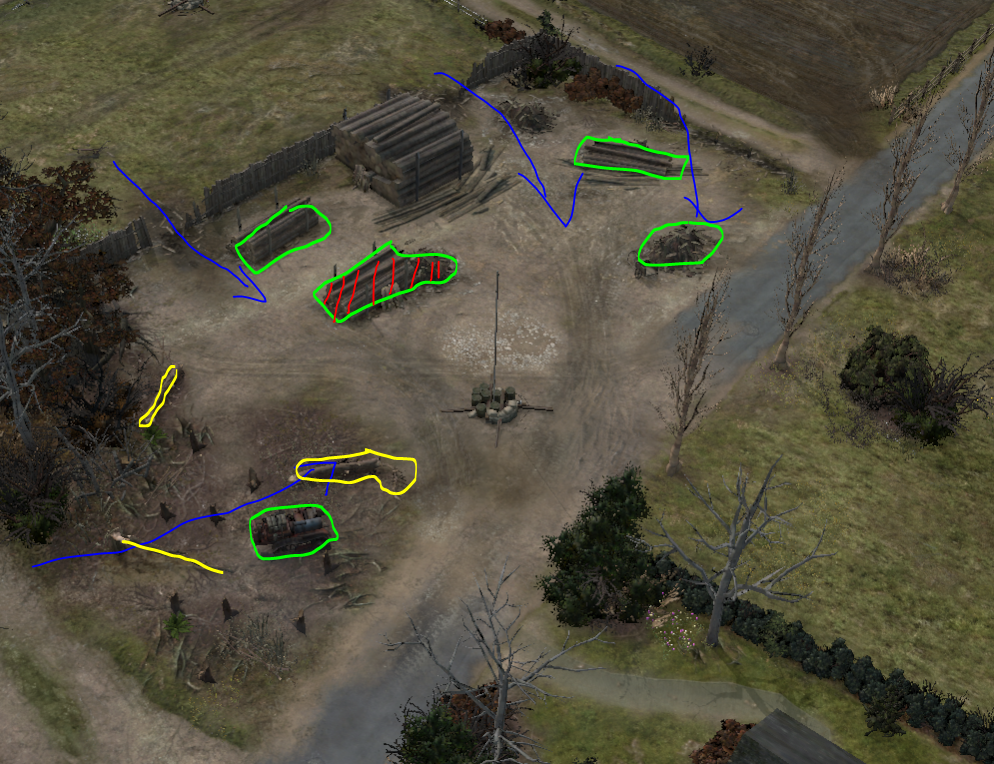
Before the capture circle was partially on the street, I change the situation so that there is no red cover in the capture circle anymore.
The tractor in the front is supposed to mimic the piles in the west; the hatched logstack basically is what the tank wreck is on the other side.
Note that on both fuel points there is yellow cover within the capture area which can be used by either side (yellow boxes).
Comments?
Posts: 2723 | Subs: 1

Posts: 5441 | Subs: 36
A) I understand this right?
So the strategypoint with "X in your map" are not connected to your basearea with sector 2.
In live version the big fuel cutoff ( nr1) was cutting the X as well?!
If so, then yes this changes make it more friendly to get some more ress. Fine for me
B) Not sure, why on both fuel you edited 1 green cover with red lines. For what does this red lines are? What you want to say it with that^^

Posts: 1138 | Subs: 2
A) I understand this right?
So the strategypoint with "X in your map" are not connected to your basearea with sector 2.
In live version the big fuel cutoff ( nr1) was cutting the X as well?!
Yep.
If so, then yes this changes make it more friendly to get some more ress. Fine for me
Good, thanks
 I guess it also makes the layout of the cut-off more intuitive which most likely is a good thing.
B) Not sure, why on both fuel you edited 1 green cover with red lines. For what does this red lines are? What you want to say it with that^^
Ah, ok. Well, I just wanted to say that the two hatched blocks of green cover are supposed to be functionally equivalent. Like, the hatched tank wreck is in the west is supposed to be similar in function to the hatched log-stack in the east.

Posts: 2742
Those points near the base seemed particularly hard to get to as well as being prime FHQ sectors for at least OKW trucks. However, so long as the "#2" sector and its counterpart remain cutoffs I think the sector shift is just fine.
So, essentially, all changes you've made seem for the better.

Livestreams
 |
|
|
48 | ||
 |
|
|
13 | ||
 |
|
|
67 | ||
 |
|
|
5 | ||
 |
|
|
2 | ||
 |
|
|
2 | ||
 |
|
|
1 |
Ladders Top 10
-
#Steam AliasWL%Streak
- 1.43163.872+9
- 2.59482.879+8
- 3.13644.756+10
- 4.14839.791+7
- 5.286162.638+4
- 6.18151.780+4
- 7.313114.733+9
- 8.14265.686+10
- 9.388260.599+2
- 10.14059.704+7
Replay highlight
-
 cblanco ★
 -
 보드카 중대
-
 VonManteuffel
 -
 Heartless Jäger

Board Info
3 posts in the last week
50 posts in the last month
Welcome our newest member, Vraden25
Most online: 2043 users on 29 Oct 2023, 01:04 AM


