Visuals
The minimap is amazing, Loading screen image could be better, there is not much going on, Ui covers most of the action.
Color tone and the atmosphere is amazing, it really captures the spirit of a dawn in autumn. There could be a tad more orange tones, like the ones in the minimap to support the autumn look. The map has great details, areas look different and especially the forest roads look amazing. Over all visually the map is already one of my favorites.
Now, onto the fog. After a while, it gets really annoying, because you can´t see your units clearly and you have to zoom in, to actually get a clear picture. On the other hand, it really gives the map atmosphere so I would advise against outright removing it. I don´t know if it's possible, but if so, I would make it go away after 3-4 min. And maybe change the light to become warmer over time, to simulate sunrise. Another option would be to let the fog appear for a short amount of time during the match (like the blizzards).
Gameplay
I played only one match so far, (more will definitely follow) but it seems to be rather balanced. No major buildings, no excessive red cover etc. Pathfinding is also astonishing good, even with all the small roads, trees, etc. That's probably because of the almost nonexistent green cover.
Despite the look, there are some parts, that are rather open (mid for example) so Ostheer is not completely redundant. I still feel, that close quarter units have an easier time here, but not to an unreasonable amount. Transitioning from top to bottom is a bit complicated, so playing together with a teammate is definitely possible but not really supported by the map.
There is also a lot of flanking potential, (medium tanks shine).
One part I noticed, is how the left side enters the bottom resource area. The player always has to go throw a small choke (red in the picture). Also, enemies can just hide behind the trees on the VP (black) which gives an unfair advantage to the right side. Additionally, the top fuel is way more open to the right side, thus coordinating attacks is easier.
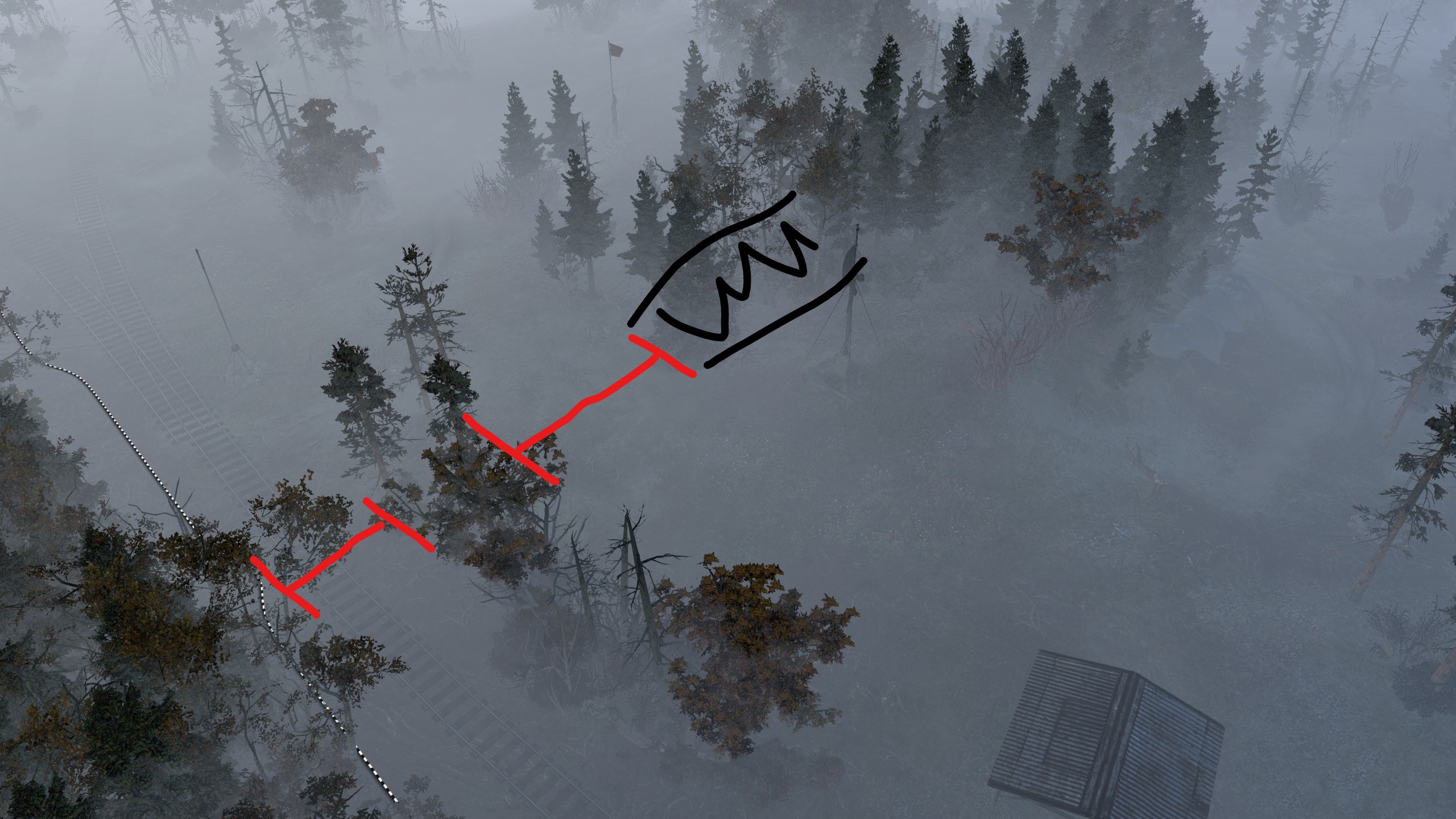
Overall, the map played nicely and had a fresh feeling. It needs more testing, but all in all a very polished and promising map.
Here is the replay if someone is interested. It was with FPB 1.2.
Ponary Forest 2vs2
19 Aug 2017, 15:29 PM
#1
2
Posts: 194
19 Aug 2017, 19:07 PM
#2
Posts: 1467 | Subs: 4
From the screen it looks like the fog might be a bit rough too. Myself and VonIvan should be playtesting this tonight and post any follow ups.
20 Aug 2017, 00:45 AM
#3
Posts: 1467 | Subs: 4
Played it, and that south VP is very very hard to get from either side at first, but then you realize that the building holds the vp and well, you're never going there again. Will upload a replay of the game shortly, other than the serious B4 RNG it was fun, think a few changes and it would be pretty good.
Overall I liked how you can get huge engagements in the middle area from the corners of the map when all players come together. Was hectic and allowed some really nice flanks that wouldn't at first be obvious for the map.
21 Aug 2017, 02:29 AM
#4
Posts: 38
GOOD
1. Map has a very real but playable forrest feel. Very hard to pull off as pathing goes with all of the trees etc.
BAD
1. Some of the very tall groves obscure the lane that is behind them. Maybe replace a layer of tall trees with smaller ones if possible.
2. Needs some scrub or grass around the naked buildings for artistic reasons.
3. North and South VPs do not appear balanced. South has grove around it making it easier to take from south. I will rewatch the replays posted above and see if that is the case.
POSSIBLE CHANGES
1. Maybe replace the large oak tree south of the north VP for obscuring view below it. Again peel a layer of tall trees off if possible.
2. The ground fog is a little dense and abruptly cuts off about 15 ft up. But this adds to the ambience so I would not remove it. Maybe tweak it a little if possible.
3. There are virtually no shadows, which is probably very realistic to light scatter in the fog, but in the game engine it disconnects the units from the ground so they appear to float. This may be an issue with the ground fog itself and cannot be changed? In that case I would leave it alone
SCORE
9/10 - This map is very unique in its presentation and also seems to really allow for the preferred method of play. There are numerous flanking options. This is very much a players map.
PAGES (1)
0 user is browsing this thread:
Livestreams
Offline
Ladders Top 10
-
#Steam AliasWL%Streak
- 1.831222.789+37
- 2.34957.860+14
- 3.587215.732+2
- 4.1098613.642+2
- 5.280162.633+8
- 6.305114.728+1
- 7.916405.693-2
- 8.271108.715+22
- 9.721440.621+3
- 10.1041674.607-2
Replay highlight
VS
- cblanco ★
- 보드카 중대
- VonManteuffel
- Heartless Jäger
Einhoven Country
Honor it
9
Download
1231
Board Info
650 users are online:
650 guests
3 posts in the last 24h
6 posts in the last week
38 posts in the last month
6 posts in the last week
38 posts in the last month
Registered members: 49057
Welcome our newest member, maservices
Most online: 2043 users on 29 Oct 2023, 01:04 AM
Welcome our newest member, maservices
Most online: 2043 users on 29 Oct 2023, 01:04 AM