Poltawa
Posts: 955
Other than that, this map looks very promising, quite wide to prevent frontline-forming, a decent amount of sight blockers to allow some CQB and bases are close to the combat zones. Also, lots of no/red cover wont hurt either (if you´re not a blobber)
Posts: 38
Posts: 42
Posts: 38
1. Looks good.
BAD
1. Fix the obvious wheat mounds that are owned by North so things are VIS when they shouldnt be.
CHANGES
1. The long ditch lanes on sides appear to block VIS? They are deceiving. Maybe put some large hedgerows along fence to help players know they cannot shoot thru that area.
2. A few points have shrubs etc that pull INF from taking points.
3. The base bunkers could be better. You can attack buildings without being shot at. The massive size of the USF base makes this a PITA. Sometimes you need to put bunkers in the middle of a opening which creates pathing issues later
4. The buildings on the side VPs may become an issue. They are setup so each side has better access to them. Cool idea but, if someone pushes your VP early game they could easily have two well protected VPs and its GG for you. This may create the annoying "Rush to the middle" footrace that ruins this game. It removes tactics and creates randomness in a game that already has way too much randomness.
Posts: 1467 | Subs: 4
Outside the hay stacks giving site, the map plays pretty well.
However the spacing near the buildings needs opened up where there are hedges blocking site (in a few cases) this is because vehicles on tracks will have to stop and turn because the pathing is a little tight (this is negated if they have heavy crush)
The ditch in the south east also needs to be made more clear that it blocks pathing to mimic the height elevation on the west side.
The height elevation wasn't used, so i wouldn't worry about it being anything crazy that impacts games, and it also provides a nice flanking route if they other team is entrenched there.
The other thing is that there is one single cutoff, this could potential lead to very early aggression centered entirely around the cutoffs and leading to the game being over very fast if it is successfully camped by the opposing team.
So far I've really enjoyed the map.
Posts: 2742
The buildings on the edges of the map are so close that they constrain and block vehicle pathing.
I'm not sure this is an intentional design, but the impassable, sight and shot blocking nature of garrisons make them pretty integral parts of gameplay. Not being able to maneuver around them due to map borders is a little frustrating.
I'm not a fan of how the top generic resource point by the windmill exists half out-of-bounds.
At first I didn't like the dreary look to the map, but I'm actually a fan of it after looking at it a bit. The ingame visuals look nice against that canvas.
Posts: 3
Posts: 1138 | Subs: 2
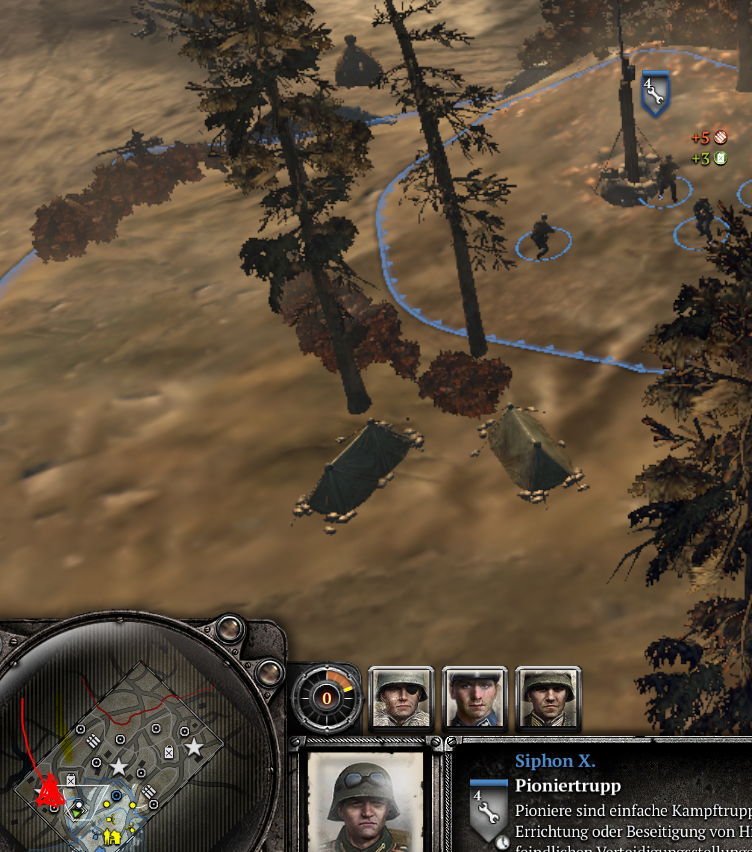
Two minor comments:
The tents result in funny symbols on the map when you have line of sight to them:
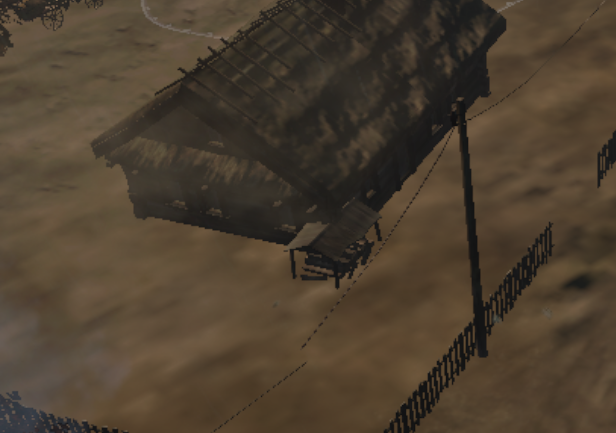
Also, not sure if it intentional that the wood shack is stuck halfway in one of the houses:
Posts: 5441 | Subs: 36
Nice map
Two minor comments:
The tents result in funny symbols on the map when you have line of sight to them:
Also, not sure if it intentional that the wood shack is stuck halfway in one of the houses:
About the first picture.
Sorry, but you are not up to date^^
I found that mistake already and it got fixed before the 2vs2 cup started
Posts: 1554 | Subs: 7
Posts: 31
Posts: 301
Livestreams
38 | |||||
30 | |||||
5 | |||||
131 | |||||
19 | |||||
6 | |||||
4 | |||||
2 | |||||
1 | |||||
1 |
Ladders Top 10
-
#Steam AliasWL%Streak
- 1.831222.789+37
- 2.34957.860+14
- 3.589215.733+4
- 4.1101614.642+2
- 5.305114.728+1
- 6.916405.693-2
- 7.271108.715+22
- 8.721440.621+3
- 9.1041674.607-2
- 10.17146.788+1
Replay highlight
- cblanco ★
- 보드카 중대
- VonManteuffel
- Heartless Jäger
Board Info
8 posts in the last week
38 posts in the last month
Welcome our newest member, 23winlocker
Most online: 2043 users on 29 Oct 2023, 01:04 AM