Login

russian armor

Close Quarter Combat sections of maps

4 Nov 2016, 09:28 AM
#1
avatar of Siphon X.
Senior Editor Badge

Posts: 1138 | Subs: 2

Ok, as we know there are units that fare better at short ranges, while other are better at long ranges. New maps typically try to have areas where both sorts of units can shine.

Now, it's quite obvious what the ideal area for a long range unit would be: Just a flat area without any obstacles. Conversely, CQC units should be happy in a heavily build up area (like a city), right?

Well, I think it's not as simple, and my feeling is that certain layouts are frustrating for both sides...

Here are a couple of sketches, how a build up area could look like:
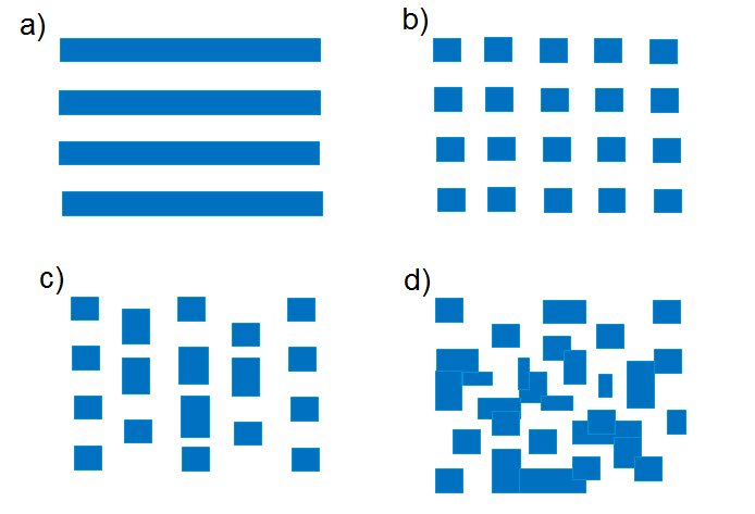


The blue boxes could indicate buildings or other sight and shot blockers.

Example a) has a lot of shotblockers, but obviously is not a good map for CQC units because there lanes without any flanking routes, so a CQC unit would be spotted and shot at from a distance already.

Now, example b) has lots of flanking routes (this looks much like the original Stalingrad). Is it the ideal CQC map? I'd say no, because a unit parked on a corner of one intersection will still have long sight axes. Every unit trying to creep up has a high chance of being spotted. So, parking a long range unit at suitable corner would still make it hard to flank it without the other player noticing. However, as soon as the long range unit starts to move around, there is a chance of encountering a CQC unit around the next corner.

So, I'd say this kind of layout is actually quite frustrating regardless of what type of unit your are using. It's bad for long range units as they have to fear being demolished as soon as they move around the corner, but short range units have problems closing in to long range units undetected. So in effect both types of units would be parked somewhere, the CQC unit around a corner for an ambush, the long range unit at an intersection. Doesn't sound like a lot of fun, eh?

Now, c) with a staggered pattern in one direction: Ok, somewhat better, assuming that the bases are left and right. I varied the lengths of the blockers to not create new diagonal lines of vision. Still, the there are long lines in N-S direction, so getting from left to right without being seen anywhere will be tricky. So while maybe a bit more CQC-unit friendly than a), the problem is still there for both types of units when moving E-W.

In d) I tried to create a pattern that has no long lines of vision while still retaining at least three paths to get from left to right. To me this seems like a CQC unit heaven where long range units have little business of being around.

A positive side effect: d) is much closer to what European cities look like :)

Makes sense, or complete nonsense, what do you think?

Edit:

My hypothesis is merely that a layout like b) and some extend c) isn't as great for CQC units as one might think and in fact awkward to move around in for all sorts of units and therefore probably should be avoided.

If you you want to include a CQC part in a map, I'd say it should more look like d).
4 Nov 2016, 14:27 PM
#2
avatar of Vuther
Senior Moderator Badge

Posts: 3103 | Subs: 1

Wouldn't d) be a poor choice for a map because CQC are greatly favoured there though?

...and probably because vehicle pathfinding would give us all cancer.
4 Nov 2016, 17:16 PM
#3
avatar of ZombiFrancis

Posts: 2742

D is a good choice for one corner of a map surrounding something like a munitions point. It's a good design for a CQC section of a map, but not for the whole map.

There should be a city park, an empty field, or a series of entirely passable rubble adjacent.

But there's something to keep in mind, sight blockers, shot blockers, and finally buildings are HUGELY different. Many sight blockers can be destroyed and crushed, many shot blockers can't until at least the endgame, and buildings, even destroyed ones, are permanent impasse. Not to mention garrisoned buildings offer intense bonuses to sight, range, and mobility that other blockers down.

For instance, if in D, that isolated square in the bottom center was a strong building, there'd be an obvious imbalance in the buildings that would be intensely unpopular.
4 Nov 2016, 18:33 PM
#4
avatar of ferwiner
Donator 11

Posts: 2885

For anybody interested, here is how the center of real european town/city with medival history (magdeburg law) would look like. Quite a lot of garrisons and quite close quarter if you ask me, but also some long lines in the market. Not a single one through the whole area though. Mind that the streets that go out of the map would usually also end with triangular crossings, shortening long, as would seem, lines of sight even more.

4 Nov 2016, 18:42 PM
#5
avatar of Siphon X.
Senior Editor Badge

Posts: 1138 | Subs: 2

jump backJump back to quoted post4 Nov 2016, 14:27 PMVuther
Wouldn't d) be a poor choice for a map because CQC are greatly favoured there though?


D is a good choice for one corner of a map surrounding something like a munitions point. It's a good design for a CQC section of a map, but not for the whole map.


Totally agree, I wasn't advocating a whole map that would look like d). It's more about that I think b) isn't fun for both long and short range units.


jump backJump back to quoted post4 Nov 2016, 14:27 PMVuther

...and probably because vehicle pathfinding would give us all cancer.


Yeah, and the retreat paths...

But I guess if this is only a smaller section around maybe a munitions and/or victory point it's probably not too bad (plus, the streets could still be wide enough so that vehicles can get through).
4 Nov 2016, 18:54 PM
#6
avatar of Australian Magic

Posts: 4630 | Subs: 2

For me case is simple.
None map should favour only long range units or only mobile units or static units or close range units etc... etc.. etc. (RIP new city maps).

Perfect example is Angoville.

Amazing map.
Divided almost perfectly between wide, open spaces and smaller ones with buildings. Great map.

Second map is Arnhem. Middle is really cluster, great for flanking, and mid-close range units while flanks remain open.

Each map needs some balance between sections but none of them should give advantage.
1 user is browsing this thread: 1 guest

Livestreams

Offline

Ladders Top 10

  • #
    Steam Alias
    W
    L
    %
    Streak
Data provided by Relic Relic Entertainment

Replay highlight

VS
  • U.S. Forces flag cblanco ★
  • The British Forces flag 보드카 중대
  • Oberkommando West flag VonManteuffel
  • Ostheer flag Heartless Jäger
uploaded by XXxxHeartlessxxXX

Board Info

805 users are online: 1 member and 804 guests
eventquip
0 post in the last 24h
5 posts in the last week
33 posts in the last month
Registered members: 49138
Welcome our newest member, trevinehickman
Most online: 2043 users on 29 Oct 2023, 01:04 AM