Login

russian armor

(2 - 4) Demjansk Pocket

18 Dec 2013, 20:34 PM
#1
avatar of ofield

Posts: 420

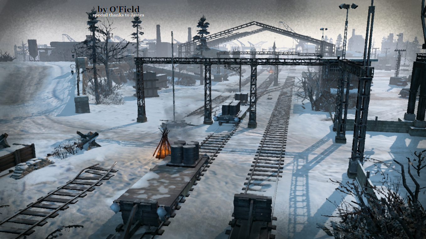
My new map. It's supposed to be a good competitive map, so i'd be glad to get as much feedback as possible, espcially regarding balance.


Map description:With the start of winter and impending defeat at the gates of Moscow, the Wehrmacht was forced into a defensive position. Finally gaining the initiative, the Red Army began a series of counter-attacks and managed to successfully encircle a large concentration of German troops in what became known as the Demjansk Pocket. As at Stalingrad, the OKW ordered all units to stand their ground and repel the Bolsheviks. Supplied by the Luftwaffe and aided by inclement weather, the Wehrmacht dug in, awaiting the inevitable...

Steamworkshop


18 Dec 2013, 22:08 PM
#2
avatar of Slavy87

Posts: 20

Looking good, will give this a shot!
19 Dec 2013, 11:36 AM
#3
avatar of Brick Top

Posts: 1162

Looks good, I'll play some games with you if you'd like?
19 Dec 2013, 11:48 AM
#4
avatar of Strummingbird
Honorary Member Badge

Posts: 952 | Subs: 1

It's a pity people don't seem to be using the custom map testing group... it would make testing maps much easier.

Speaking of this map I'll gladly playtest it with anybody willing. My profile's http://steamcommunity.com/profiles/76561198047219124, add me if you want a game :)
19 Dec 2013, 15:36 PM
#5
avatar of ofield

Posts: 420

It's a pity people don't seem to be using the custom map testing group... it would make testing maps much easier.

Speaking of this map I'll gladly playtest it with anybody willing. My profile's http://steamcommunity.com/profiles/76561198047219124, add me if you want a game :)


There is a testing group?

Well whoever is willing to test with me, can add me, just go on the workshoppage you'll get from to my profil from there. It's easier for me this way than asking each person for his/her steamname.
21 Dec 2013, 12:51 PM
#6
avatar of ofield

Posts: 420

I've released a couple of updates since the 1st release here is the change log:

Code

Changed minimap (looks more official now, see steamworkshop for this)

Territory_point objects replaced with territory_point_mp. So the map is now using the default territory points for mp maps, this effects the resource income and sets it to the same level as on official maps (less resources than before).

Changed sector layout: Added more cut-offs to increase the strategical value of some sectors.

expanded base sector and changed mapentry points to avoid that vehicles get stuck in the base.

removed several objects that blocked shots but not LOS. Their shot-blocking effect was uninteded and so they were replaced with other objects.

Several balance changed:

Added additional ways to improve the game flow for starting positions 3/4.
Edited buildings damage state.
Ex-/changed buldings, their facing and accessibility to achiev a better balance.

Removed several visual and gameplay glitches.


As always i'd be happy if you can provide feedback.

I am currently in vacation so i can't play and test it on my own :)
21 Dec 2013, 13:15 PM
#7
avatar of OnkelSam
Honorary Member Badge

Posts: 1582 | Subs: 4

only had a quick glance, but it looks like a solid map, also aesthetically...

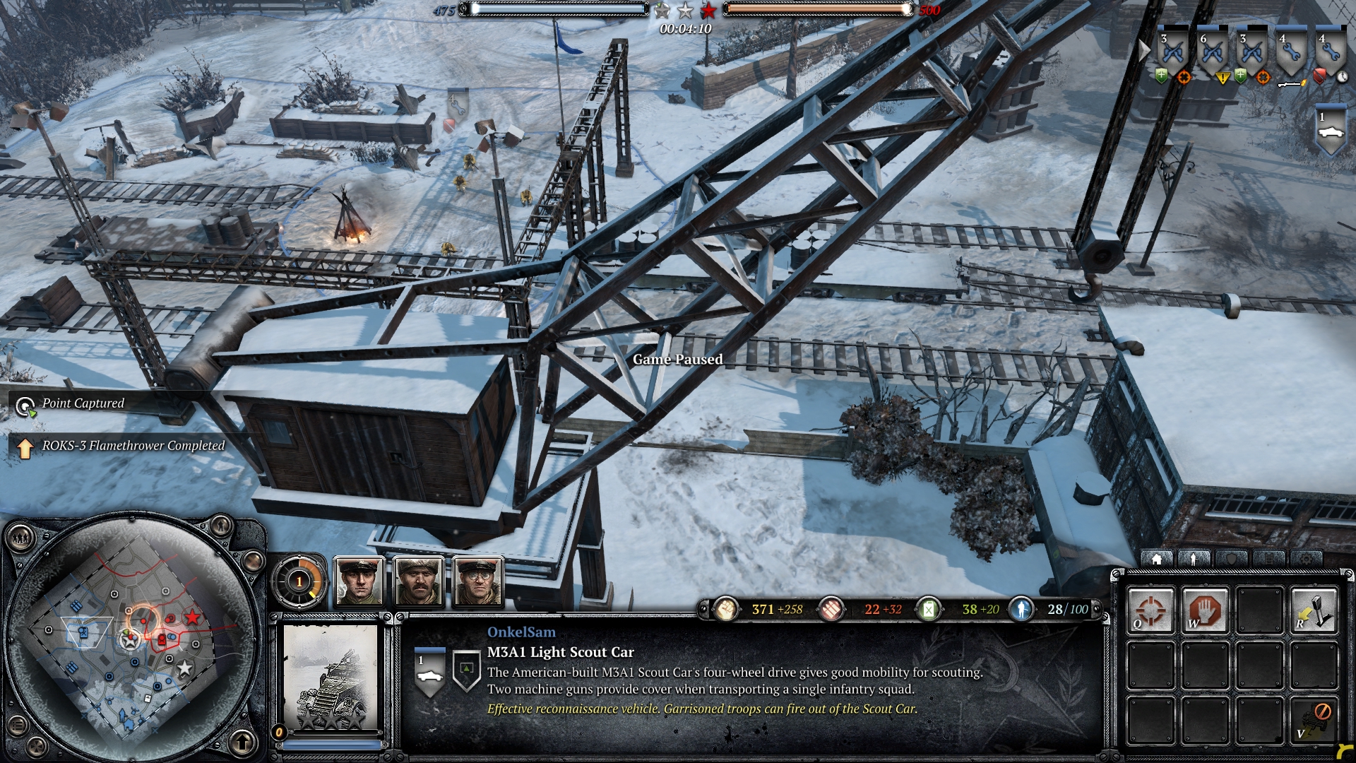
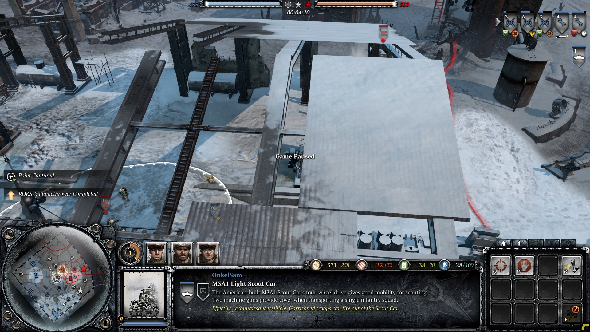
some of the bigger objects are a bit annoying though, cause they disturb your view. They are especially annoying, if they are placed in key areas around VPs

examples:


21 Dec 2013, 13:23 PM
#8
avatar of ofield

Posts: 420

Yea i get your point. I also were struggling with keeping them or removing them. because aesthetically they fit, but they can be indeed annoying view blockers. I'll see want can be changed when I am home again.

Thx for your feedback Sam.
21 Dec 2013, 13:30 PM
#9
avatar of Leodot

Posts: 254


fighting below the roof is hard, because you cant see much of your models or the others!

But overall, I must say it makes really fun!
Great map, indeed!

Leo :)
31 Dec 2013, 11:30 AM
#10
avatar of Lutzow

Posts: 64

Played it today and there are some annoying objects that block vehicles - fences, walls that go in the middle of the map. I understand that this might have been your intention but in my opinion they are just too long.

And at the middle Victory point, vehicles from starting positions 1 or 2 cannot get to it through the entrance, although it seems wide enough, they have to go all around again.

Otherwise a very aesthetic map, keep up the good work! :)
14 Jan 2014, 21:47 PM
#11
avatar of ofield

Posts: 420

Thx for the feedback.

Removed some view blockers (e.g. parts of the roof). And made the vp in middle passable as Lutzow mentioned.
1 user is browsing this thread: 1 guest

Ladders Top 10

  • #
    Steam Alias
    W
    L
    %
    Streak
Data provided by Relic Relic Entertainment

Replay highlight

VS
  • U.S. Forces flag cblanco ★
  • The British Forces flag 보드카 중대
  • Oberkommando West flag VonManteuffel
  • Ostheer flag Heartless Jäger
uploaded by XXxxHeartlessxxXX

Board Info

547 users are online: 547 guests
1 post in the last 24h
7 posts in the last week
39 posts in the last month
Registered members: 49061
Welcome our newest member, Rihedcfrd
Most online: 2043 users on 29 Oct 2023, 01:04 AM