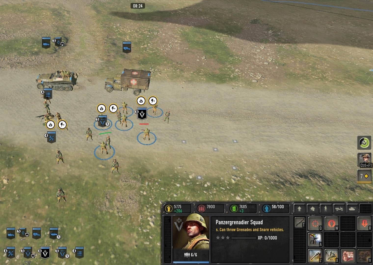
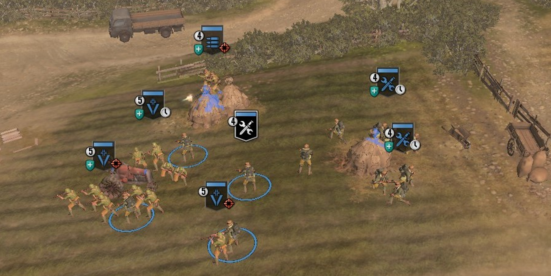
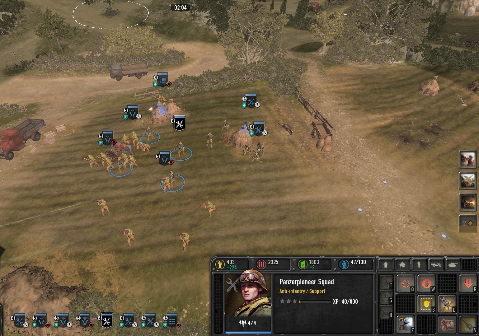
IT IS DIFFICULT TO DIFFERENTIATE THE SELECTED UNIT BASED ON THE COLORS OF THEIR ICON.
In Company of Heroes 3 During intense battles, managing multiple units can be challenging. It becomes difficult to identify the currently active unit without referring to the (UI) or heads-up display (HUD).
To improve clarity, non-selected units should have a much dimmer color while the selected unit should have a brighter color. Identifying selected units is a persistent issue that I am facing. As evidence, I have attached three pictures that show how difficult it is to locate the selected unit among a group of non-selected units.
Icon colors make unit recognition hard in CoH3
27 Feb 2023, 12:33 PM
#1
Posts: 210
27 Feb 2023, 14:55 PM
#2
Posts: 1379
Sounds like a good addition for accessibility.
PAGES (1)
1 user is browsing this thread:
1 guest
Livestreams
65 | |||||
360 | |||||
34 | |||||
33 | |||||
11 |
Ladders Top 10
-
#Steam AliasWL%Streak
- 1.831222.789+37
- 2.611220.735+5
- 3.34957.860+14
- 4.1110614.644+11
- 5.276108.719+27
- 6.306114.729+2
- 7.918405.694+2
- 8.262137.657+3
- 9.722440.621+4
- 10.1041674.607-2
Replay highlight
VS
- cblanco ★
- 보드카 중대
- VonManteuffel
- Heartless Jäger
Einhoven Country
Honor it
9
Download
1236
Board Info
841 users are online:
841 guests
0 post in the last 24h
7 posts in the last week
34 posts in the last month
7 posts in the last week
34 posts in the last month
Registered members: 49122
Welcome our newest member, Harda621
Most online: 2043 users on 29 Oct 2023, 01:04 AM
Welcome our newest member, Harda621
Most online: 2043 users on 29 Oct 2023, 01:04 AM