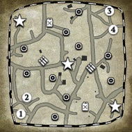
First go at a map, and following OnkleSam's rather excellent 'start here for noobs' mapping service, here's a sector map.
It was only after doing this that I noticed it looked vaguely insect liked. Anyway!
Can anyone see any initial problems with a sector layout such as this, particularly with such severe cutoffs? The placing of the points themselves are key, I think, and have deliberately placed them nearer one team or the other on opposite sides of the map and other sector points closer/further away from the munition points.
Red: VP
Green: Fuel
Blue: Munition
Orange: Strat


 Failure is always an
 It's a happy

 To make most awesome thing in universe combine
 and remember kids, we didn't start the


 cblanco ★
  보드카 중대
  VonManteuffel
  Heartless Jäger