Login

russian armor

Brecourt [1v1] Version 1.0

Hux
26 Mar 2013, 19:37 PM
#1
avatar of Hux
Patrion 14

Posts: 505

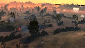
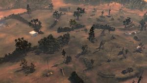
Brecourt 1.2
UPDATE:
- Have made the bottom of the map more accessible and open now to promote flanking
- Fuel points close to each base have been made more accessible to promote cut-off play
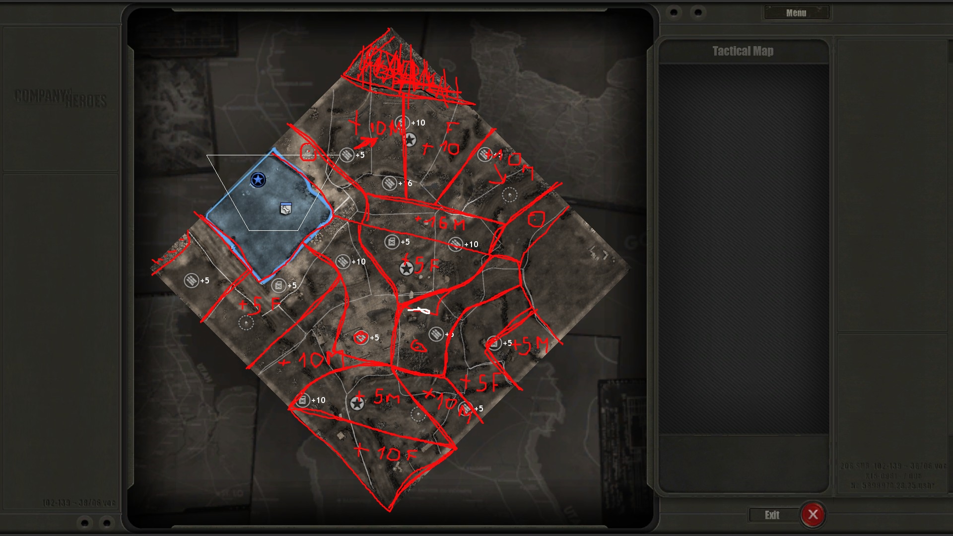
-turned top +16 muni into 2 +5 munis
-turned +5 munis close to each base into + 10 Munis
-numerous hedgerows removed to allow right side of map to be more open, heavy cover wall added to northern entrance of eastern base

Download (1.2): http://www.coh2.org/file/986/brecourt-1-2.zip

TACMAP:


As always play testing is welcomed as is feedback. I am thinking of adding in a second road going through the centre of the map to promote vehicle play. This is planned for 1.2.

Let me know what you think. Nice one
26 Mar 2013, 20:34 PM
#2
avatar of GeneralHell
Honorary Member Badge

Posts: 1560 | Subs: 1

On the 'My Files' page, you should see your uploaded zip-file. Right click on your file name and copy the link. Then paste your link in your post.

Also, remove the 'url' tags from your screenshots. You only need to use the 'img' tags ;)
Hux
26 Mar 2013, 21:15 PM
#3
avatar of Hux
Patrion 14

Posts: 505

Thank you GeneralHell. I'm not good at this forum linking business :P couldn't get the last two images to work properly so I removed them.

///ORIGINAL POST UPDATED
27 Mar 2013, 09:37 AM
#4
avatar of GeneralHell
Honorary Member Badge

Posts: 1560 | Subs: 1

jump backJump back to quoted post26 Mar 2013, 21:15 PMHux
Thank you GeneralHell. I'm not good at this forum linking business :P couldn't get the last two images to work properly so I removed them.

///ORIGINAL POST UPDATED

We are working on a BB code guide for the website. That should help with problems like had ;)
27 Mar 2013, 14:55 PM
#5
avatar of AmiPolizeiFunk
Admin Black Badge
Patrion 15

Posts: 16697 | Subs: 12

HOW TO SEE BIG PICTURES????????!???
27 Mar 2013, 15:24 PM
#6
avatar of Basilone

Posts: 1944 | Subs: 2

I think a MG42 could lock down the southern +10 fuel too easily, that conical hedgerow makes it basically unflankable, and prevents you from capping at a weird angle to avoid a possible mine.
Hux
27 Mar 2013, 16:45 PM
#7
avatar of Hux
Patrion 14

Posts: 505

First post updated
28 Mar 2013, 12:55 PM
#9
avatar of Spanky
Senior Strategist Badge

Posts: 1820 | Subs: 2

that resource layout looks a bit off, like the +16 muni is too close to the left player. Advantage like that is already game changing.
Hux
28 Mar 2013, 13:29 PM
#10
avatar of Hux
Patrion 14

Posts: 505

Thanks for the tip man, Good shout. I was a bit dubious about the point myself (especially with a brit camping straight on it. Perhaps splitting that +16 territory into 2 +5 munis, you reckon that would balance it out a bit more?
28 Mar 2013, 14:42 PM
#11
avatar of Spanky
Senior Strategist Badge

Posts: 1820 | Subs: 2

Heres my thought on how the sector might look, but i warn you, my only weakness is to draw a decent sector layout. :D So i wouldnt trust this layout myself, but its up to you to see if it gets things better or not. Anyway, i see you went for a bit of langres style base locations, i think thats one of the hardest to balance. Hope my idea helps you to refine your own resource layout. :)

Hux
28 Mar 2013, 15:38 PM
#12
avatar of Hux
Patrion 14

Posts: 505

You see, I wanted to try to decentralise the heavy resource points, on your resource layout the north looks like a Brit dream for every game. +10 muni, +10 Fuel and +16 muni all in adjacent sectors would be a nightmare. Perhaps the heavy cover of the trenches could help negate this somewhat - although, conversely, it could make it worse. (As a side-note this may not always be a part of the map and may need to be taken out later but we'll see)

I did, however take that +16 muni out of the middle and replaced it with 2 +5s and then converted the two +5 munis near each base into +10's. This takes the overall muni on the map to 70 without having lots of heavy points clumped in the middle.

I am going to save a seperate increment of this map with your layout though. And have two versions running parallel because it might just turn out to be a better idea.

thanks for the input man.

UPDATE: Original post updated with new layout.
28 Mar 2013, 17:26 PM
#13
avatar of Spanky
Senior Strategist Badge

Posts: 1820 | Subs: 2

As i said, adjust it to your own vision. And you are right, i didnt think about brits when i gave that resource layout, as i only like to see vcoh. Langres is a perfect example, vcoh!
2 users are browsing this thread: 2 guests

Livestreams

unknown 22
Germany 909
unknown 46
unknown 17

Ladders Top 10

  • #
    Steam Alias
    W
    L
    %
    Streak
Data provided by Relic Relic Entertainment

Replay highlight

VS
  • U.S. Forces flag cblanco ★
  • The British Forces flag 보드카 중대
  • Oberkommando West flag VonManteuffel
  • Ostheer flag Heartless Jäger
uploaded by XXxxHeartlessxxXX

Board Info

733 users are online: 733 guests
0 post in the last 24h
8 posts in the last week
37 posts in the last month
Registered members: 49093
Welcome our newest member, Transue
Most online: 2043 users on 29 Oct 2023, 01:04 AM