Login

russian armor

(2 - 4) Overgrowth

23 Apr 2014, 02:03 AM
#1
avatar of DrunkinGambit

Posts: 150

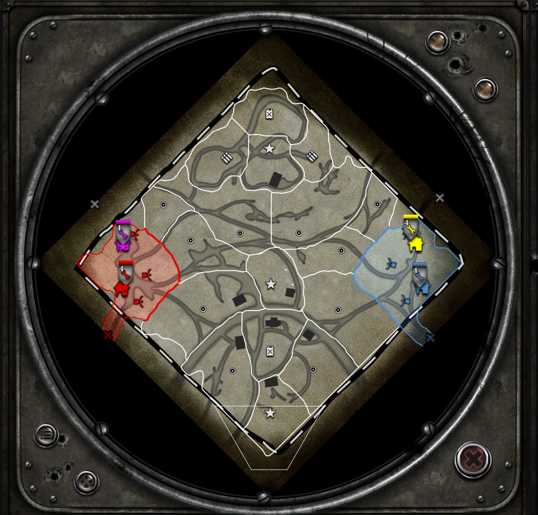
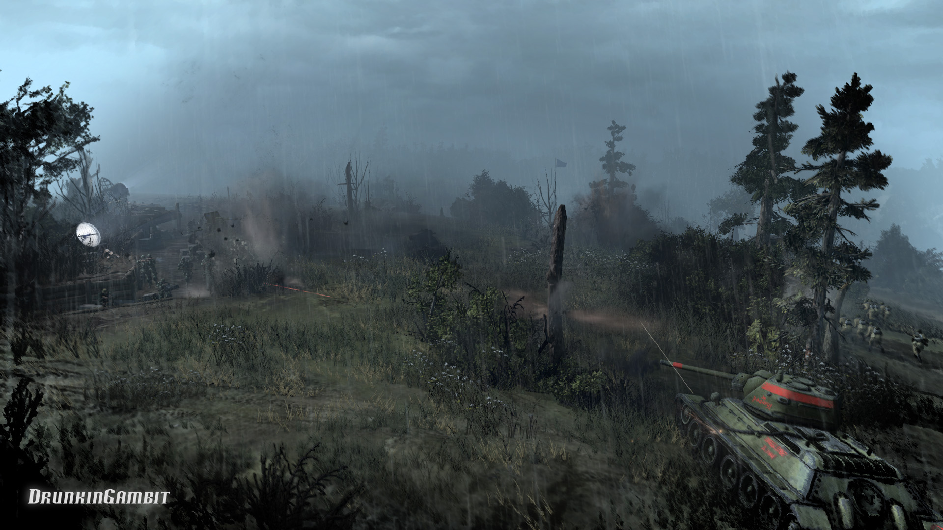
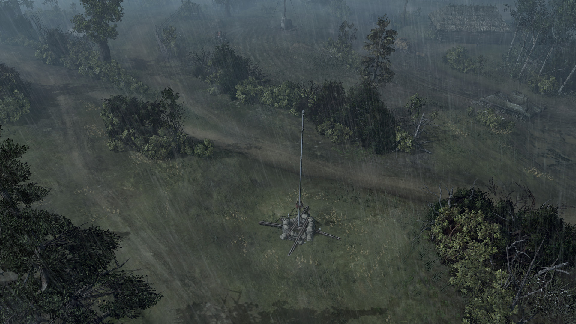
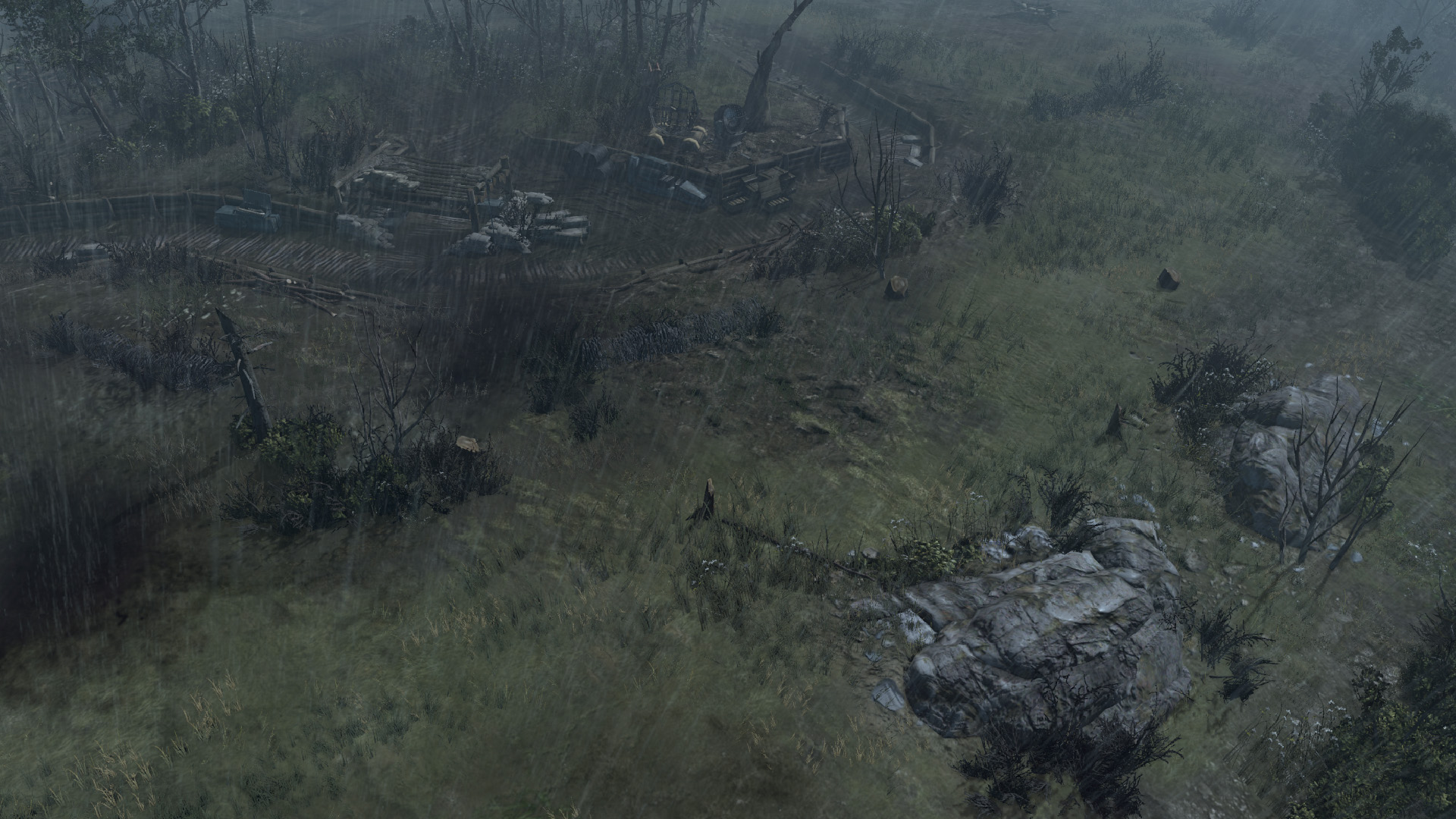
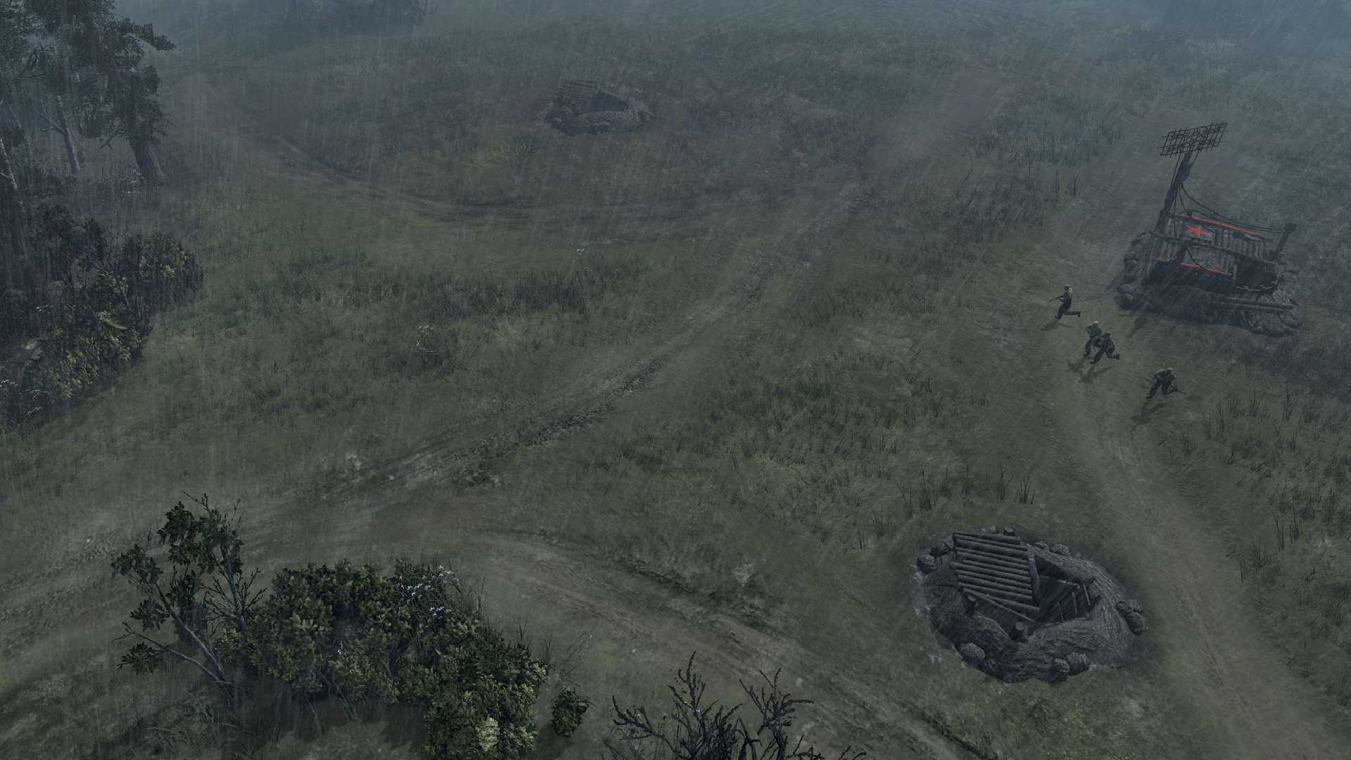
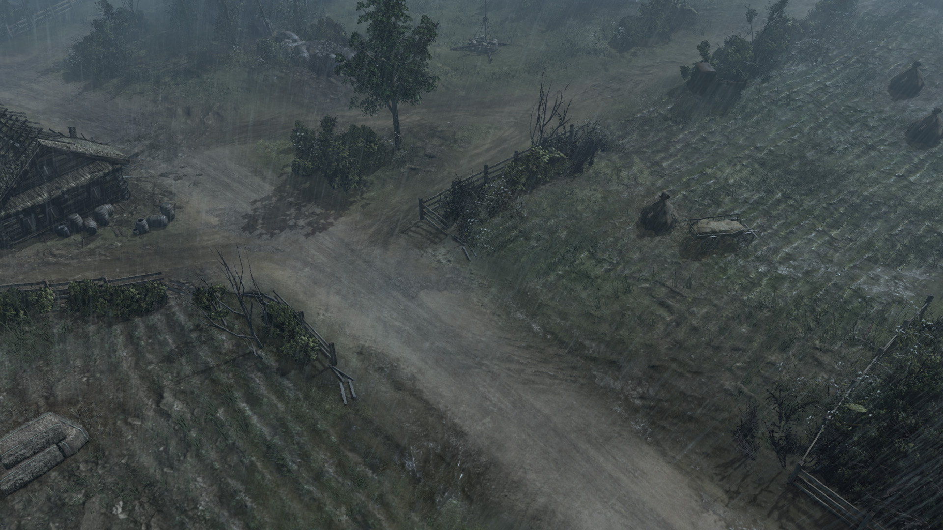
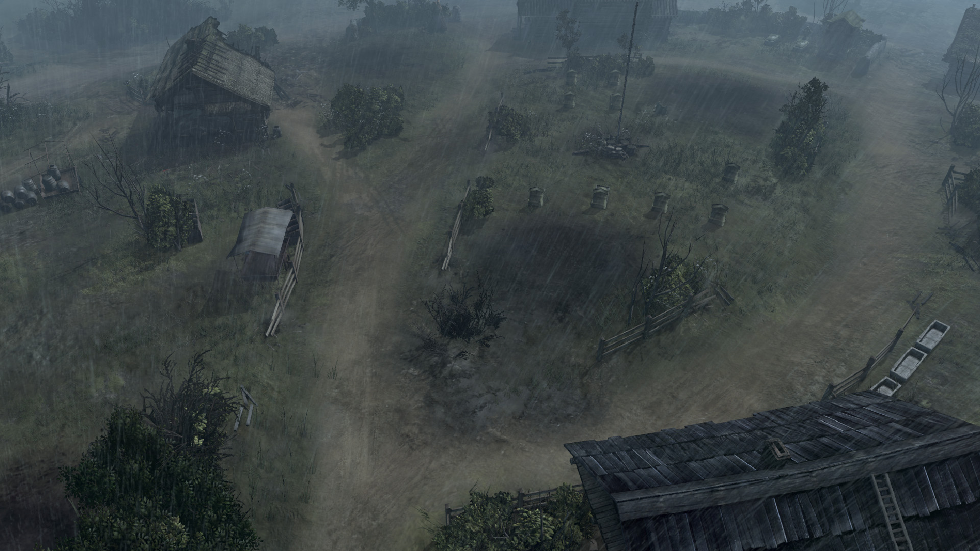
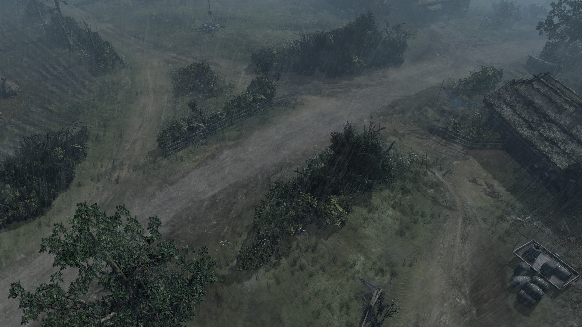
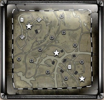
Hi all. Here is my new map in its current state. I still have some details to add, but it is ready to be shared for all to critique.

Please leave your feedback!

Workshop


23 Apr 2014, 04:23 AM
#2
avatar of Muddy

Posts: 20

looks good! I'm going to try it out now.
23 Apr 2014, 05:06 AM
#3
avatar of akosi

Posts: 1734

Permanently Banned
too much tree MVGame, anyway there is a coh1 map like this, is there?
23 Apr 2014, 06:46 AM
#4
avatar of Muddy

Posts: 20

I like it. Played it twice now and it was fun.Very good cut-offs in the middle of the map. I was battling in three spots the whole match. The bottom for the 2 VPs, the middle to cover the cut-offs, and the top for the MP's. Not easy for my to control all that, but its well made. I was a little sad that the Mortar bunker on the top of the map doesn't work persay. It doesn't have any abilities as an Mortar Bunker, but that ok.

Great work!
23 Apr 2014, 06:55 AM
#5
avatar of WiFiDi
Honorary Member Badge

Posts: 3293

mortar bunker would be fun but OP as fuck! :P

love the new changes btw gambit gonna try asap!

edit: easily one of the best custom map ive played as far as atmosphere and gameplay but i played an alpha version so yea. :D

23 Apr 2014, 08:01 AM
#6
avatar of Kreatiir

Posts: 2819

Looks awesome man, can this bunker be mounted?
I mean, can units go in?

Gonna try it tomorrow!
23 Apr 2014, 08:02 AM
#7
avatar of WiFiDi
Honorary Member Badge

Posts: 3293

last time i played units can garrison. :) no it doesn't fire a mortar though just a building. :(
23 Apr 2014, 08:04 AM
#8
avatar of wuff

Posts: 1534 | Subs: 1

I've played this map several times in various forms and it just gets better and better.

Fantastic work as always Gambit.
23 Apr 2014, 16:31 PM
#9
avatar of DrunkinGambit

Posts: 150

Thank you all for the kind words. Akosi, I'll see what i can do with the trees. When I was testing last night there were a couple spots where trees blocked player vision.

I still need to add action markers for smoke/fog/dust effects as well as some other small object detailing.
23 Apr 2014, 17:25 PM
#10
avatar of akosi

Posts: 1734

Permanently Banned
Thank you all for the kind words. Akosi, I'll see what i can do with the trees. When I was testing last night there were a couple spots where trees blocked player vision.

I still need to add action markers for smoke/fog/dust effects as well as some other small object detailing.


That was sarcasm, i automatically dislake any map which has village atmosphere, but the maps looks fine but not my style, i was told in another topic i am sick of this kind of maps, because there are so many, just look automatch 1v1 mappool
23 Apr 2014, 18:20 PM
#11
avatar of DrunkinGambit

Posts: 150

jump backJump back to quoted post23 Apr 2014, 17:25 PMakosi


That was sarcasm, i automatically dislake any map which has village atmosphere, but the maps looks fine but not my style, i was told in another topic i am sick of this kind of maps, because there are so many, just look automatch 1v1 mappool


Yeah, I saw your post. But the map you posted on is the most barren map I've ever seen I think... This map will be my last "nature", "country-side", "village" map for a while. I will make one that's more urban or industrial next. I can sympathize with your opinion. I happen to really like rural type maps.
24 Apr 2014, 01:35 AM
#12
avatar of hound54

Posts: 31 | Subs: 1

I don't post often but I had to commend you on a very good map.
30 Apr 2014, 03:35 AM
#13
avatar of DrunkinGambit

Posts: 150

Thank you Hound for taking the time to post.
I have made some nice updates here, mostly concerning fine detail and other peripherals.

Some updates:
-Fixed second map entries for both sides. (notice screen shot in OP, how the base territory does not extend to one of the map entries). Both entries now work.
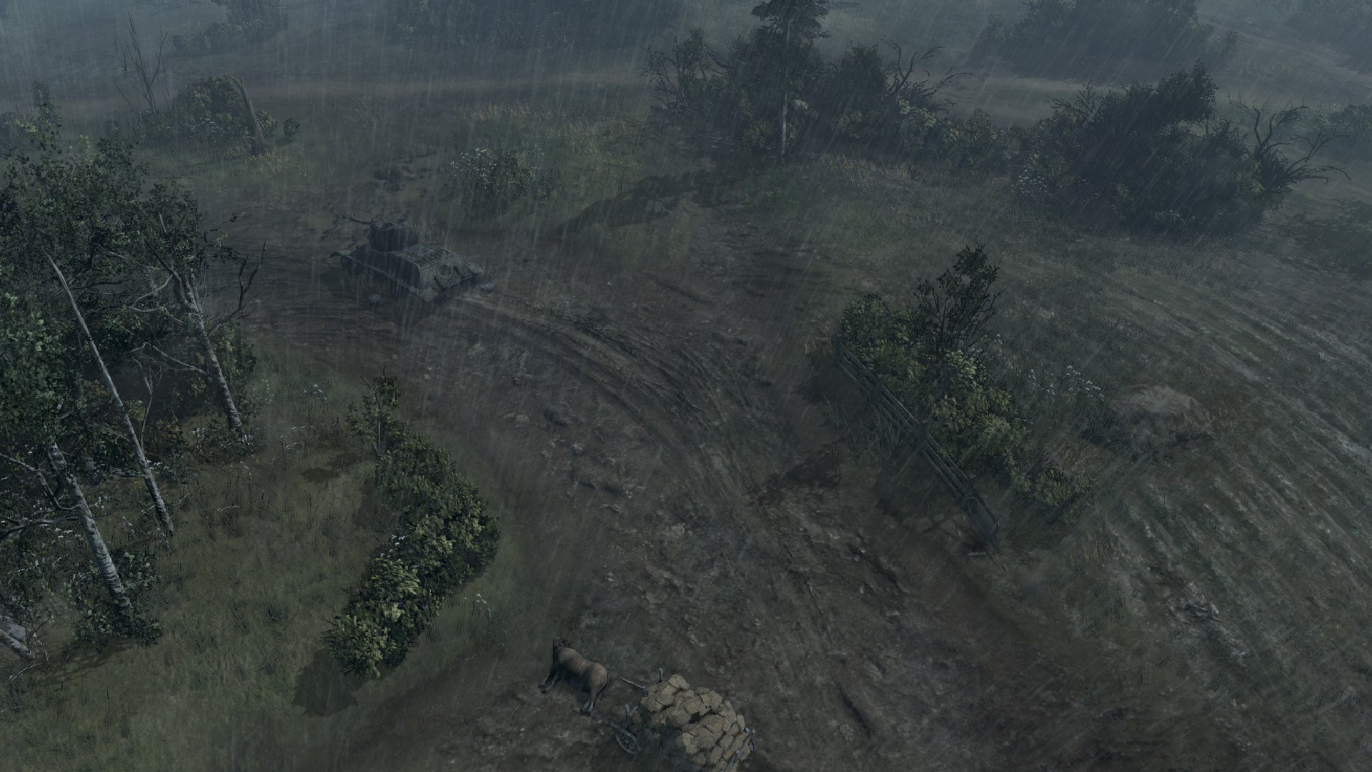
-Added texture detail to the main road arcing through the village. Plus other random texture detail that no-one will ever notice.
-Fixed some ambient effects to be more subtle.
-Finally added a loading screen (1st screen shot following tac map screens in OP).

I still need a map description (seen on loading screen) if anyone wants to help with that, I'm taking suggestions.

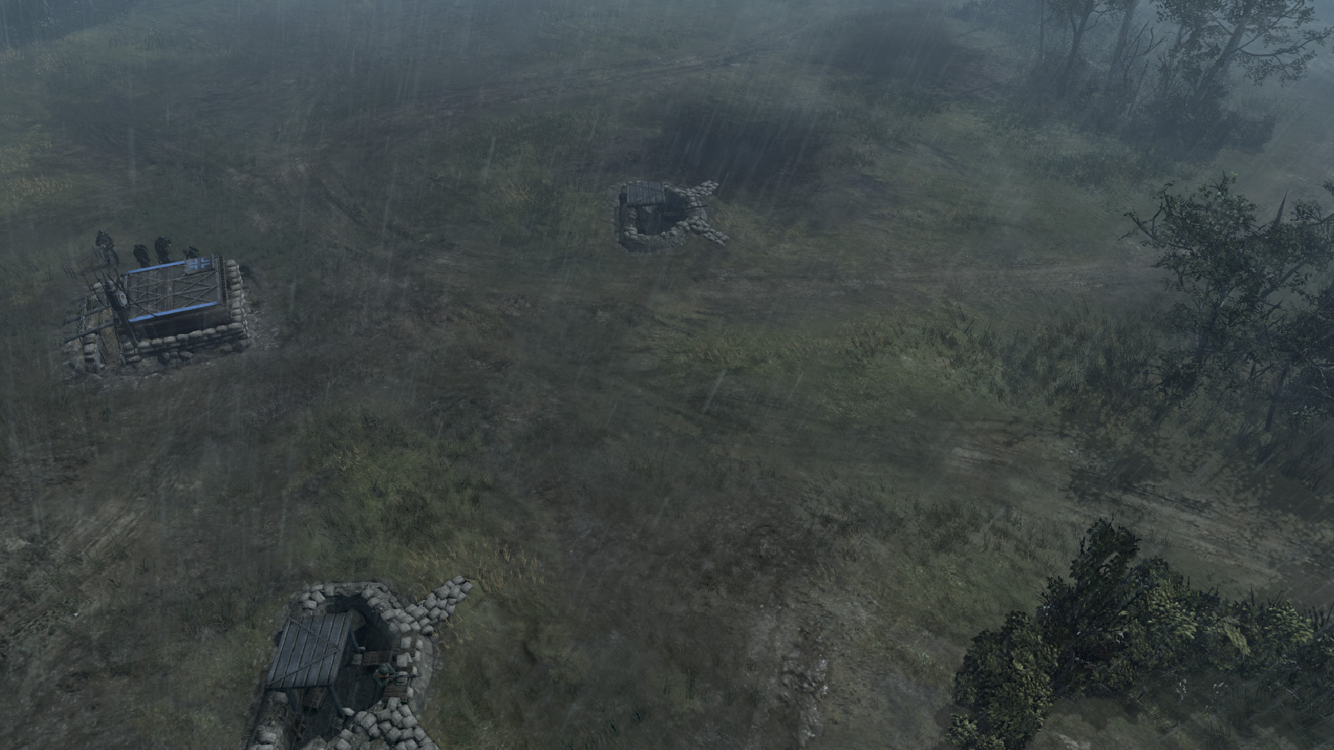
Side note: The main bunker is just a normal building as Wifi states. It would not be there if it operated as a mortar bunker or some such.. That would just be a huge variable for balanced play.

30 Apr 2014, 04:06 AM
#14
avatar of 白俊成

Posts: 27

Looks awesome, gonna try it out later. Is there any documentation for the worldbuilder? All I can find are videos which I can't watch. I'd like to have a go at making maps.
30 Apr 2014, 13:47 PM
#15
avatar of DrunkinGambit

Posts: 150

I'm happy you like my map.
You can check out written tutorials here:
http://www.coh2.org/topic/10409/map-making-tutorial-index

and here for more specific tips:
http://www.coh2.org/topic/13773/worldbuilder-tip-of-the-week-index
30 Apr 2014, 14:05 PM
#16
avatar of 白俊成

Posts: 27

Thanks muchly. I'll study those links.
22 May 2014, 03:11 AM
#17
avatar of DrunkinGambit

Posts: 150

Hey guys.

Updates here:

Updated all screen shots. See OP

-Changed the atmosphere to a gloomy, rainy scene. Let me know what you think.
-Added damaged section of trench, allowing troops to move into the trench without vaulting. This should allow access to weapons teams and greater mobility in the trenched areas.
-Removed concrete trench bunker and replaced it with a new wooden bunker with sandbags. This bunker does not act like a building. http://www.coh2.org/file/4830/screen-shot-v2-4.jpg
-Added a trench entrance between the two hedges near the northern VP.
-Re-modeled the trenches. The trenches looked curvey before. This was not intended. Each stretch of trench is now straight to reflect a more realistic construction.
-Shot/movement/sight blocks added around groves.
-Slightly adjusted start locations.
-Map description added thanks to SabreBadger, thanks man, much appreciated.

-New loading screen coming soon to reflect map changes.

Please let me know what you think. Improvements are ongoing in an attempt to deliver the best maps to you guys.


22 May 2014, 16:26 PM
#18
avatar of Janne252
Admin Black Badge
Patrion 15

Posts: 3421 | Subs: 11

I really like the new look. In some ways it looks a lot like COH1 maps. I'm not entirely sure but aren't there any maps with *liquid* rain in the current automatch rotation? Based on the screenshots the improvement is huge.
22 May 2014, 18:56 PM
#19
avatar of DrunkinGambit

Posts: 150

Thanks Janne, I'm happy you like it. I just need to get those search lights to be on... I can't figure out how to do this. They appear to be on in WB but they aren't on in the game. I looked at other posts about this and none of the proposed solutions has worked for me.

Have any suggestions?
22 May 2014, 19:22 PM
#20
avatar of Janne252
Admin Black Badge
Patrion 15

Posts: 3421 | Subs: 11


(click for full size)

<map_name>.scar:
Code

function OnInit()
EGroup_SetAnimatorState(eg_light, "Light_State", "On")
end

Scar_AddInit(OnInit)
1 user is browsing this thread: 1 guest

Ladders Top 10

  • #
    Steam Alias
    W
    L
    %
    Streak
Data provided by Relic Relic Entertainment

Replay highlight

VS
  • U.S. Forces flag cblanco ★
  • The British Forces flag 보드카 중대
  • Oberkommando West flag VonManteuffel
  • Ostheer flag Heartless Jäger
uploaded by XXxxHeartlessxxXX

Board Info

314 users are online: 314 guests
0 post in the last 24h
4 posts in the last week
35 posts in the last month
Registered members: 49217
Welcome our newest member, Hodnefield01
Most online: 2043 users on 29 Oct 2023, 01:04 AM