Help me test Bayeux

Posts: 1820 | Subs: 2
Map has been updated to version 2.0, major changes including map rotation to fit east vs west.
New map version here: Bayeux 2.0
Hey community, I want to give this a try. After hearing the feedback about Bayeux, I've spent time in the world builder trying my best to bring the map size to a more reasonable fit with a couple of more things changed. I feel confident that this will make the game play feel more fast paced.
So I would love to hear feedback and I am also hoping you the community would help me play test it, I am thinking of some sort of a reward for lets say:"the best replay". If any caster wants to hop in, get in contact with me here or steam.
Without further ado, here are the changes with explanations.
Tactical map: What you see here is the white Line around sectors being the new size and the old border showing the pervious size. I also haven't updated the Tactical map but I'm hoping Rosbone will make it happen. Changed a couple of sectors to bring them closer to the players. Base starting point and area moved/reworked.
I will put a scetch here for the points moved and base readjustment.
More pictures of the changes done.
Middle reworked
South entrance
North entrance
North cutoff
South Cutoff
West fuel now on the otherside of the forest with a reworked area.
East fuel forest area reworked
You can get the new map file here.
(2) Bayeux
Hope the community will give this a chance. Thank you!
Posts: 999 | Subs: 1
GL with the rework!

Posts: 55
So, I've played on the new Bayeux once (against a human player) and noticed a few things about it:
-You left out the useless parts of old Bayeux, that's great but now, the map is just way too small. Especially the capture points are all square now and yellow covers are clunky. I don't know if this is intended but in some cases, infantry enter the yellow cover but doesn't capture the point. This isn't a very good idea if you ask me. Most of the successful maps on the pool has big capture points and if you ask me, that's the best.
-Base MGs overlooking capture points:
I don't know how the majority of the playerbase think but I assume nobody likes these in Crossing in the Woods map. Base MGs are for protecting the base, not the capture points. so, you might want to look into them.
I think map is just way too small right now, which leads to small capture circles. You might want to make it bigger by adding some space here and there (I suggest adding more space between capture points, personally, they're too near to each other currently).
Posts: 2155 | Subs: 2
I think map is just way too small right now, which leads to small capture circles. You might want to make it bigger by adding some space here and there (I suggest adding more space between capture points, personally, they're too near to each other currently).

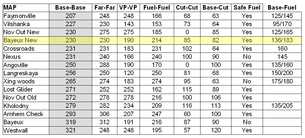
Most of the more popular maps are nearly the same size as the new Bayeux. The actual width where points are located is approx 190 at the midline. And more like 230-240 fuel-fuel just off center.
The distance between points ranges from 35m-60m. Which is also normal. The points are central to each side VP, so the muni, muni cutoff, and mid TP could each be moved 5-10m more towards the center maybe? I am not aware of the tactical reason Spanky was designing to, so I dont want to say this is needed. The points are generically fine.
I agree that the capture points could be a little bigger. This would also bring the cover objects into the circle so units dont clump outside the circle.
Just looking at the map I am very excited about the layout. I think the smaller size, removal of the cutoff houses, and the point layout looks great. This map will be great for players that focus on resources over VPs. Each main point is easily taken and connected for income.

Posts: 5441 | Subs: 36

Posts: 1820 | Subs: 2
Lets start with the capture circles/squares. I wanted to try out something different this time and made perfect squares, but I see that it needs a little adjustment, so I will focus on making those tad bit bigger.
About the mg nests in the base, I am not aware that those arcs would cover cutoff points, I will give this a test myself. Adjusting accordingly.
Cover around points will be adjusted with the new radius.
Rosbone you also pointed out a very detailed list of things you found on discord, thanks for that!
Thanks guys, appreciate it!


Posts: 1820 | Subs: 2
1. Fixed a couple of mistakes. (thanks Rosbone for pointing out)
2. south side had a steeper climb so I smoothened it out
3. Made changes to the sector layout, moved 4 manpower points and 2 munition points as seen below.
4. Deleted some hedges and added hedges to the intersections as seen below.
My final thought is to copy paste the map to a new template which is smaller, so the minimap wont be as large.
Thank you again, for giving feedback!

 1
1 Posts: 2439 | Subs: 6
North vs. South maps have a history of bias against north and players not changing their camera angle to face their opponent.
It is too noticeable a problem to design a map with north vs. south on the outset.
Posts: 999 | Subs: 1
Suggestion: please rotate this map 90 degrees and make it East vs. West and tweak it accordingly
North vs. South maps have a history of bias against north and players not changing their camera angle to face their opponent.
It is too noticeable a problem to design a map with north vs. south on the outset.
I second this! I've seen some players even go so far as to rotate their PoV by 180 degree in case they start north - which at least seems to be an option for most people... except for me though, since I'll completely lose orientation upon rotating the map even the slightest bit


Posts: 1820 | Subs: 2
Suggestion: please rotate this map 90 degrees and make it East vs. West and tweak it accordingly
North vs. South maps have a history of bias against north and players not changing their camera angle to face their opponent.
It is too noticeable a problem to design a map with north vs. south on the outset.
Good point!

Posts: 1820 | Subs: 2
Found out what you meant by playtesting, fixed now.
I will copy paste the template to a new canvas tomorrow as I got no time anymore today. But a new version is available, see first post "map file".

Posts: 55
Most of the more popular maps are nearly the same size as the new Bayeux. The actual width where points are located is approx 190 at the midline. And more like 230-240 fuel-fuel just off center.
New bayeux has the same size as Crossroads? That's weird, map really felt a lot smaller to me. I don't know what caused this but well, nevertheless, numbers don't lie. Thanks for the comparison chart.
Found out what you meant by playtesting, fixed now.
I will copy paste the template to a new canvas tomorrow as I got no time anymore today. But a new version is available, see first post "map file".
Good to know. I'll try to find somebody to playtest it (hopefully someone similar to my skill level this time) and post the replay if I can. Keep up the good work!

Posts: 1820 | Subs: 2
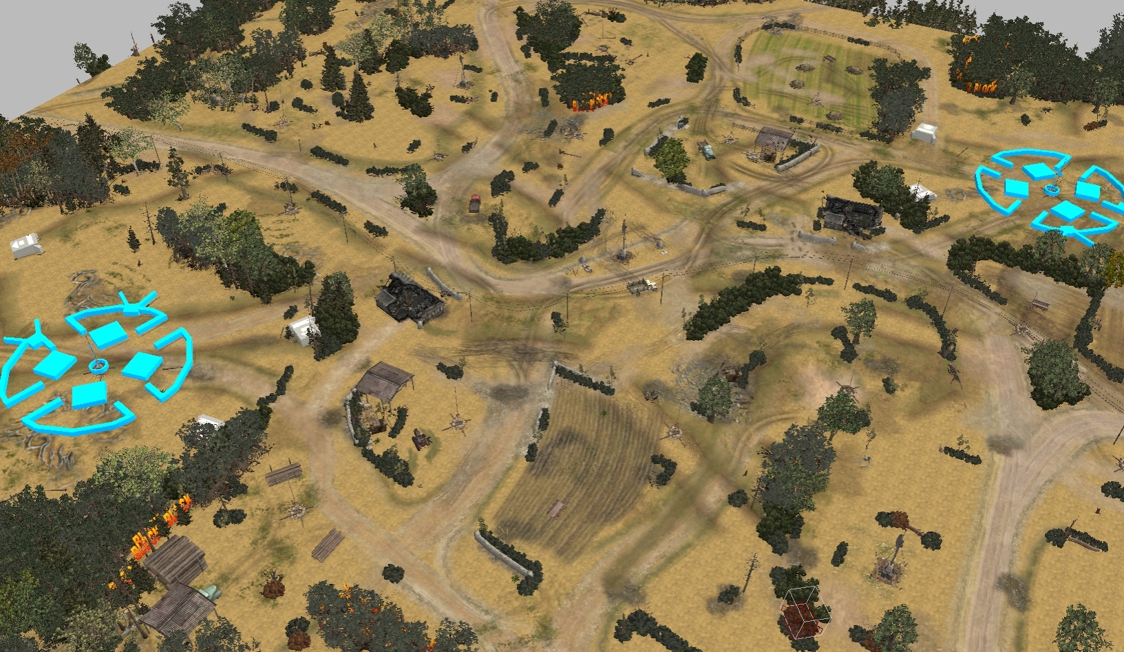
So I tried real quick to copy paste the template and rotate it to match west to east angle and it works but.. look at it. Gonna take me some time to get the aesthetics looking like it did.

If the community likes this angle more than the original, then I will put work into it. I'm just wondering how much time do I have until the next map patch hits.


 1
1 Posts: 2439 | Subs: 6
Cheers Raxzero!
So I tried real quick to copy paste the template and rotate it to match west to east angle and it works but.. look at it. Gonna take me some time to get the aesthetics looking like it did.
If the community likes this angle more than the original, then I will put work into it. I'm just wondering how much time do I have until the next map patch hits.
Dude wtf, the map looks way sexier that way. How is that possible, usualy it takes a lot of shadow tweaking etc to make it look nicer

Posts: 1820 | Subs: 2
You are kidding right, cause I'm laughing!
All of this lush green is gone, no atmosphere preset either. The re painting is painful thats all as it takes time to get different tiles to blend in. No way Im going with this yellow color.

Anyhow, expect an update tomorrow.

 1
1 Posts: 2439 | Subs: 6
You are kidding right, cause I'm laughing!
All of this lush green is gone, no atmosphere preset either. The re painting is painful thats all as it takes time to get different tiles to blend in. No way Im going with this yellow color.
Anyhow, expect an update tomorrow.
Ok I thought that was just how it looked in WB. Tbh I just mean the geometry of the map layout kind of stands out better from this perspective.

Posts: 5441 | Subs: 36
I think you will find and have the time for it. That does not mean wait now 1 month lol^^
The plan is to patch in June.
Posts: 3588 | Subs: 3
Posts: 3602 | Subs: 1
I second this! I've seen some players even go so far as to rotate their PoV by 180 degree in case they start north - which at least seems to be an option for most people... except for me though, since I'll completely lose orientation upon rotating the map even the slightest bit
I almost always rotate the map and Bayeux north fuel point is a bit of a pain in the ass to supervise at the moment. Too much tall trees.
But overall I like the actual map.
Have to give a try to the new version.

Posts: 1820 | Subs: 2
Ok I thought that was just how it looked in WB. Tbh I just mean the geometry of the map layout kind of stands out better from this perspective.
All good, just a miss understanding bro.
 True, didnt have much energy yesterday to get an overall feel but I will take this direction, thanks for suggesting it!
Livestreams
 |
|
|
12 | ||
 |
|
|
90 | ||
 |
|
|
27 | ||
 |
|
|
3 | ||
 |
|
|
3 |
Ladders Top 10
-
#Steam AliasWL%Streak
- 1.42463.871+2
- 2.659233.739+2
- 3.300162.649+1
- 4.286110.722-2
- 5.12243.739-1
- 6.310114.731+6
- 7.193100.659+3
- 8.10829.788+9
- 9.370283.567+3
- 10.1171650.643+2
Replay highlight
-
 cblanco ★
 -
 보드카 중대
-
 VonManteuffel
 -
 Heartless Jäger

Board Info
5 posts in the last week
42 posts in the last month
Welcome our newest member, Gutma236
Most online: 2043 users on 29 Oct 2023, 01:04 AM


